
See What the Shelf Demands
Retail Shelf
Packaging Design
Your pack is never alone on 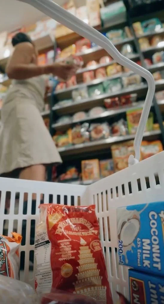 a shelf. We design it to earn attention,
 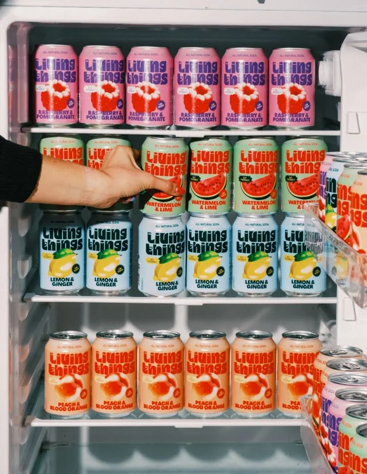 communicate quickly, and stay recognisable beside
  everything competing with it.
01. What Does the Buyer Notice First?
On shelf, the buyer does not study every pack. The eye picks up colour, shape, brand name, category cues, and the strongest message first.
We design the front of the pack so the most important information is understood quickly, even from a distance.
TFX Strategy in Action
For Burp, the pack needed to feel playful and refreshing before the customer even started reading the functional benefits.
02. Will the Pack Still Stand Out Beside Competitors?
A strong pack can look impressive on a mockup and disappear completely once placed beside ten similar products.
We study shelf colours, category codes, competitor layouts, claims, and visual density to understand where the pack needs familiarity and where it needs contrast.
03. Can the Buyer Understand the Product in Seconds?
Shelf packaging needs to answer basic questions quickly:
What is it?
Which variant is this?
What is the main benefit?
Why should I consider it?
We structure product names, claims, benefits, imagery, and supporting information so the customer does not have to decode the pack.
TFX Strategy in Action
For Bioticle, different supplement formats and benefits needed clear communication without turning the front panel into a crowded health-information board.
04. What Should Stay Familiar, and What Should Look Different?
Retail packaging cannot ignore category expectations completely.
Certain colours, ingredients, formats, or visual cues help customers identify the product quickly. But following every convention makes the brand blend in.
We decide which category signals should stay and which ones the brand can challenge.
TFX Strategy in Action
For Yova, makhana needed enough familiarity to remain easy to understand while moving away from traditional or diet-led category communication.
05. Can Every SKU Be Recognised Without Losing the Brand?
A shelf rarely carries just one product forever.
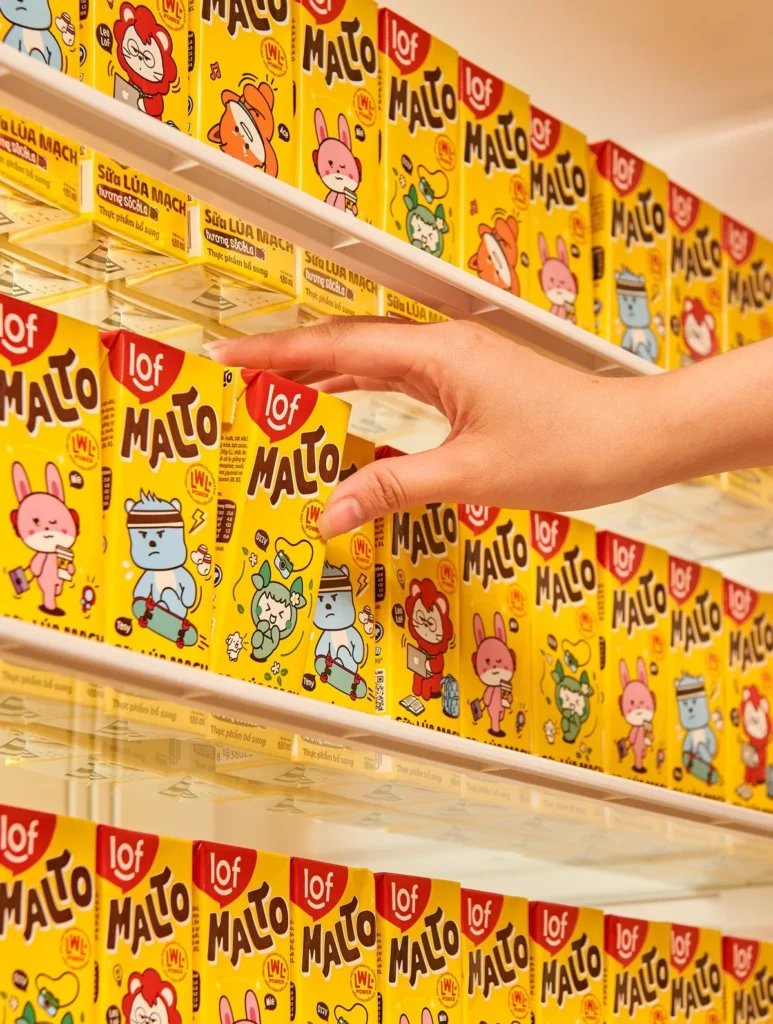
As flavours, sizes, formats, and variants expand, customers need to recognise both the brand family and the specific SKU quickly.
We create a retail packaging system where variants are easy to navigate while the full range forms a stronger visual block together.
TFX Strategy in Action
For SSM Masala, multiple products needed enough variation for quick identification while still looking clearly connected as one brand family.
06. What Happens When the Pack Is Actually Put on Shelf?
Retail performance needs to be judged in context, not only on a design screen.
We test the packaging against competitor density, shelf distance, neighbouring colours, range blocking, pack orientation, and the visual distractions found in real retail environments.
The goal is to understand whether the design still communicates once it leaves the presentation.
TFX Strategy in Action
For consumer brands like Burp, the pack needs to work individually and become even more recognisable when multiple SKUs appear together.
Inside a TFX Retail Shelf Packaging Design
Shelf Visibility
We shape the pack so the brand, product, and strongest message can be recognised quickly even in a crowded retail environment.
What We Focus On:
- Distance recognition
- Brand visibility
- Category cues
- Visual contrast
Pack Hierarchy
Core
We organise the front of the pack so buyers can understand what the product is, which variant it is, and why it matters without overloading the design.
What We Build:
- Product hierarchy
- Benefit priority
- Claims placement
- Variant clarity
Range Blocking
We design multiple SKUs to work individually and together, helping the complete range create a stronger and more recognisable presence on shelf.
What We Shape:
- SKU architecture
- Colour coding
- Variant differentiation
- Shelf consistency
Questions Founders Usually Ask
What makes packaging work well on a retail shelf?
Retail packaging needs to do three things quickly: get noticed, communicate the product clearly, and remain recognisable beside competing packs.
That usually depends on a combination of brand visibility, front-of-pack hierarchy, colour contrast, category cues, claims, variant clarity, and how the range behaves together.
At TFX, we do not judge a pack only on a clean mockup. We look at how it performs in a crowded retail context where the customer is comparing multiple options at once.
How do you make packaging stand out without making it look out of place?
Standing out does not mean ignoring the category.
Customers rely on familiar signals to understand what a product is, but copying every category convention makes the pack disappear into the shelf.
We study competitor colours, layouts, claims, imagery, and visual behaviour to decide which cues the brand should keep and where it can create meaningful contrast.
The goal is to feel recognisable enough to understand, but different enough to notice.
How important is front-of-pack hierarchy in retail packaging?
How important is front-of-pack hierarchy in retail packaging?
Very important.
A shopper may only give the pack a few seconds before moving to another option. The front panel needs to make the most important information easy to process.
Depending on the product, that may include:
- Brand name
- Product category
- Variant or flavour
- Primary benefit
- Key claim
- Quantity or format
We prioritise these elements so the customer knows what the product is before being asked to read everything else.
How do you design packaging for multiple SKUs on shelf?
A strong SKU system needs to balance brand consistency and product differentiation.
Every pack should clearly belong to the same brand while making flavours, variants, sizes, or benefits easy to distinguish.
For SSM Masala, multiple products needed enough variation for quick identification while still creating one connected brand family.
This also helps the range create a stronger visual block when several SKUs appear together in-store.
Featured Projects
Transformations Exposed
Brand Building Services Only
Not a 360° agency. A focused studio for serious brand foundations.
01
02
03
Packaging Design
Packaging designed to sell on shelves, ecommerce, and quick commerce.
04
Luxury Packaging Design
Premium packaging for brands where perception, detail, and unboxing matter.