
Standard packaging has a simple job: help people notice the product, understand it quickly and recognise it again.
Packaging Design
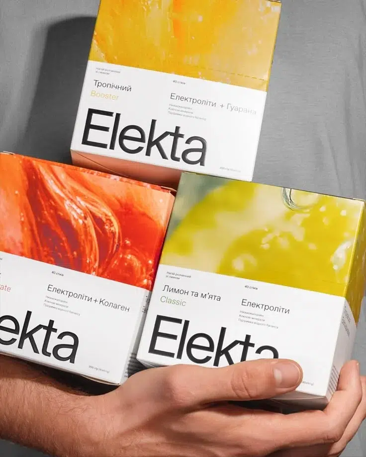
Packaging Design Prices
Master Design
$950/ MD
- Your main pack design, 1st SKU
- One design direction, 1 final route
- Front + back hierarchy
- Key product claims
- Mockups for approval
- Production-ready artwork
Example: First / Hero SKU
Variation Design
$600/ VD
- Same approved packaging system
- New flavour / variant / type
- Colour and variant cues updated
- Claims / ingredients updated where required
- Mockups included
- Production-ready artwork
Example: Same pack, new flavour
Size Adaptation
$210/ SA
- Same approved design
- Adapted to another pack size
- Information placement adjusted
- Layout rebalanced for the new format
- Mockup included
- Production-ready artwork
Example: 250g → 500g → 1kg
What Should Your Packaging Actually Do?
01. Get Noticed.
Your product is rarely sitting alone. On a shelf, marketplace or quick-commerce screen, it is competing with dozens of alternatives for the same few seconds of attention.
We build strong hierarchy, recognisable brand cues and enough visual distinction for the product to stand out without becoming unnecessarily loud.
The goal isn’t to be the loudest pack. It’s to be the one people notice and remember.
02. Get Understood.
Attention means very little if someone looks at the pack and still doesn’t understand what they’re buying.
We organise the product name, category, benefits, claims and information hierarchy so the most important things are understood in the right order.
A good pack should quickly answer: What is it? Why should I care? Which one is for me?
03. Stay Consistent.
As more flavours, variants and sizes get added, packaging can quickly start feeling like separate products from separate brands.
We build a visual language that can stretch across the range, while still giving every SKU enough distinction to be understood individually.
So every new product can look different where it needs to, while still feeling unmistakably like the same brand.
One Packaging System
Notice it. Understand it. Recognise it again.
WE EXPLORE
01
Layout possibilities
02
Logo + brand placement
03
Colour + typography behaviour
04
Claims + front/back hierarchy
WE DECIDE
✔️
What gets seen first
✔️
How the brand sits on the pack
✔️
How information + variants are structured
✔️
What deserves attention + how the pack communicates
Once the Master is solved, the range has a language to follow.
Future variants and sizes build from decisions already made, instead of starting from scratch.
Burp: Prebiotic Soda Brand
Prebiotic drinks often feel medical, complicated, or boring. For Burp, we turned gut health into a light, playful, everyday soda brand.
Brand Problem
Gut health felt clinical, complicated, and boring.
Strategic Fix
Shifted wellness into effortless refreshment.
Brand Outcome
A playful soda brand with stronger recall.
Uveraa: Making Nutrition Feel Simple
Personalised nutrition can feel scientific, data-heavy, and hard to follow. For Uveraa, we turned complex health data into a calm, clear, everyday nutrition system.
Brand Problem
Personalised nutrition felt complex and overwhelming.
Strategic Fix
Turned science into a daily ritual.
Brand Outcome
A clearer nutrition brand built for trust.
Rinele: Making Jewellery Feel Global
Indian jewellery brands often use familiar luxury cues that make them blend in. For Rinele, we shaped a more western, refined, and premium identity direction.
Brand Problem
Jewellery branding felt traditional and expected.
Strategic Fix
Shifted perception toward global refinement.
Brand Outcome
A premium jewellery brand with distinction.
Questions Founders Usually Ask
What exactly counts as a Master Design?
A Master Design is the first product where we build the packaging language from scratch, including layout, hierarchy, brand placement, colour behaviour, claims and the overall visual system.
What counts as a Variation Design?
A Variation uses the same approved packaging language but changes the flavour, type, colour, claims or product information while keeping the core structure intact.
When does a Variation become a new Master Design?
If the new product needs a different layout, hierarchy or visual system, it should be treated as a new Master Design rather than a Variation.
What counts as a Size Adaptation?
A Size Adaptation keeps the same design and product language but adjusts the artwork for another pack size or format.
Luxury Packaging Design