International Luxury, Crafted from India
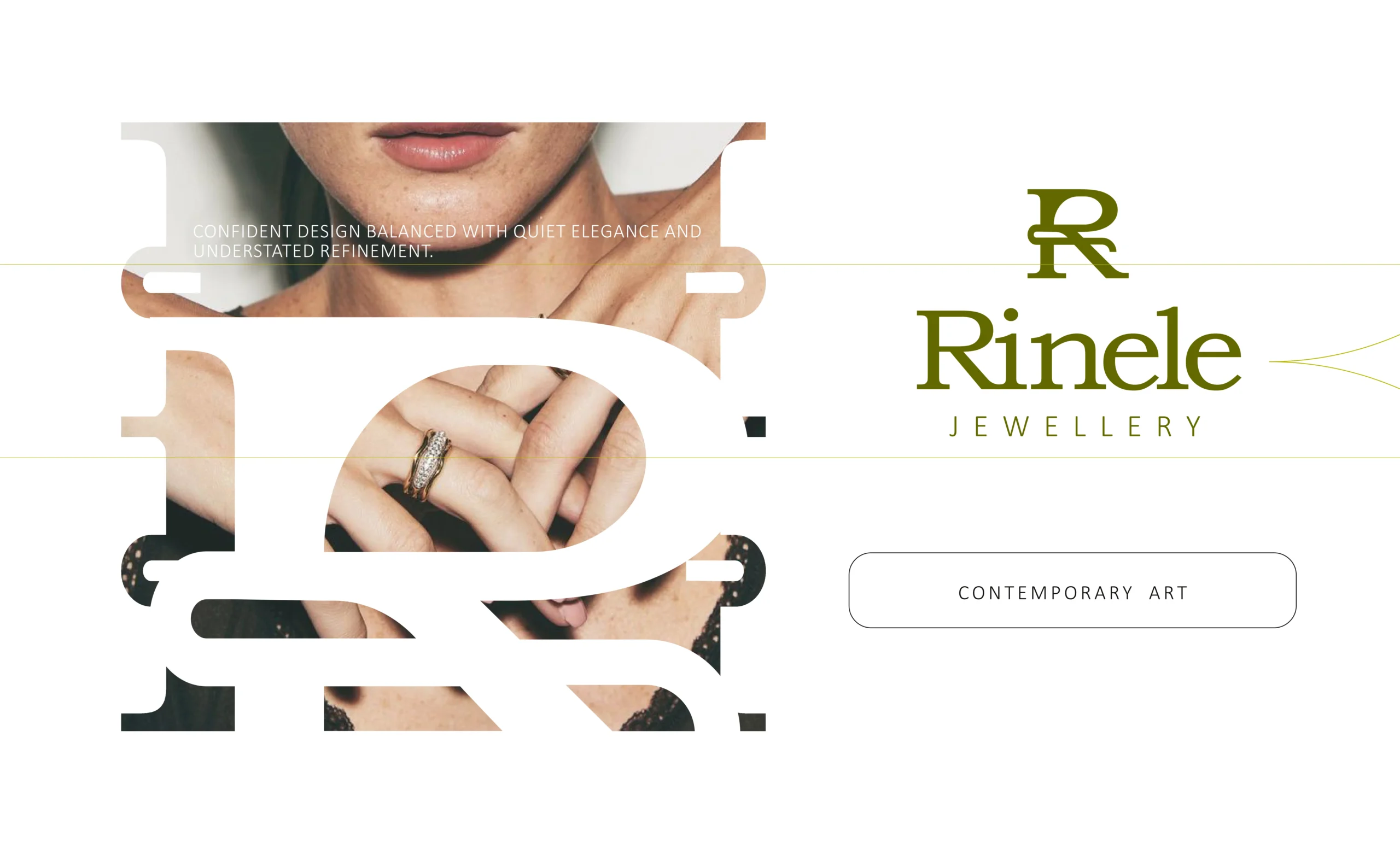
Rinele is a diamond jewellery brand built for people who want luxury to feel modern, refined, and deeply personal.
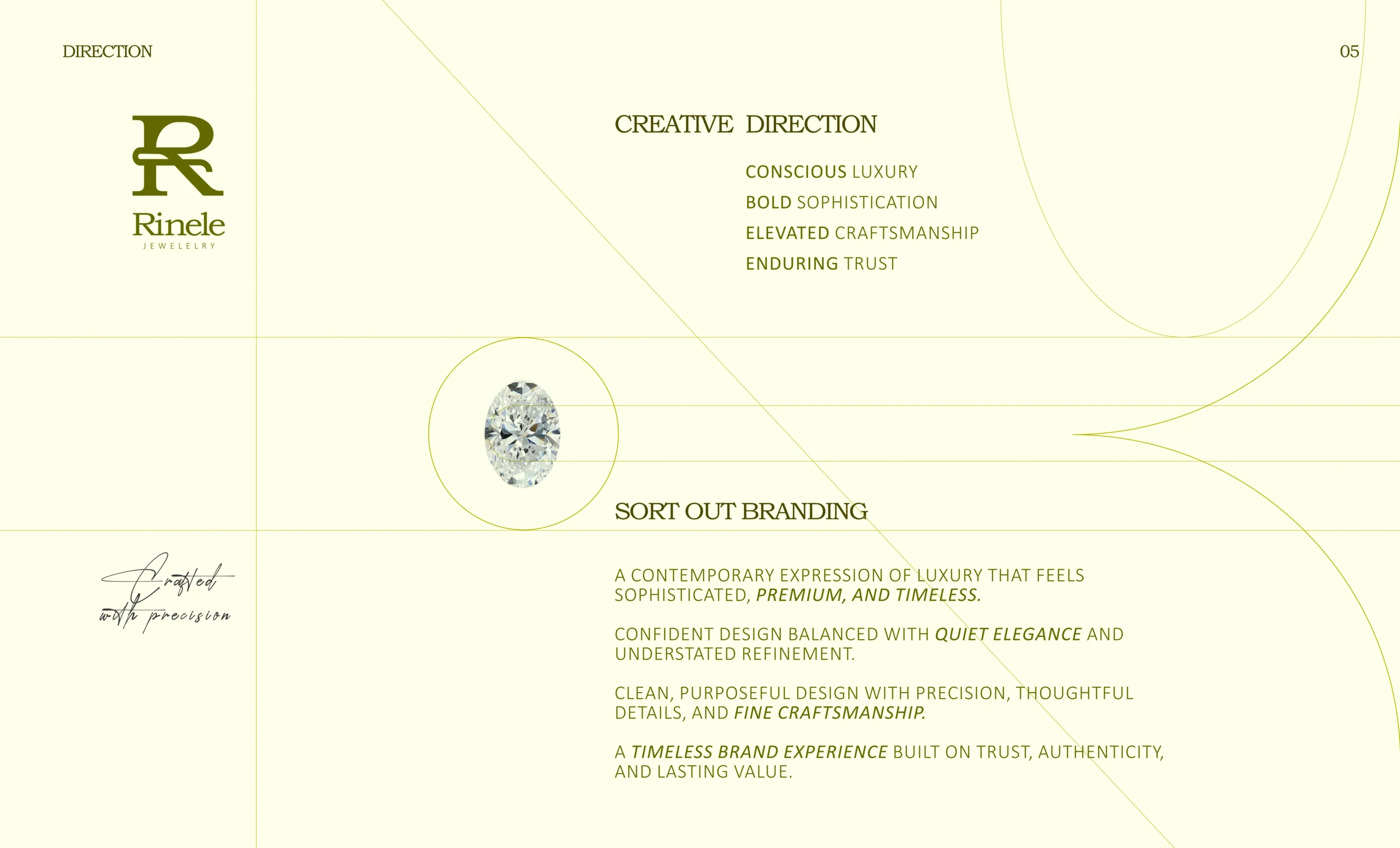
The client wanted the brand to feel “international”, but not copied from western jewellery brands. That was the real challenge. We had to understand what international luxury actually means: restraint, confidence, detailing, trust, and a feeling that stays even before someone sees the jewellery closely.
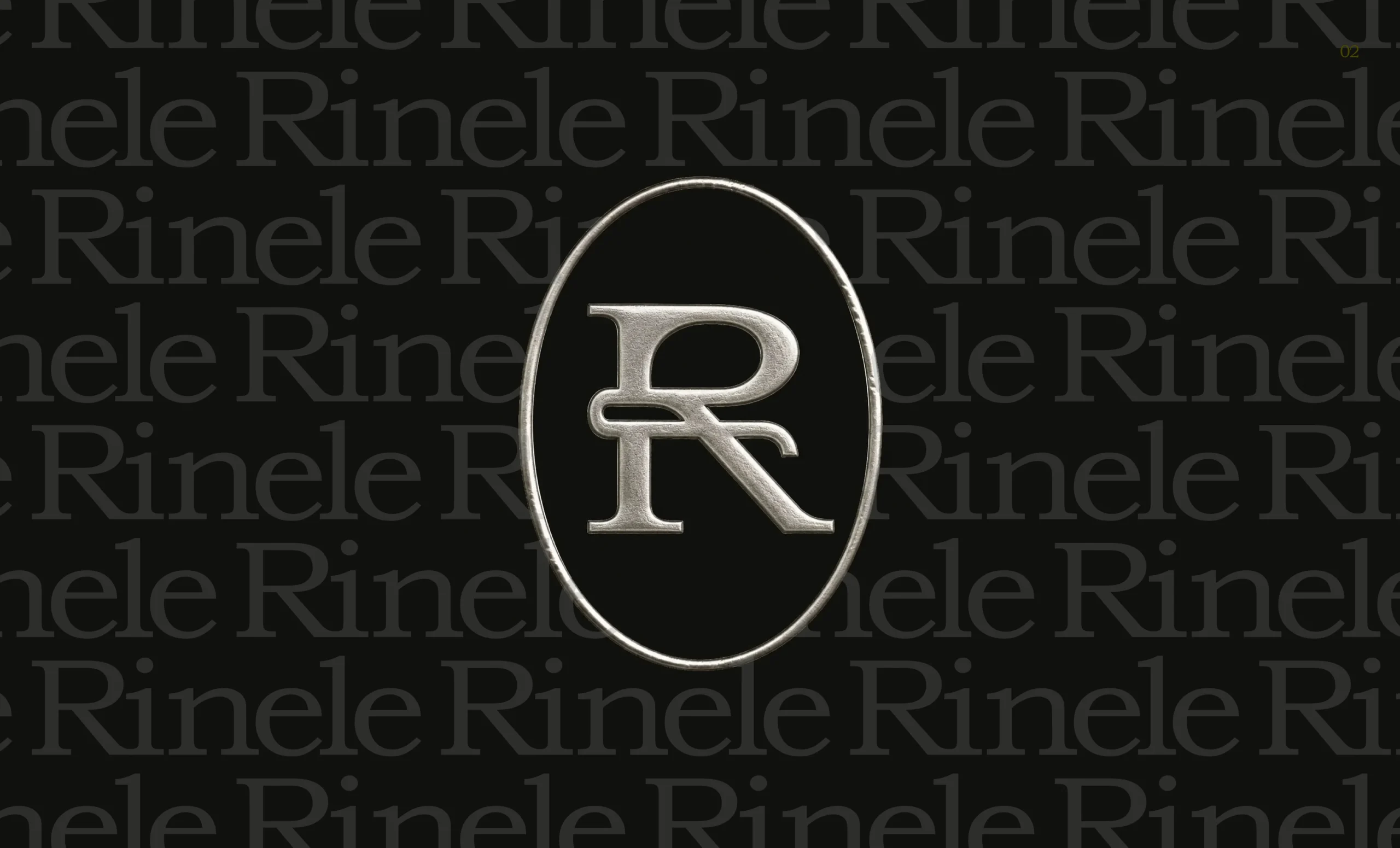
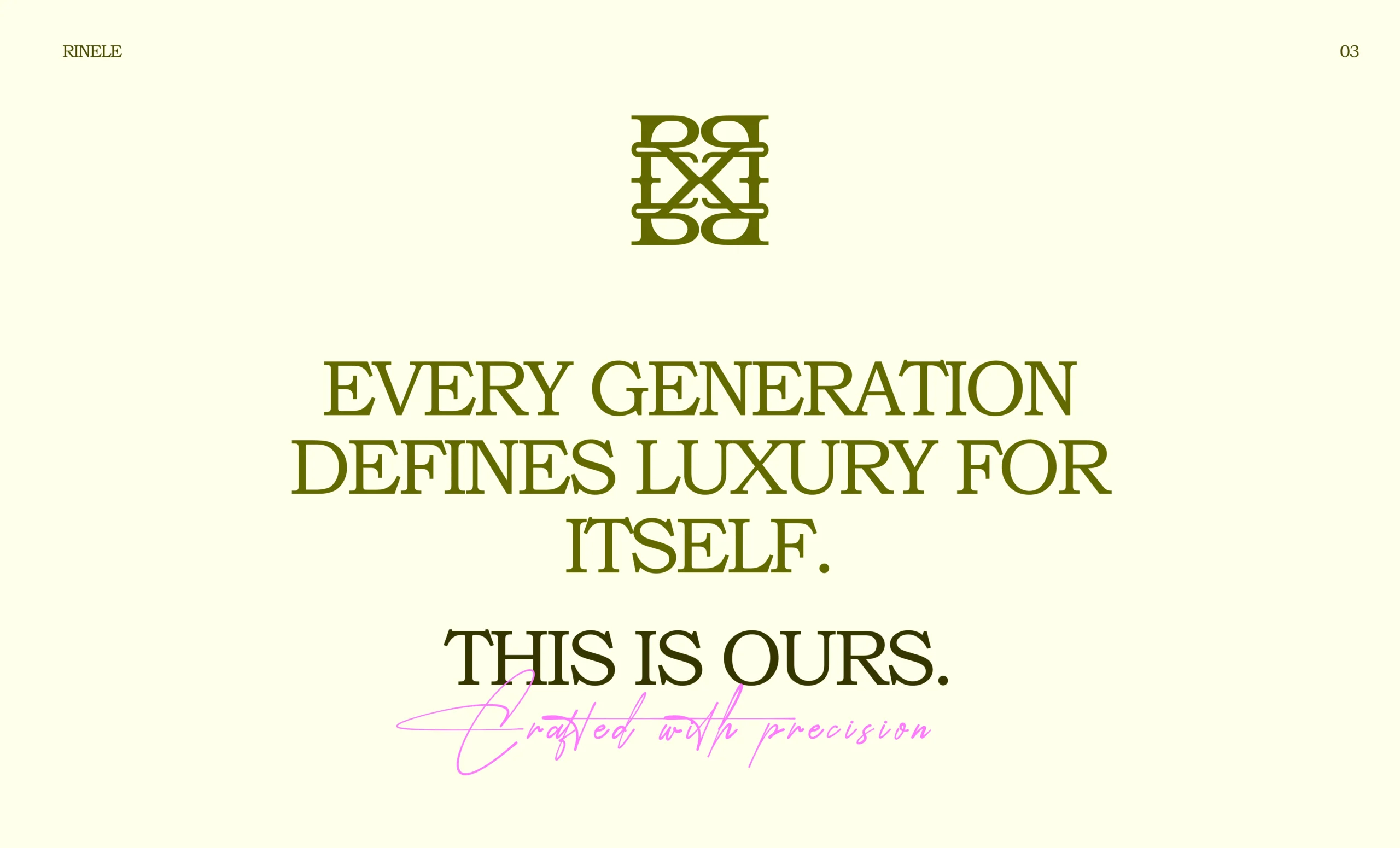
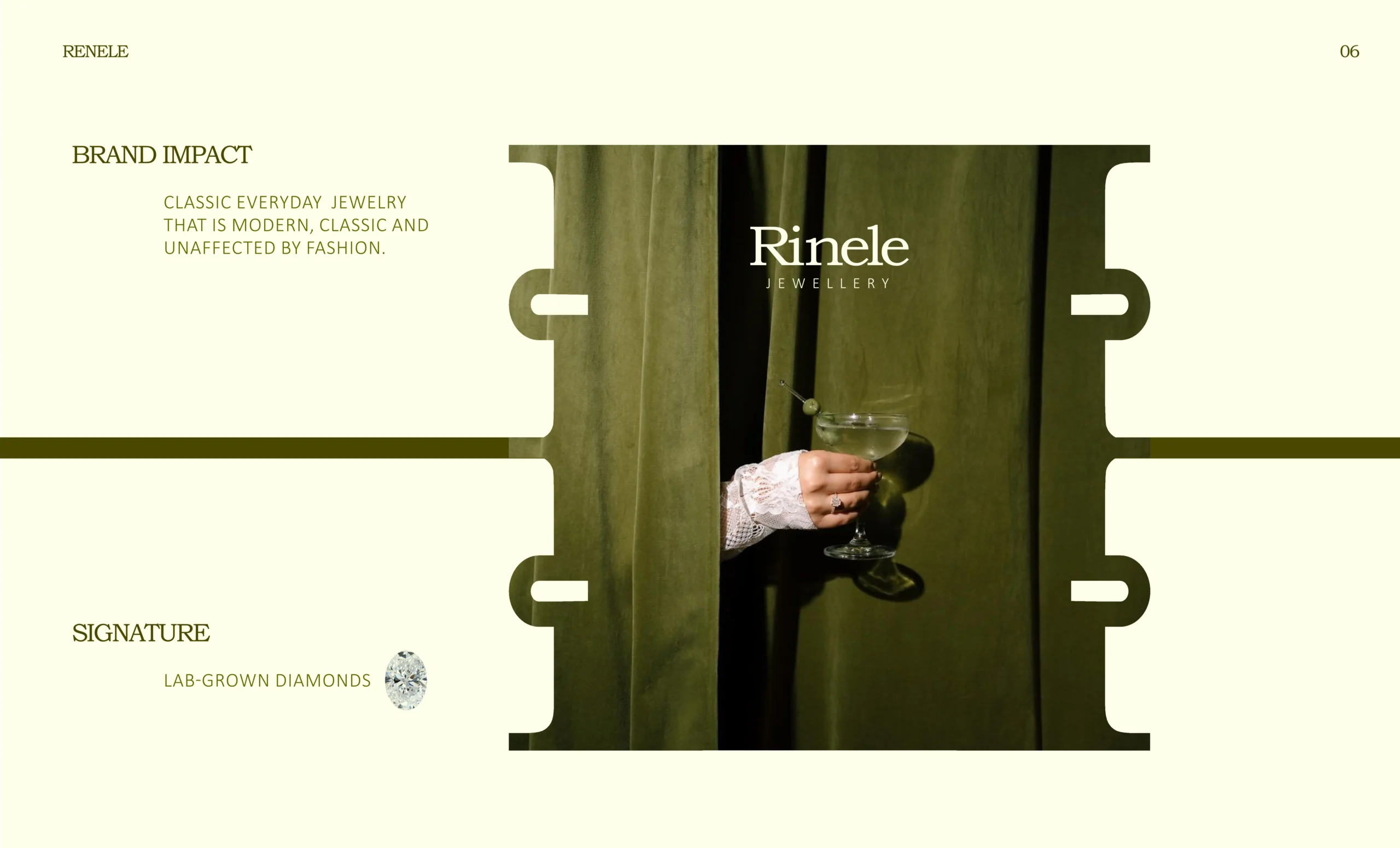
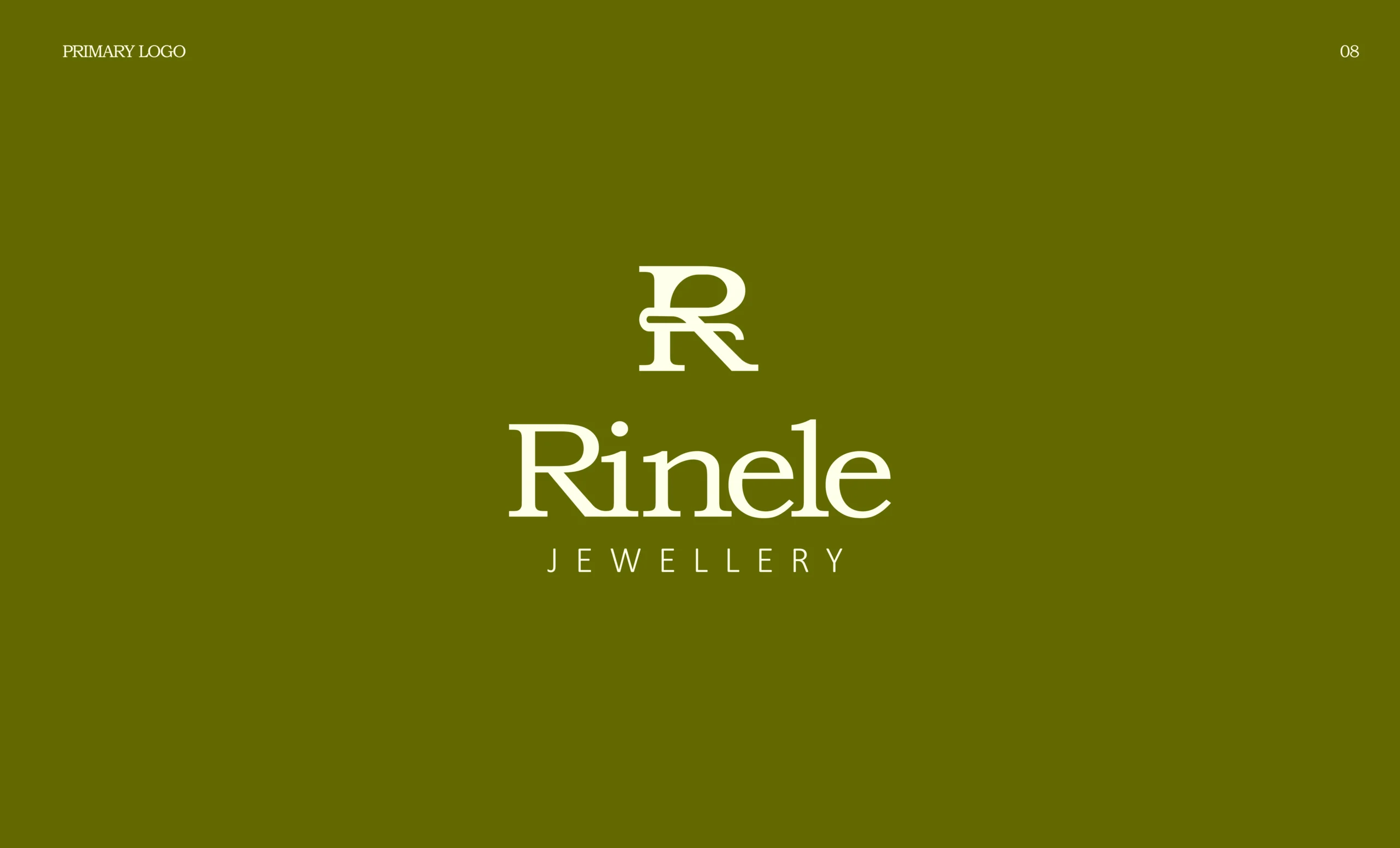
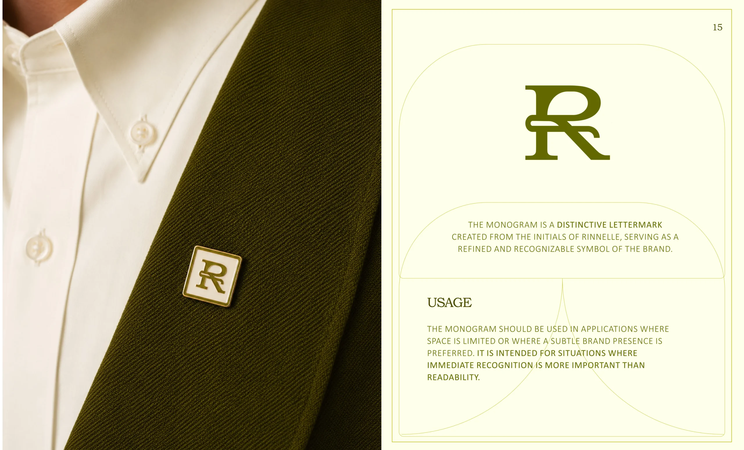
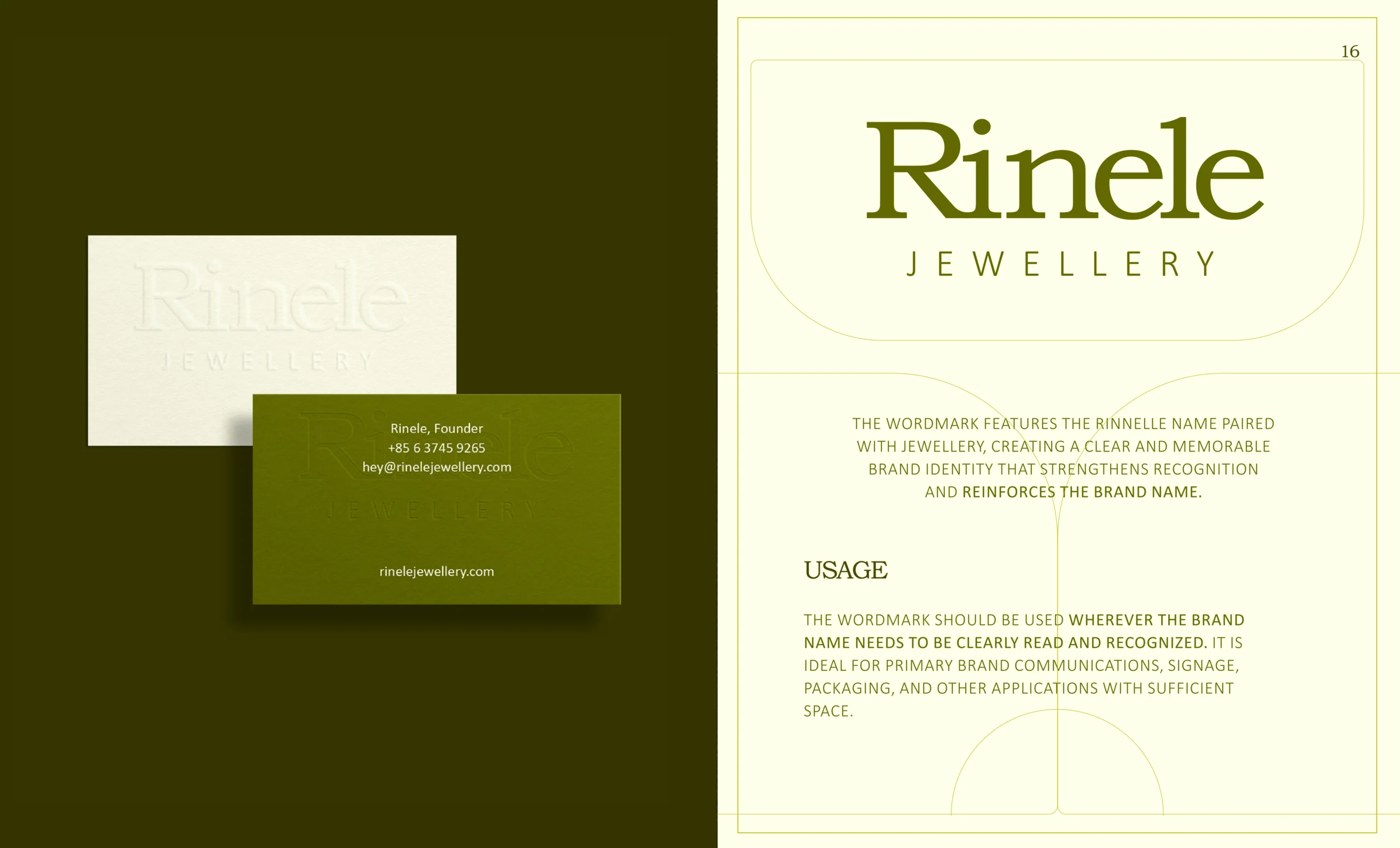
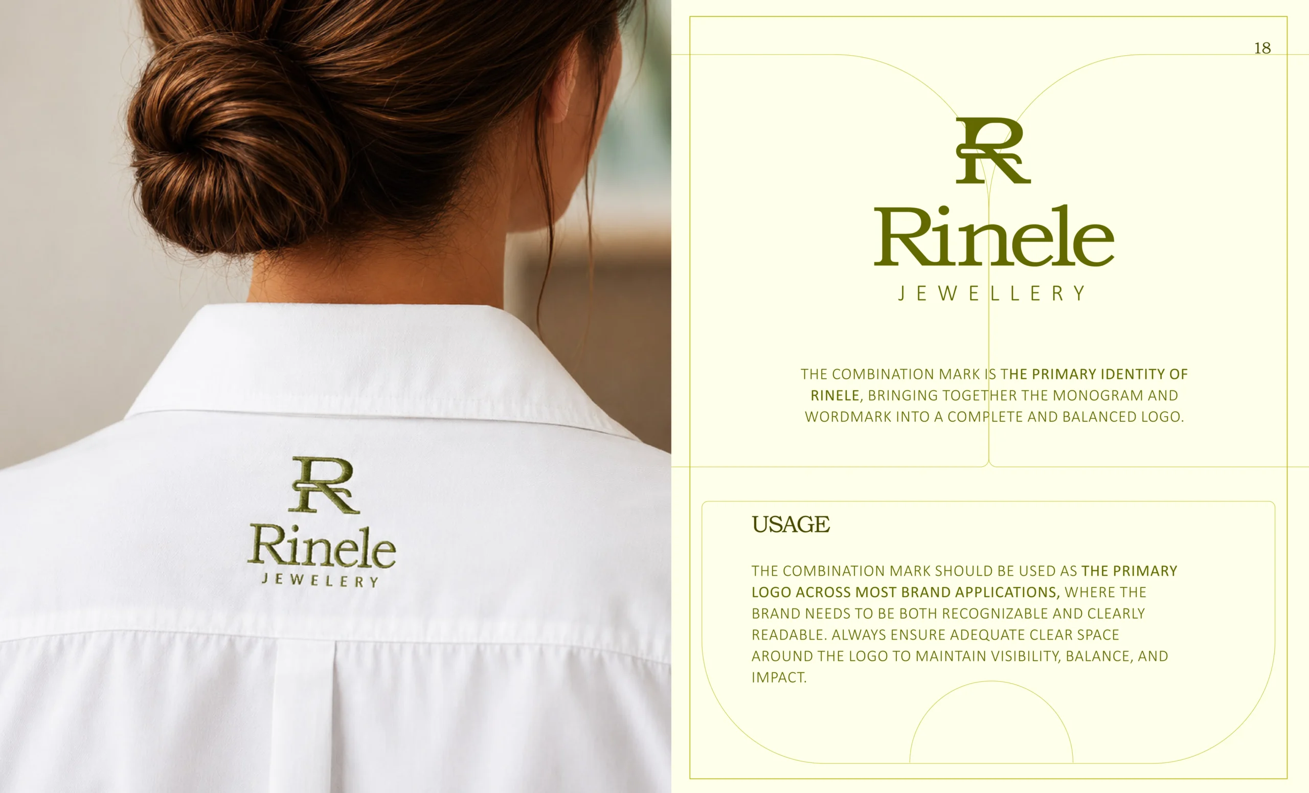
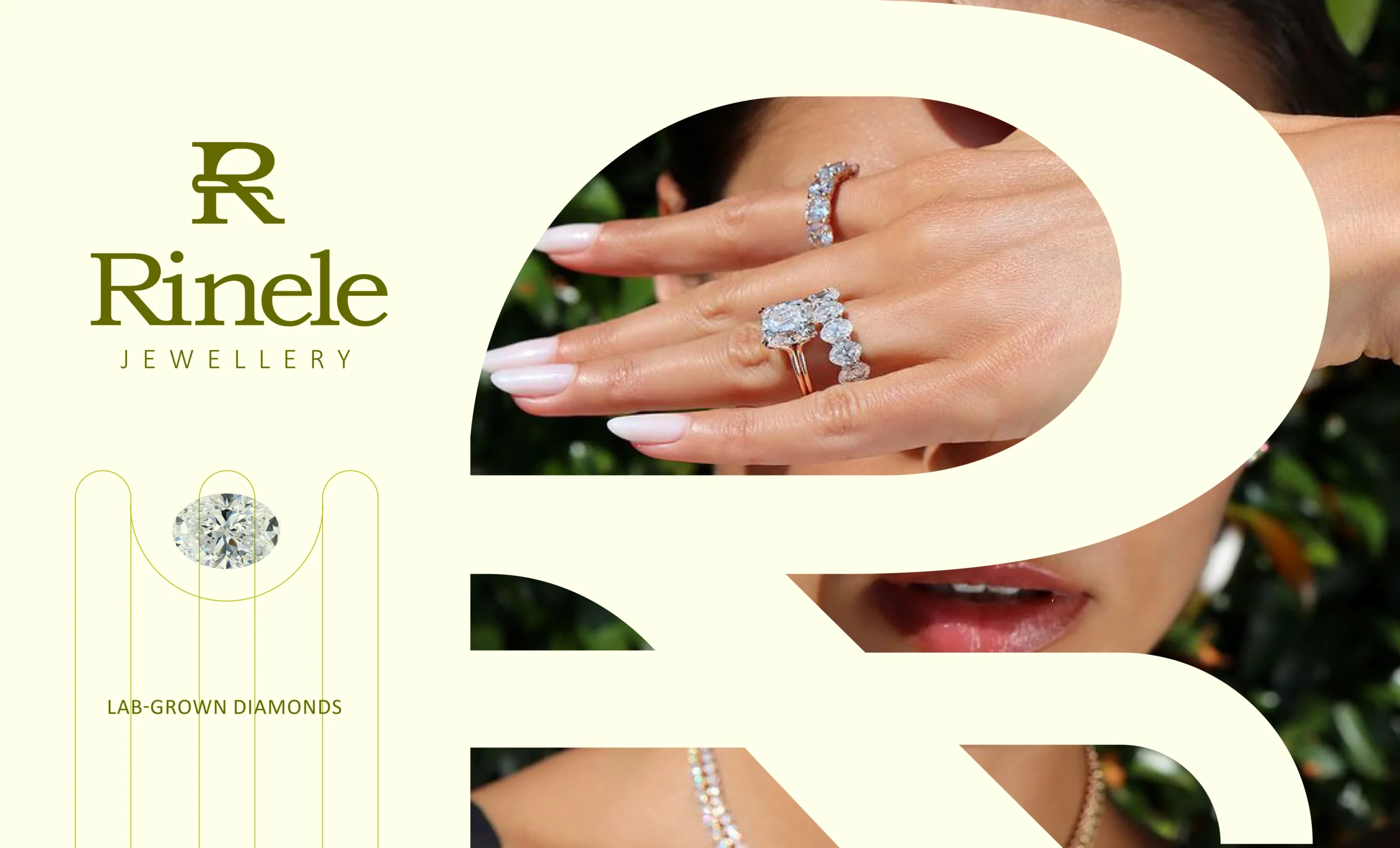
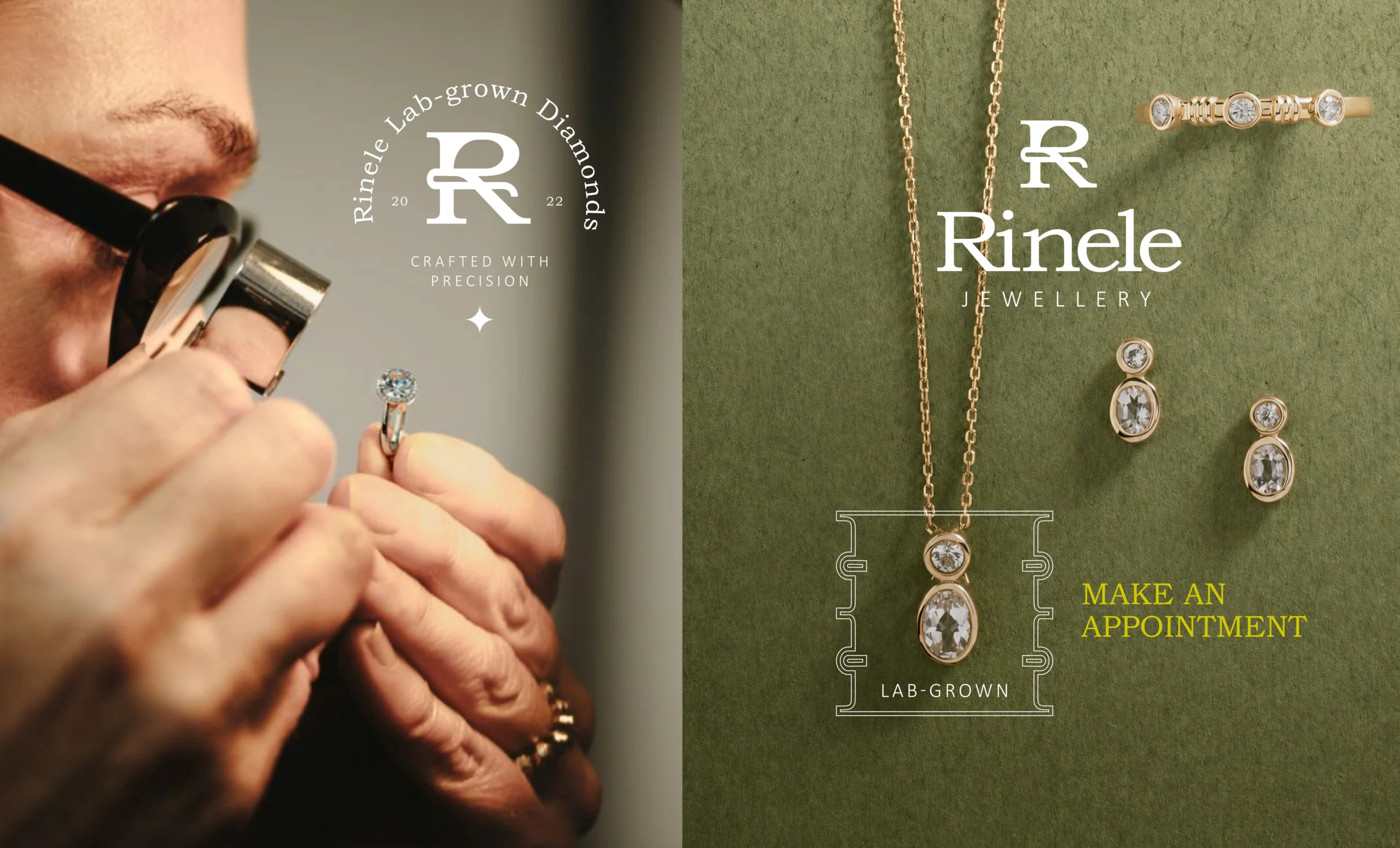
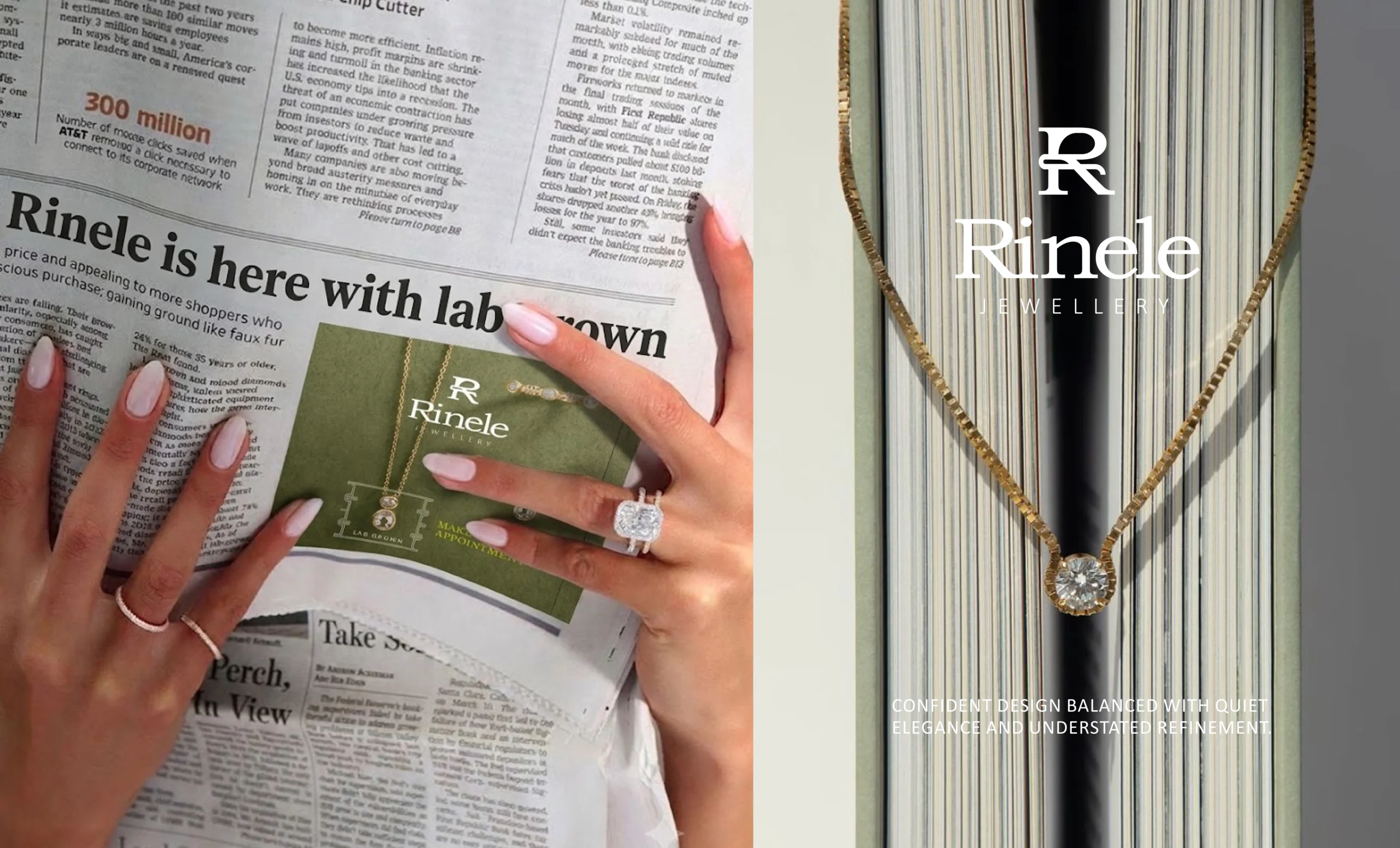
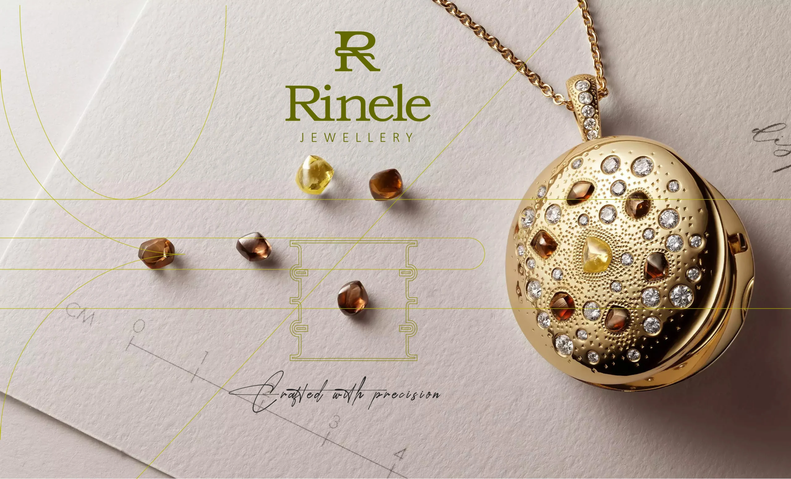
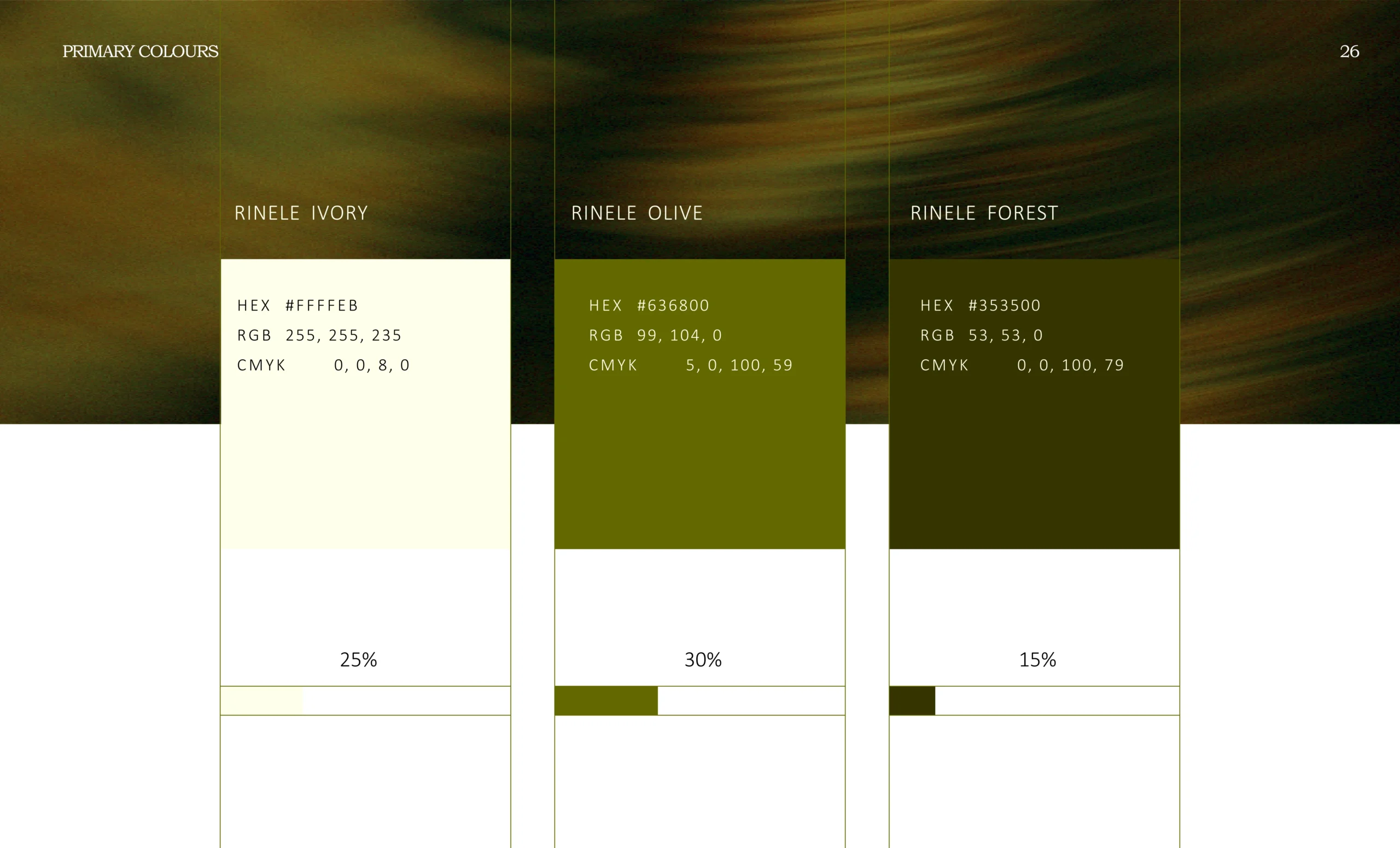
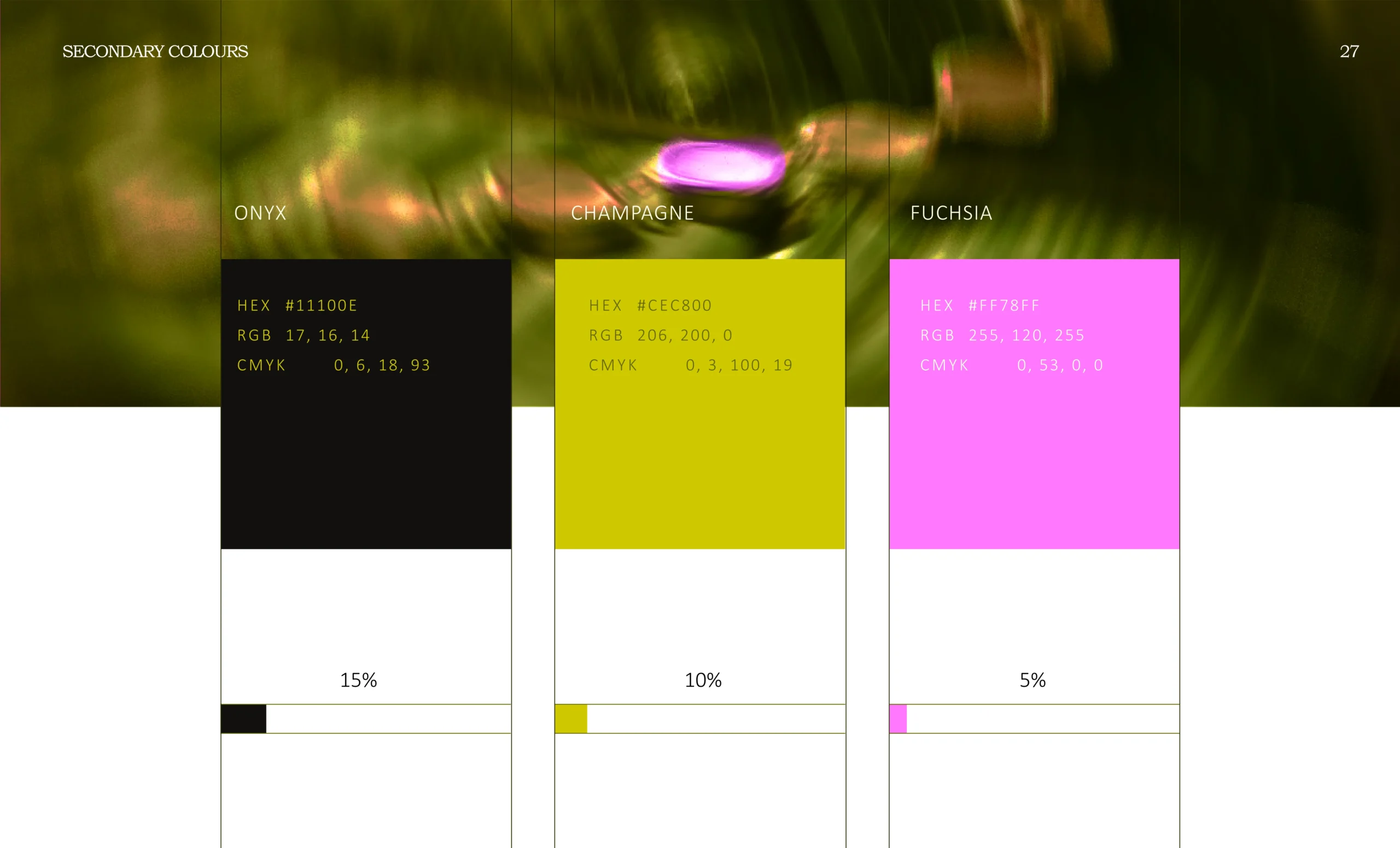
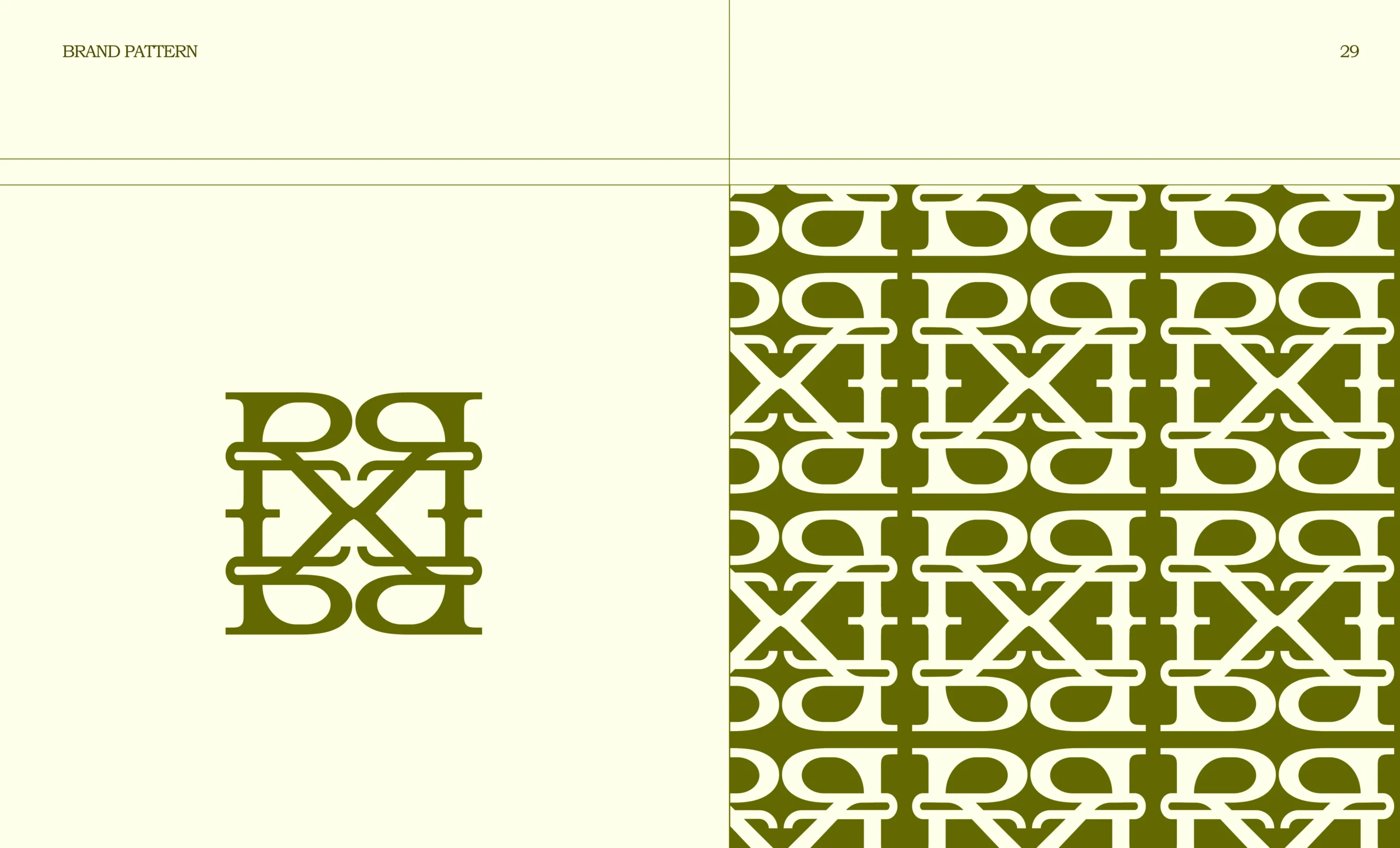
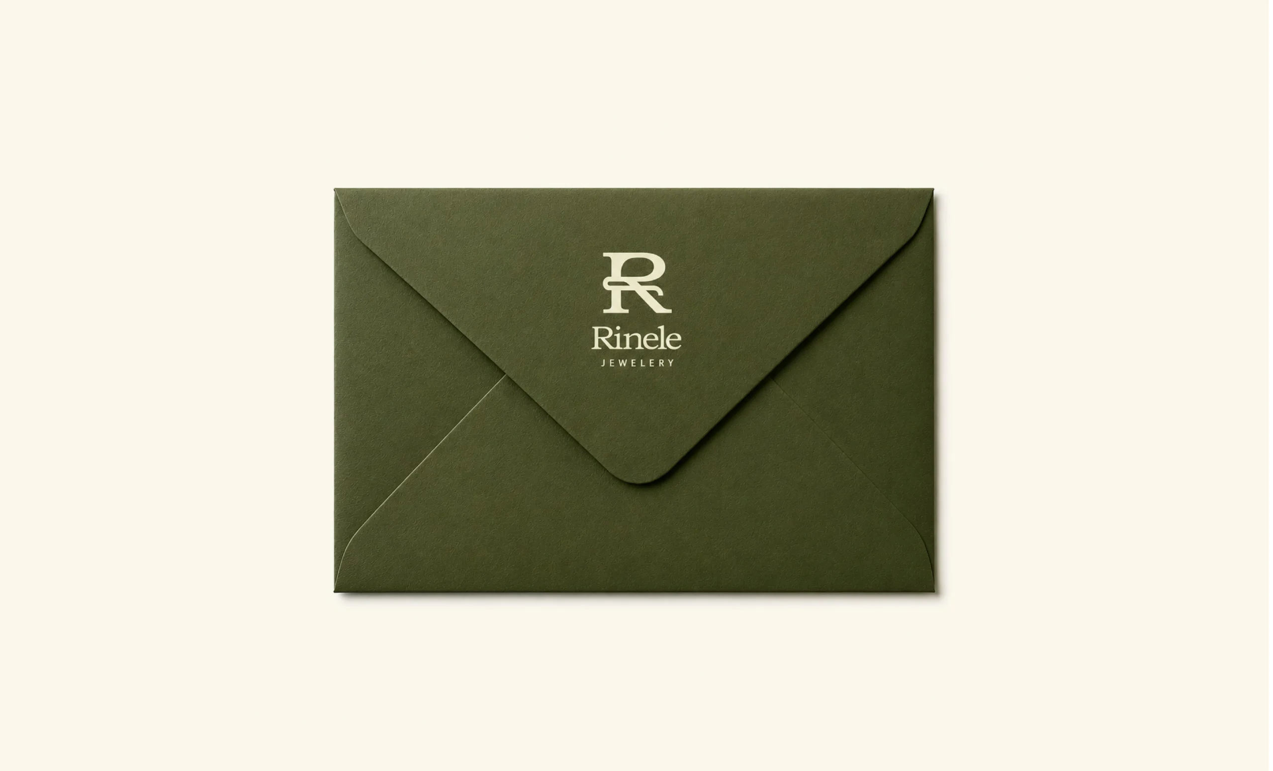
So we built Rinele with quiet elegance, a refined monogram, premium olive-ivory tones, and a visual system that feels timeless, western-inspired, and still ownable for an Indian jewellery brand.
The client wanted the brand to feel global, but “international” is not a design style. We had to decode the feeling behind it.
Most jewellery brands either look too traditional or too generic. Rinele needed a visual world that felt distinct, premium, and memorable.
The brand had to feel rich without looking loud. The challenge was to create impact through restraint, not decoration.
For diamond jewellery, people need confidence before desire. The identity had to signal authenticity, craftsmanship, and long-term value.
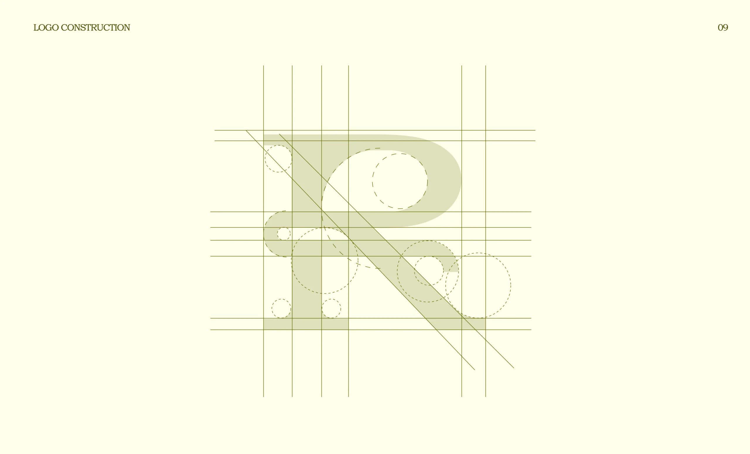
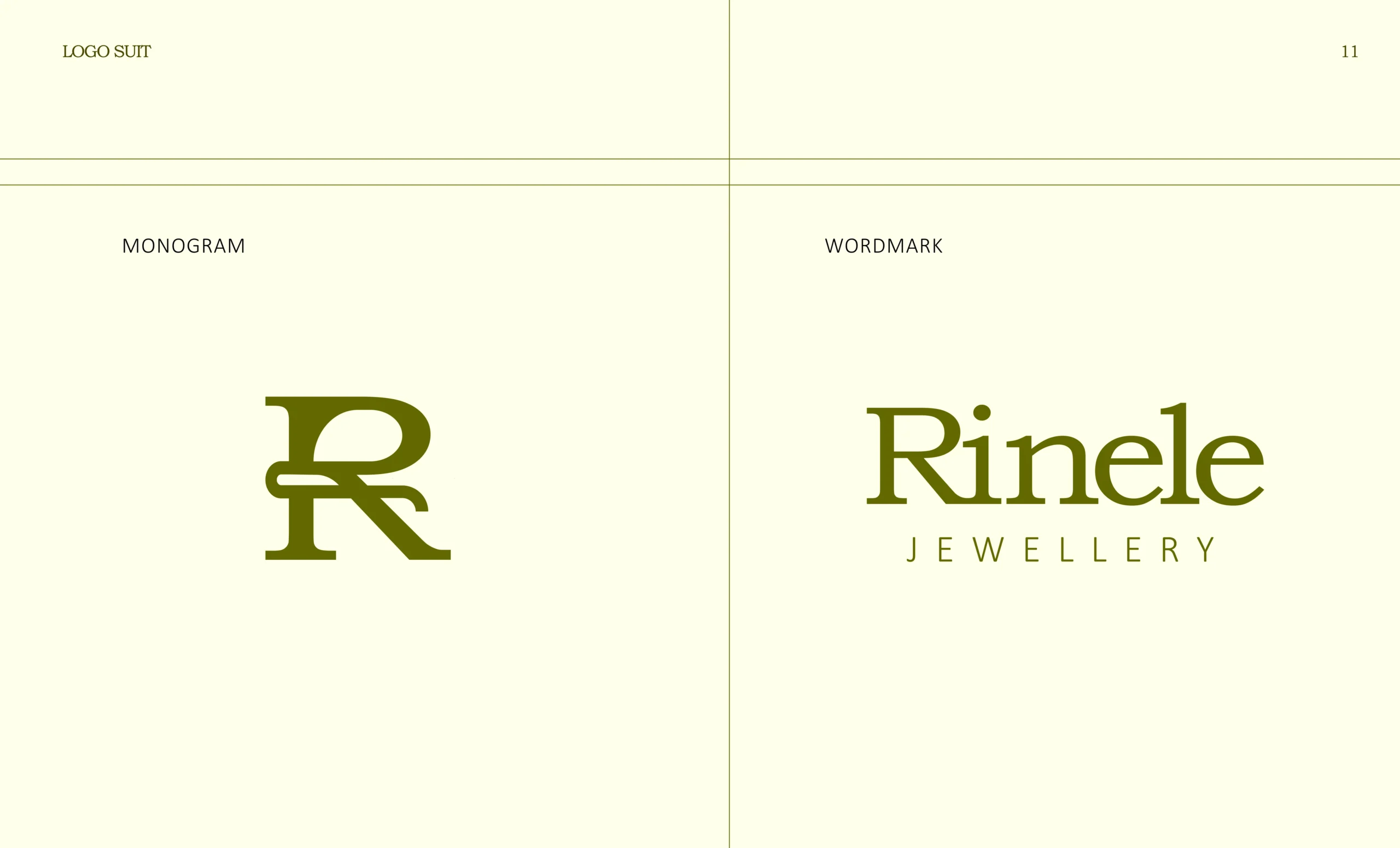
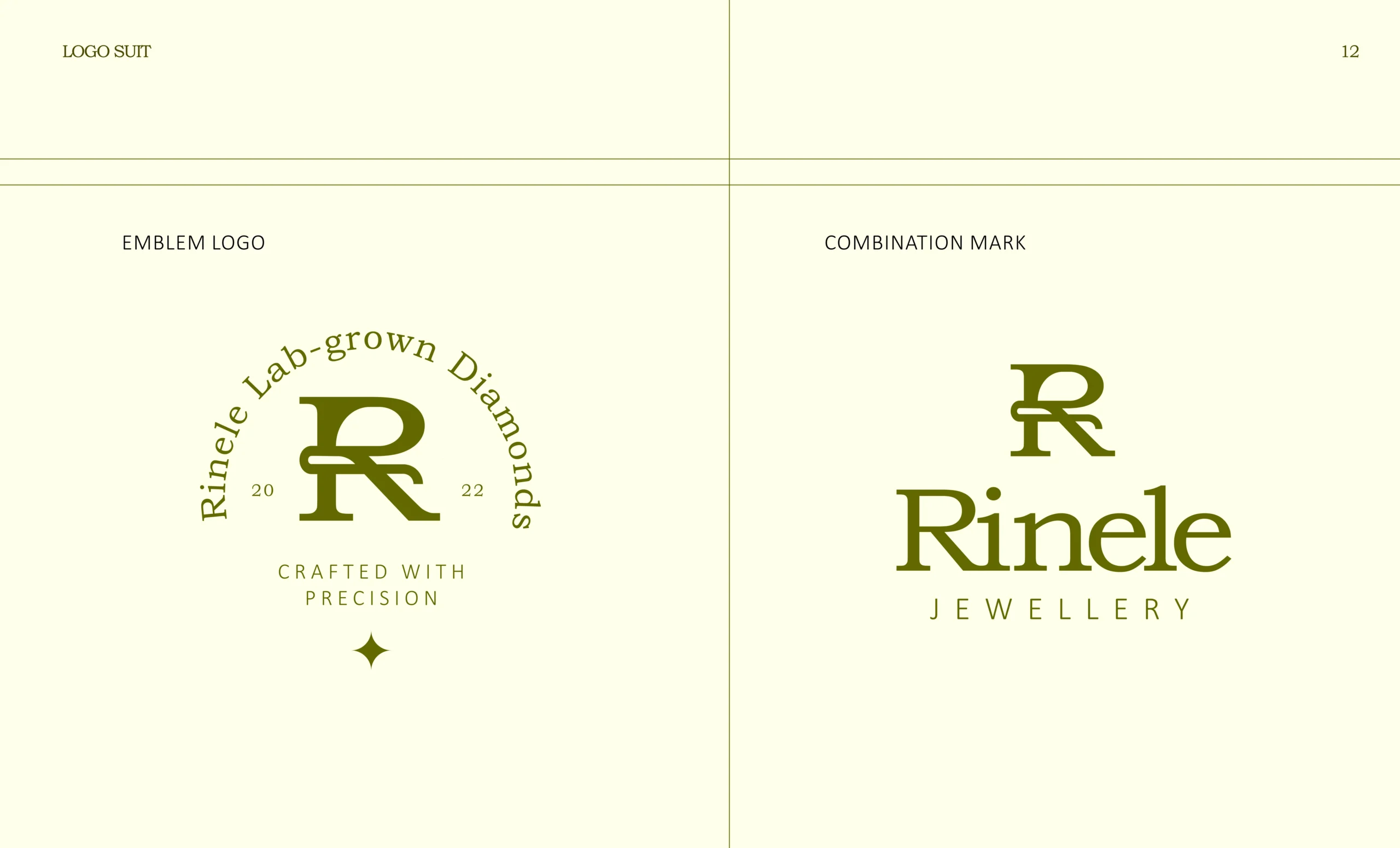
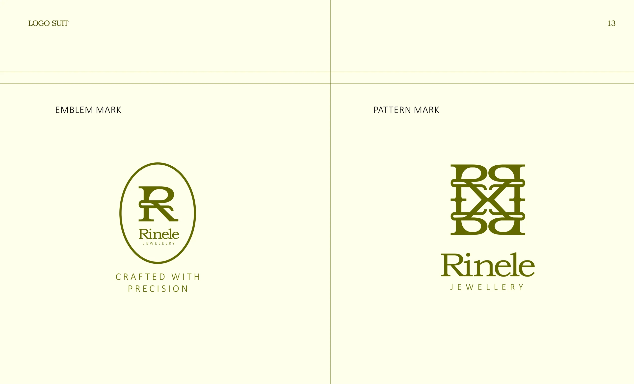
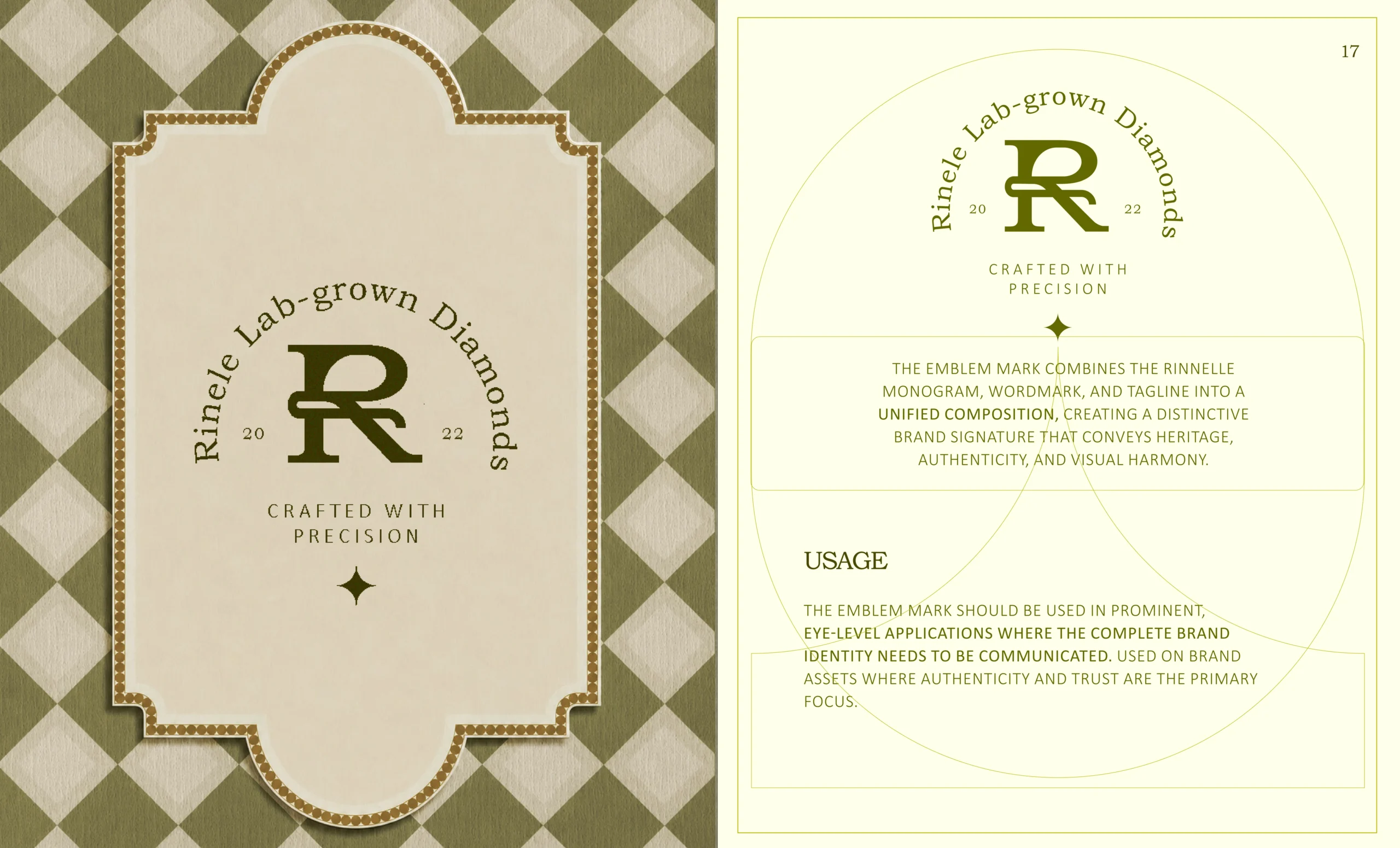
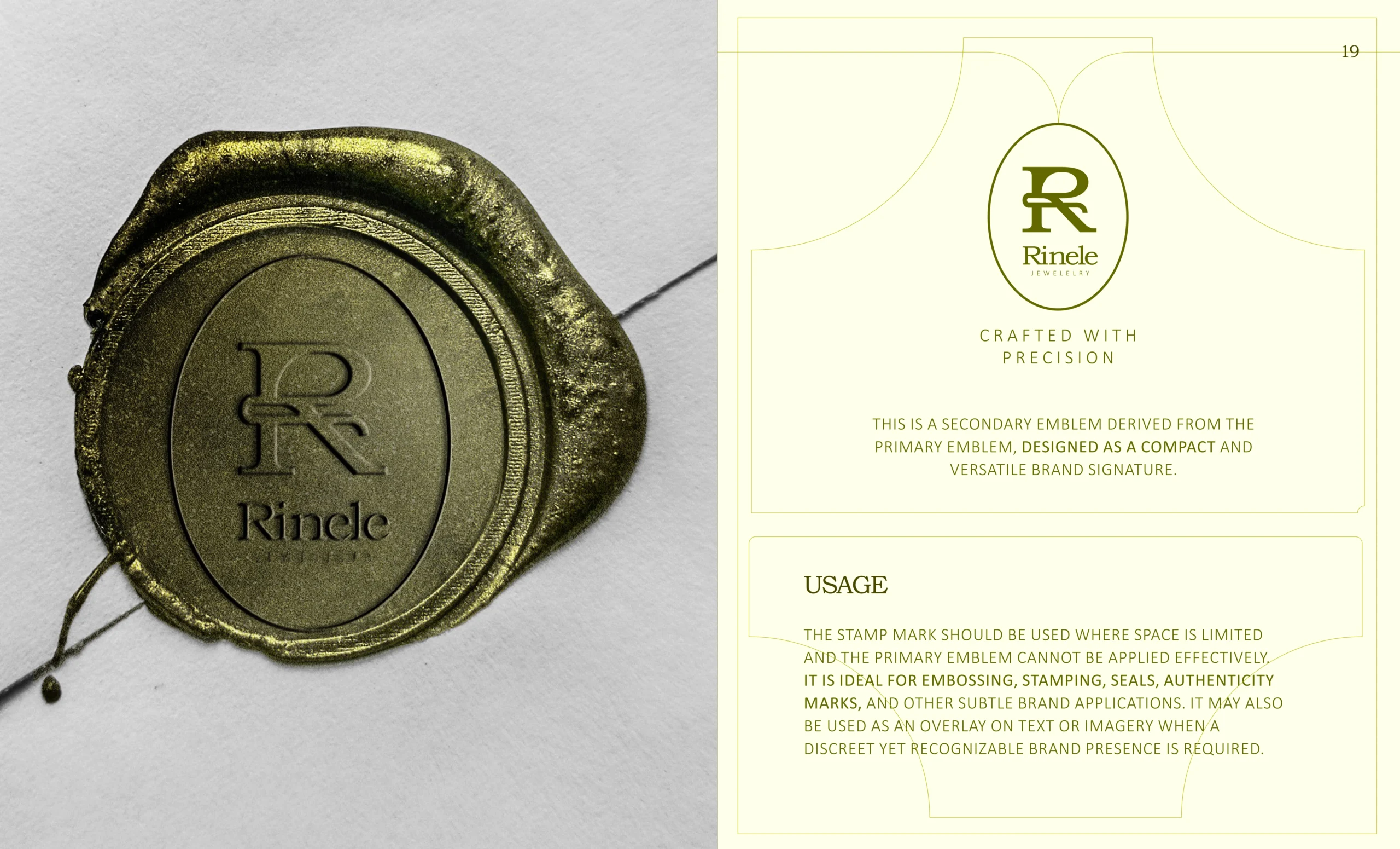
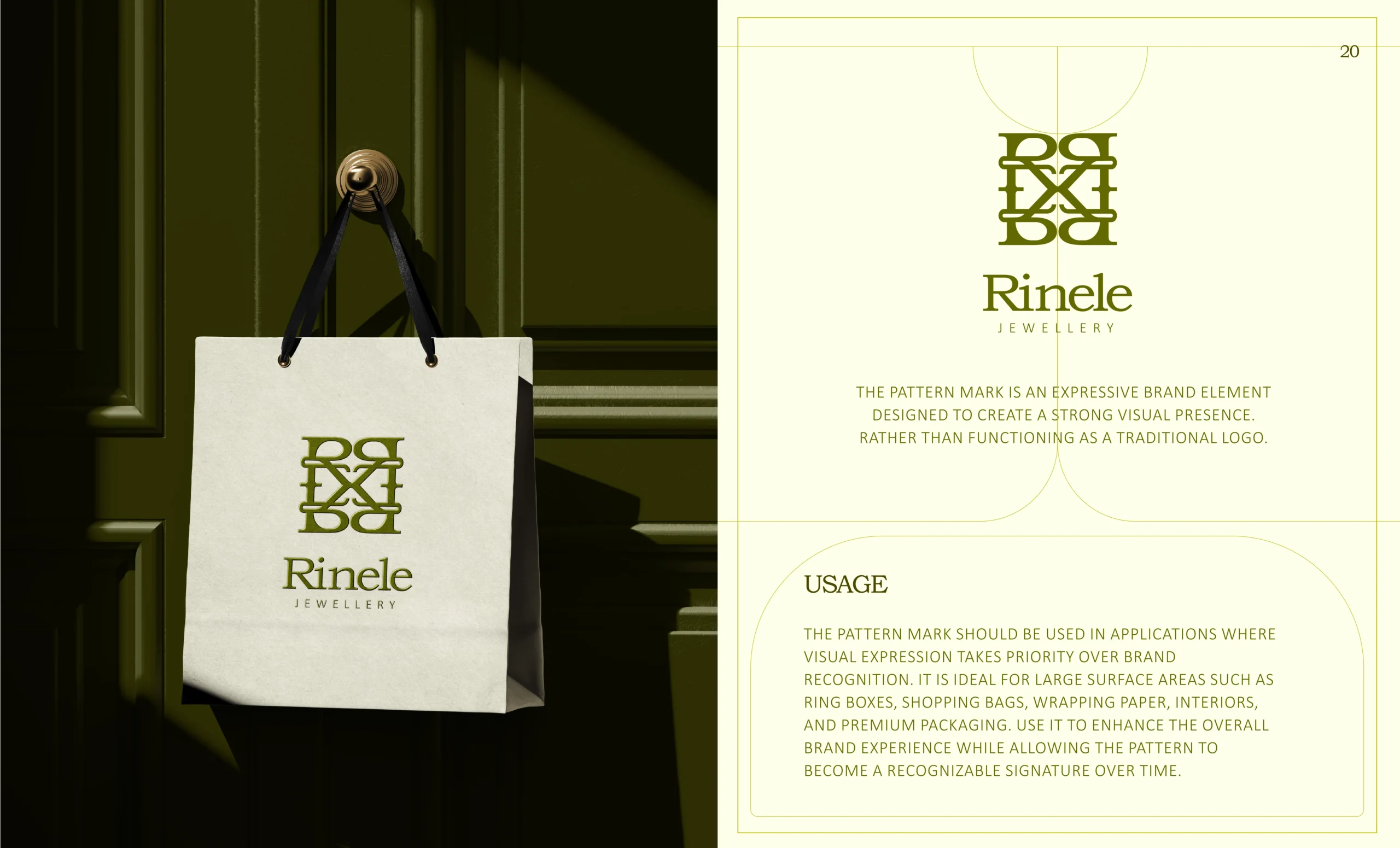
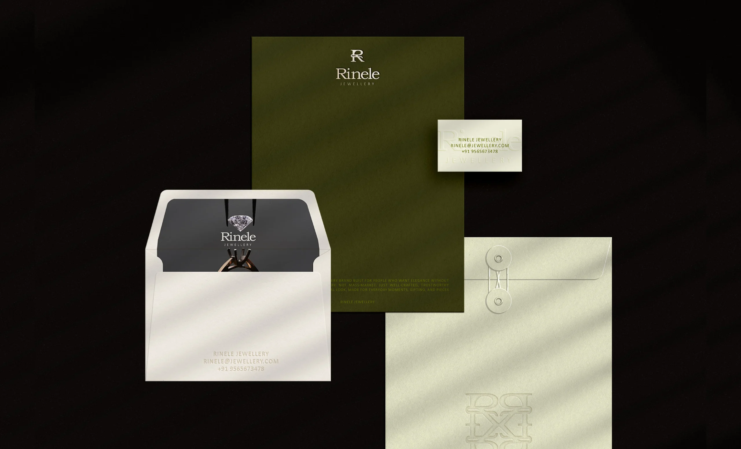
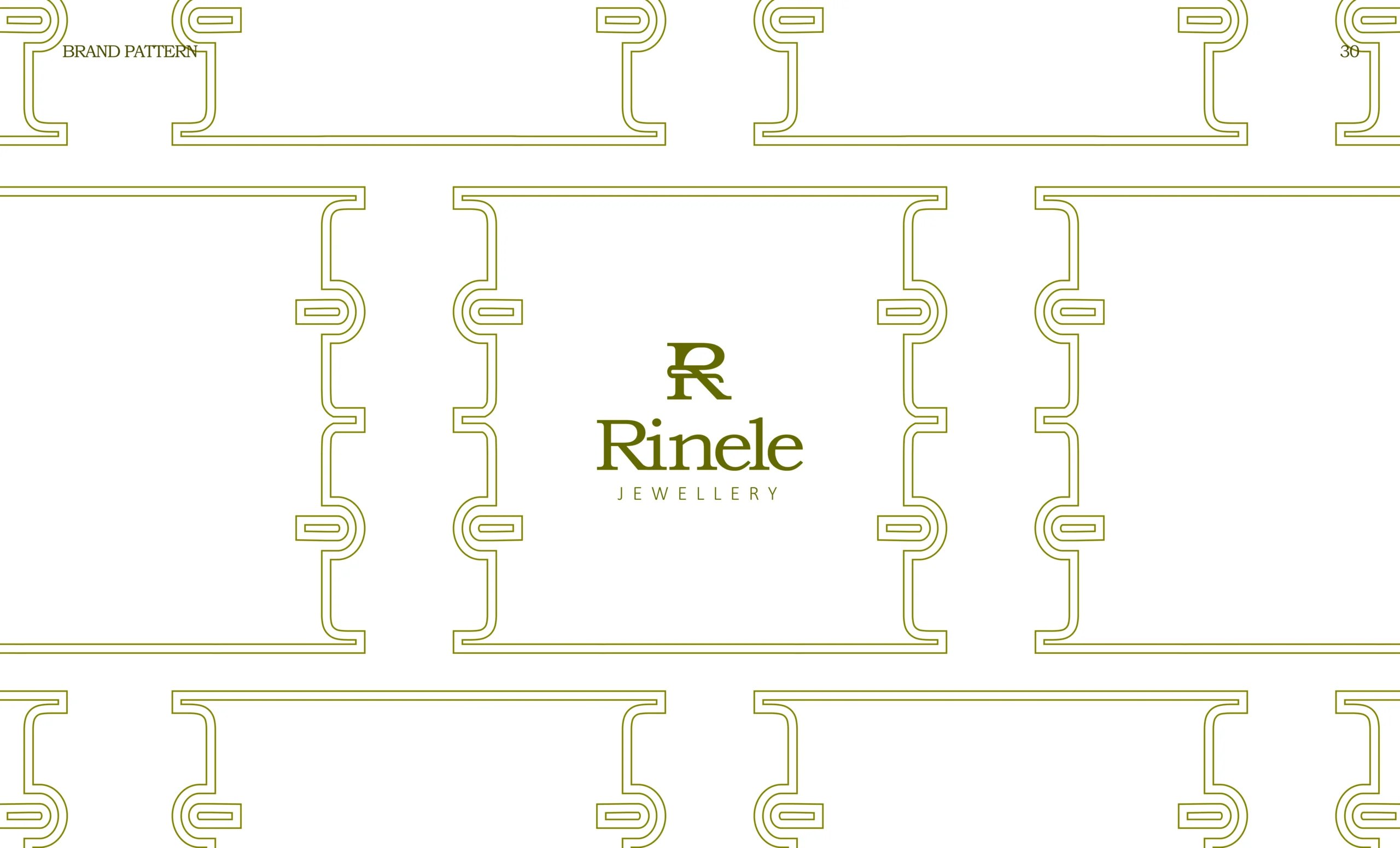
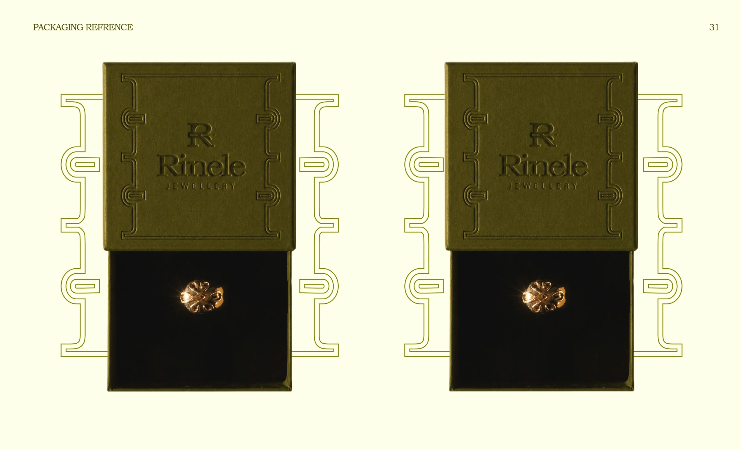
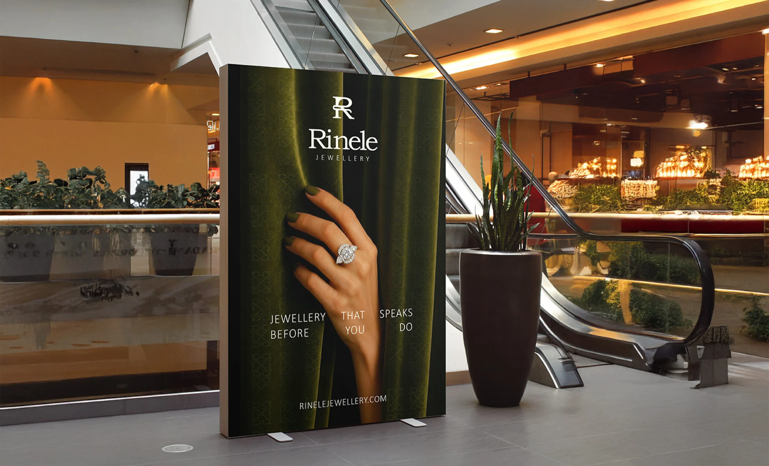
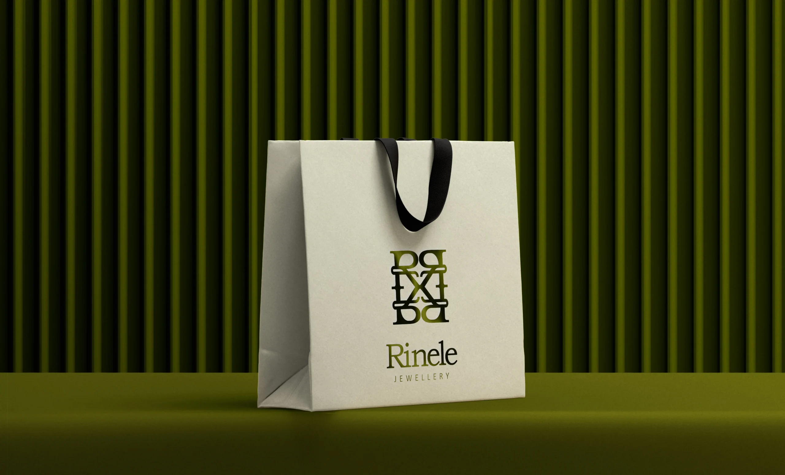
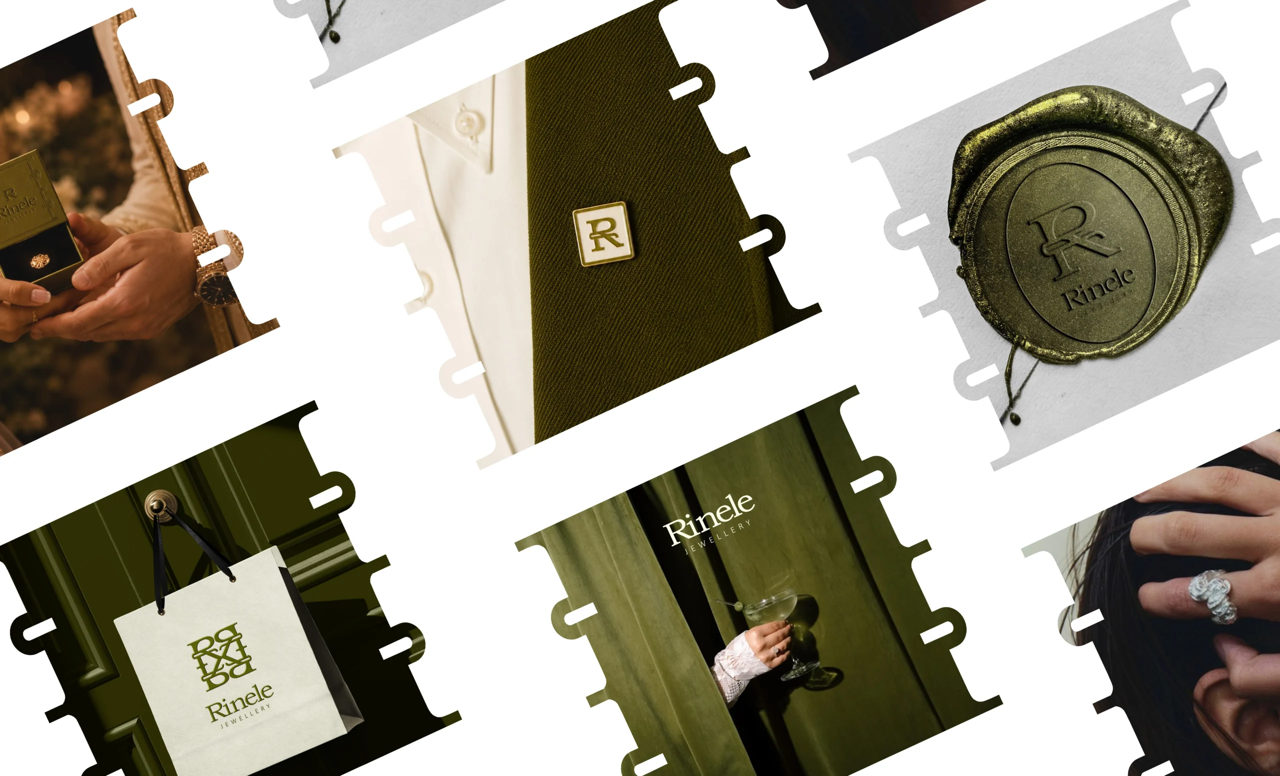
Rinele needed more than one logo. It needed a full suite for packaging, signage, stamps, tags, social, and premium retail moments.

Strategy
We decoded “international” into restraint, trust, precision, and a luxury feeling clients could instantly understand.
Identity
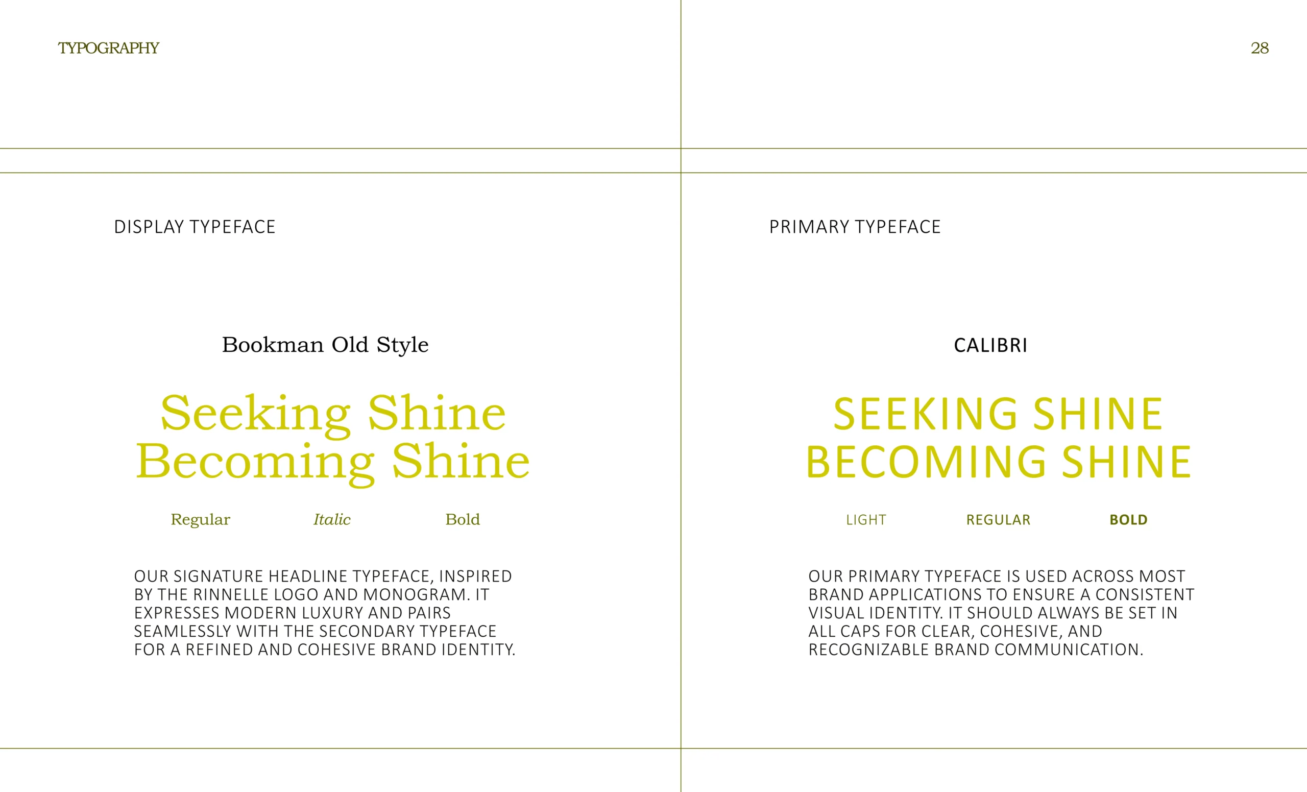
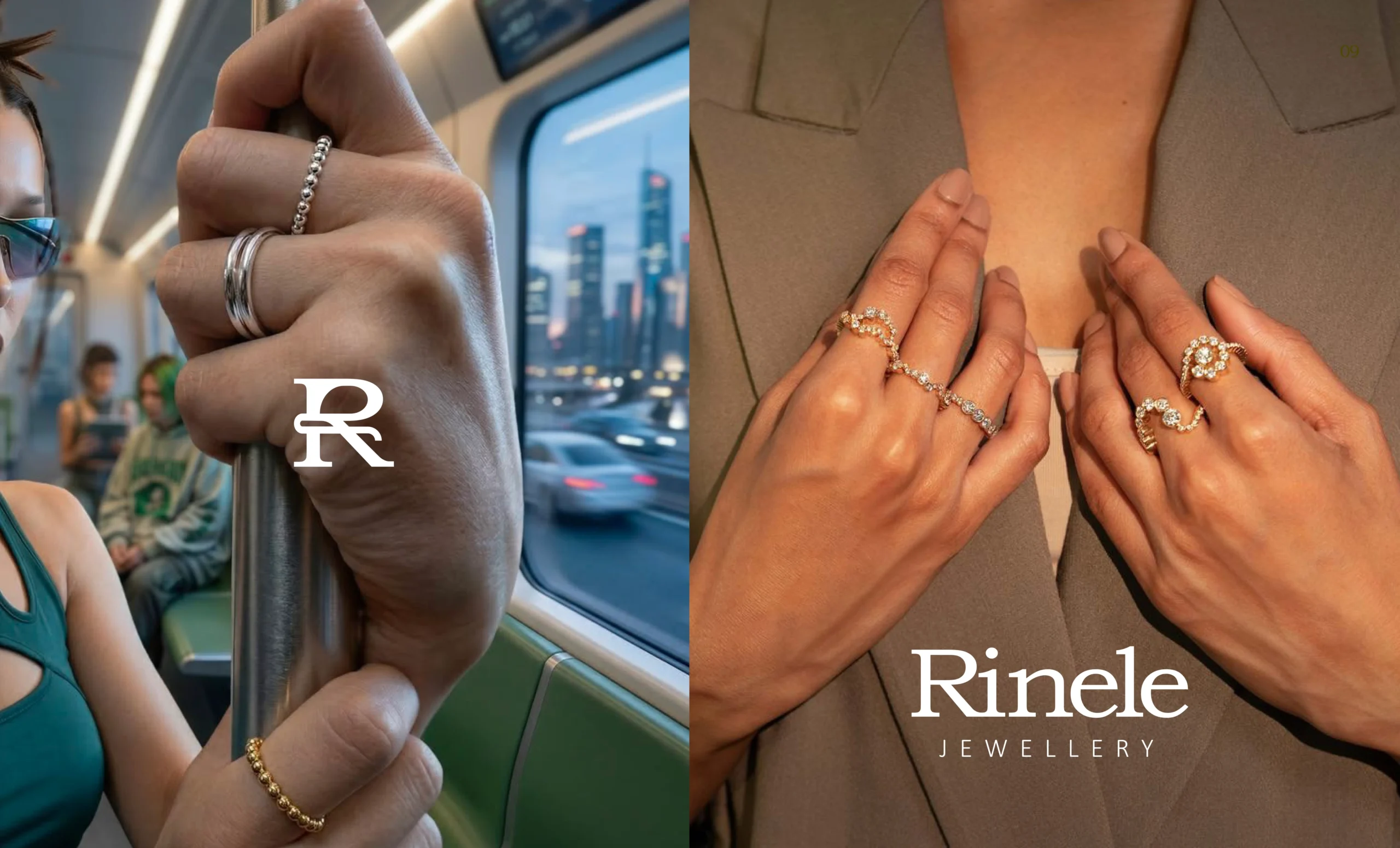
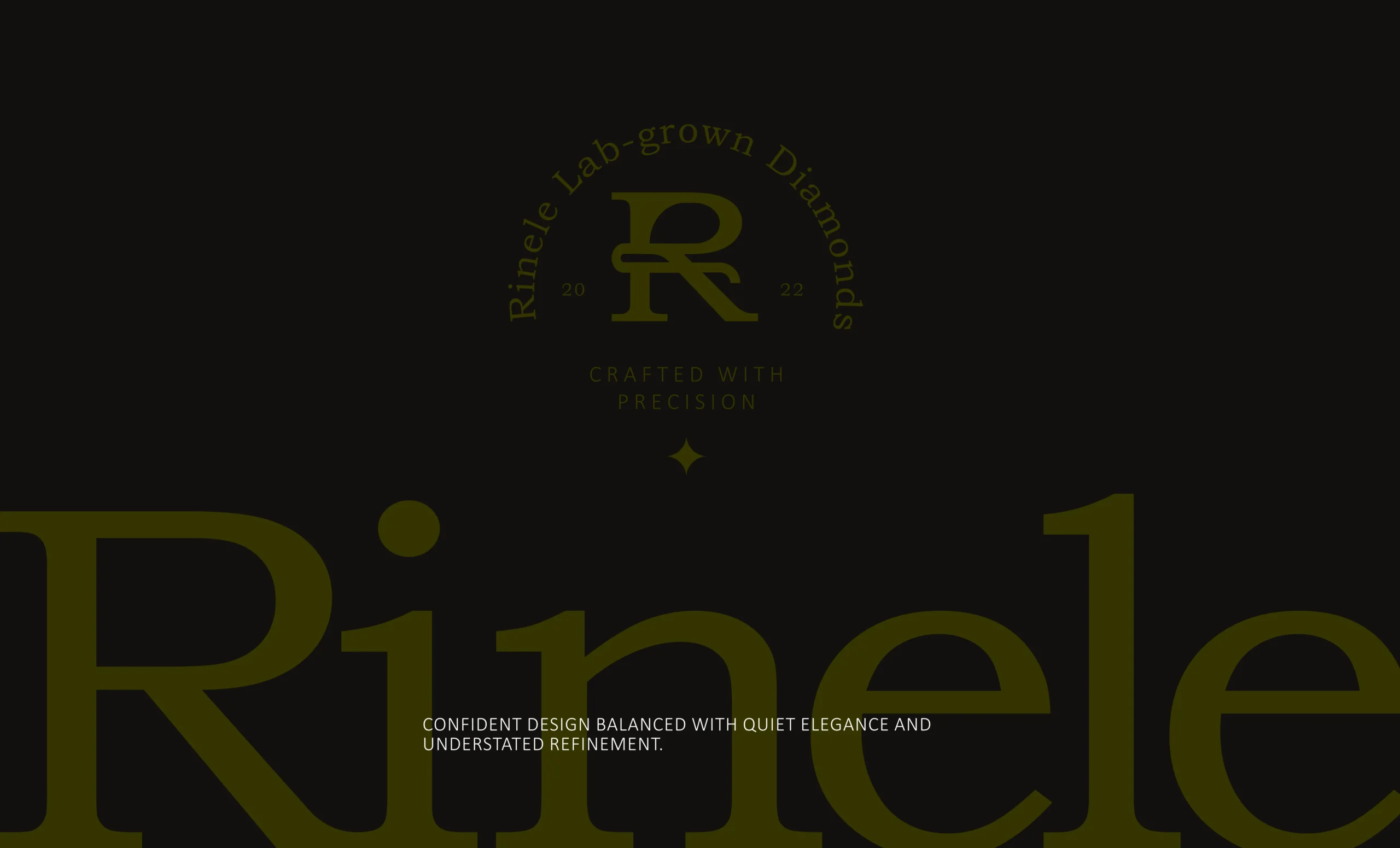
Refined typography, olive tones, and monogram details made Rinele feel premium without looking overdesigned.
System
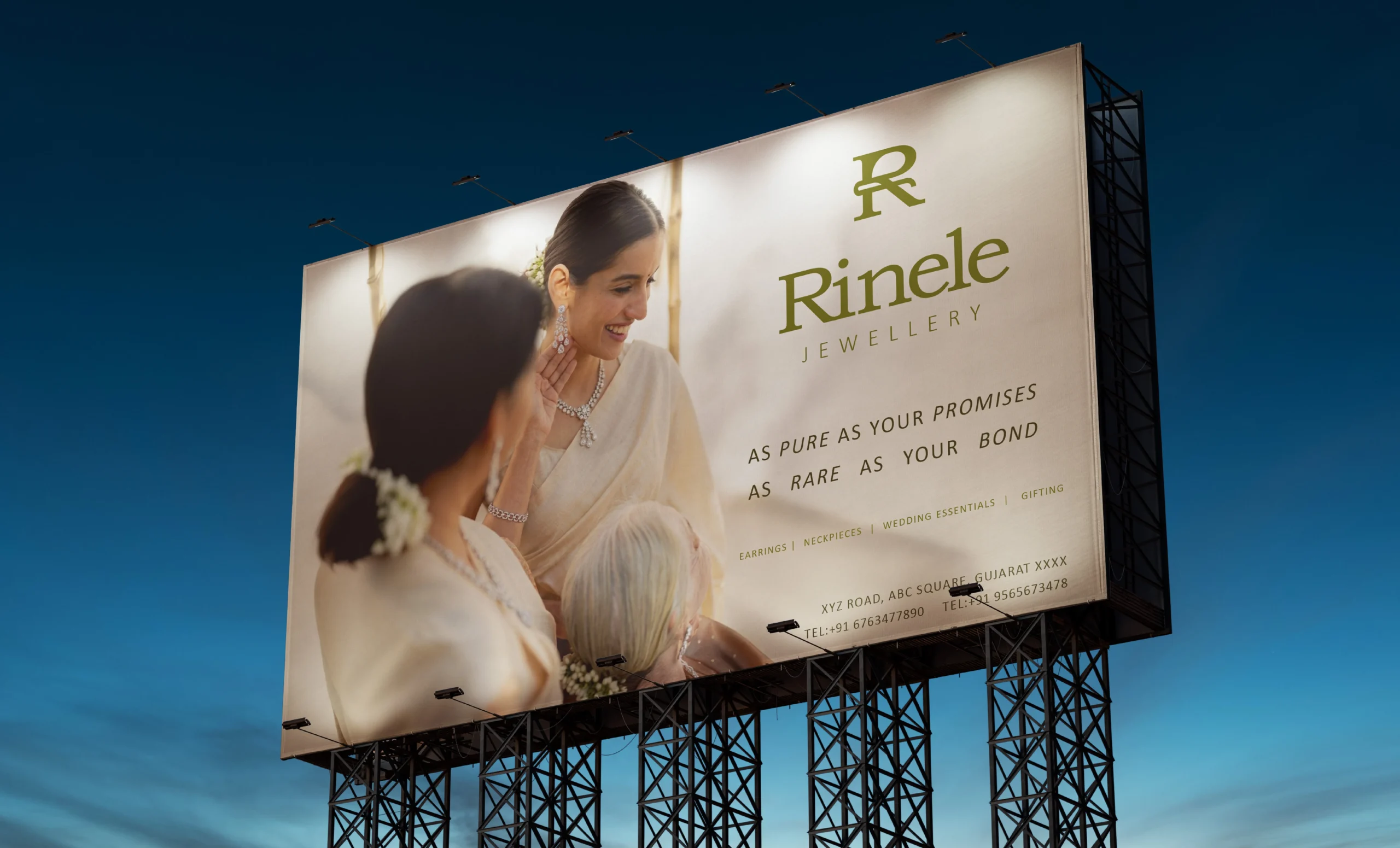
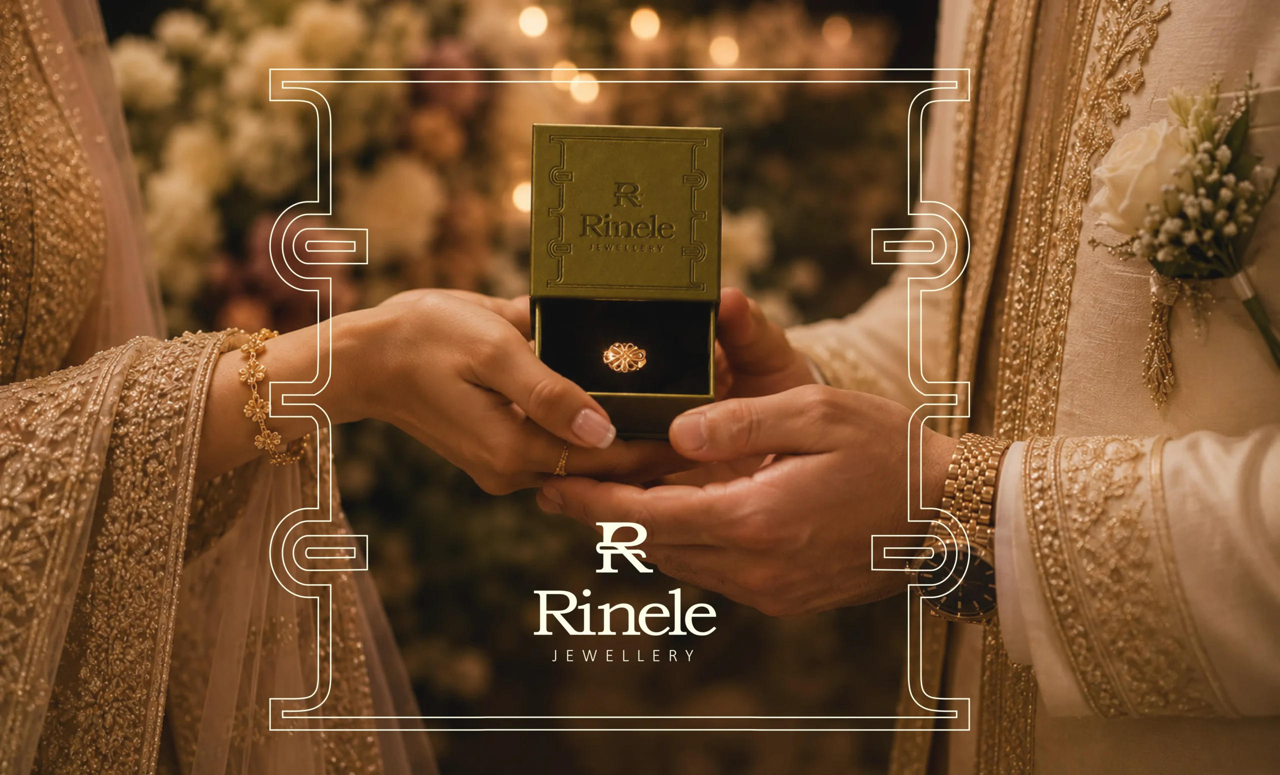
One flexible identity system worked across packaging, stamps, signage, social, tags, and premium retail touchpoints.
 is the art of becoming knowable,
  likable,
  and trustable.