

Making Millets Feel Modern
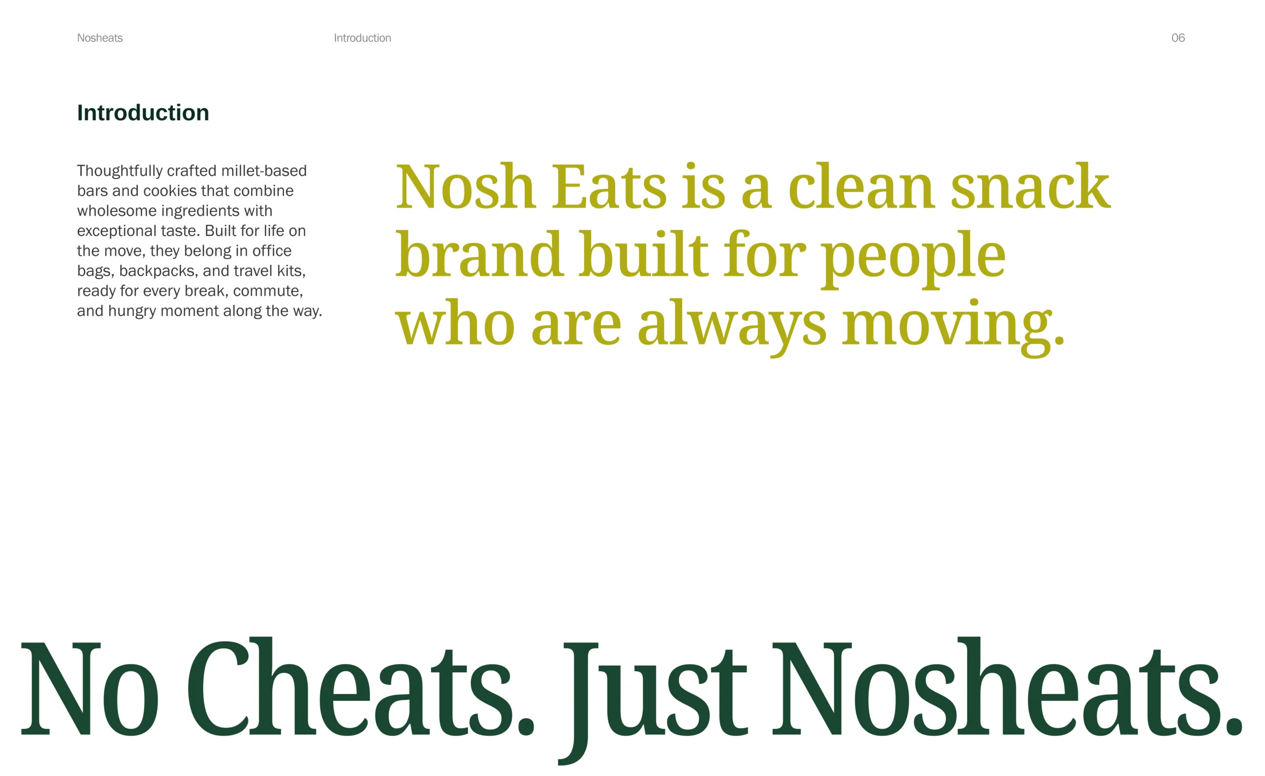
Nosheats is a clean millet-snacking brand made for people who are always moving – from office breaks and daily commutes to airport waits and late-afternoon cravings.
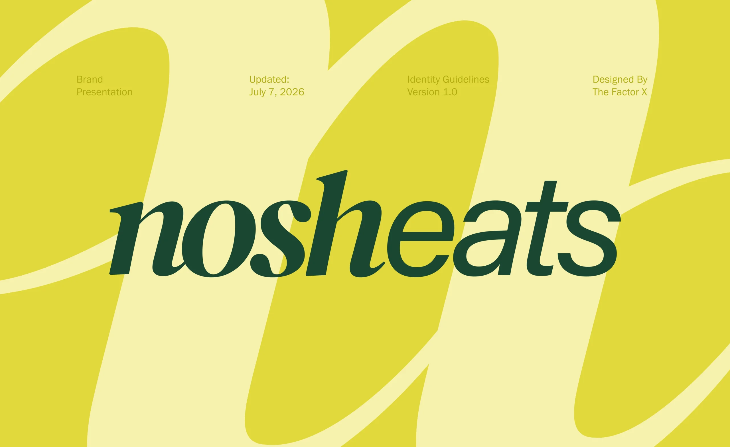
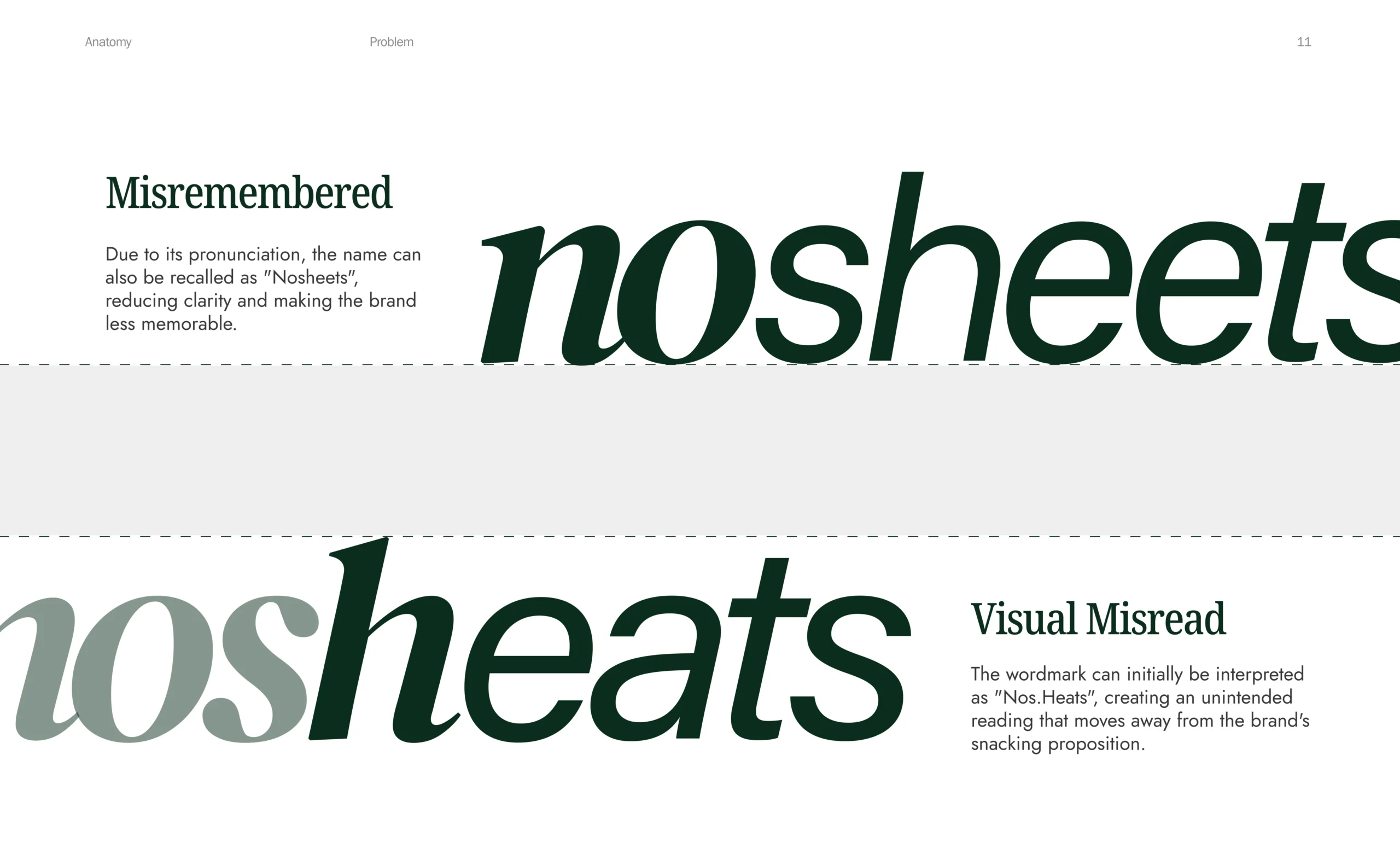
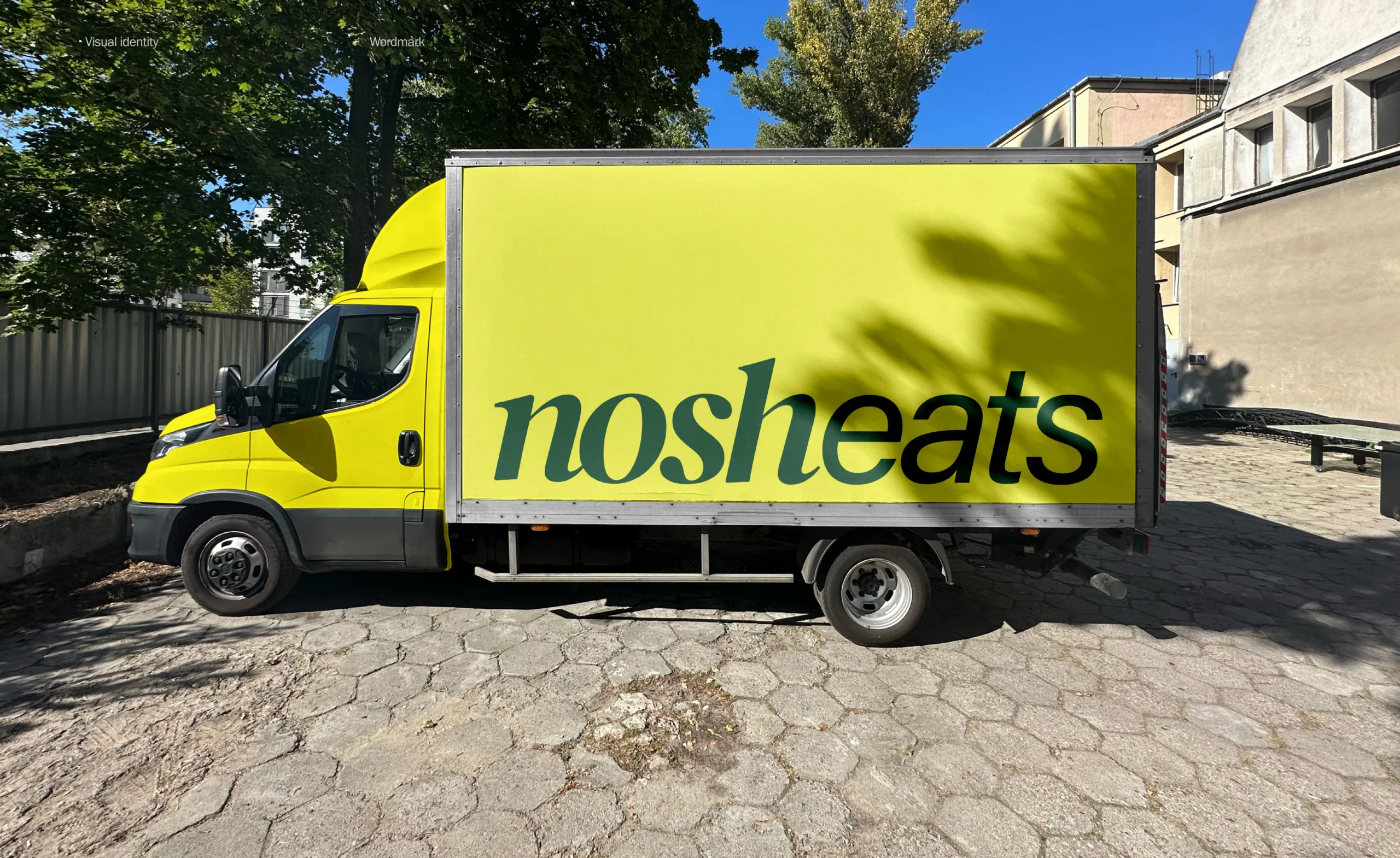
But before people could understand the product, they needed to understand the name. “Nosheats” could easily be misread as “Nos Heats” or remembered as “No Sheets.” That made the wordmark more than a visual choice—it became the first strategic problem we had to solve.
We built an identity that makes Nosh + Eats clearer, while giving millet-based bars and cookies a playful, modern, and highly recognisable brand world.
No cheats. Just Nosheats.
The first problem was not the product-it was the name. Different readings could weaken recall before customers even understood the brand.
The client already had a distinctive name. We needed to improve readability through design rather than changing the identity completely.
Many millet brands rely on earthy colours, traditional visuals, and serious health language. Nosheats needed to look completely different within the Indian market.
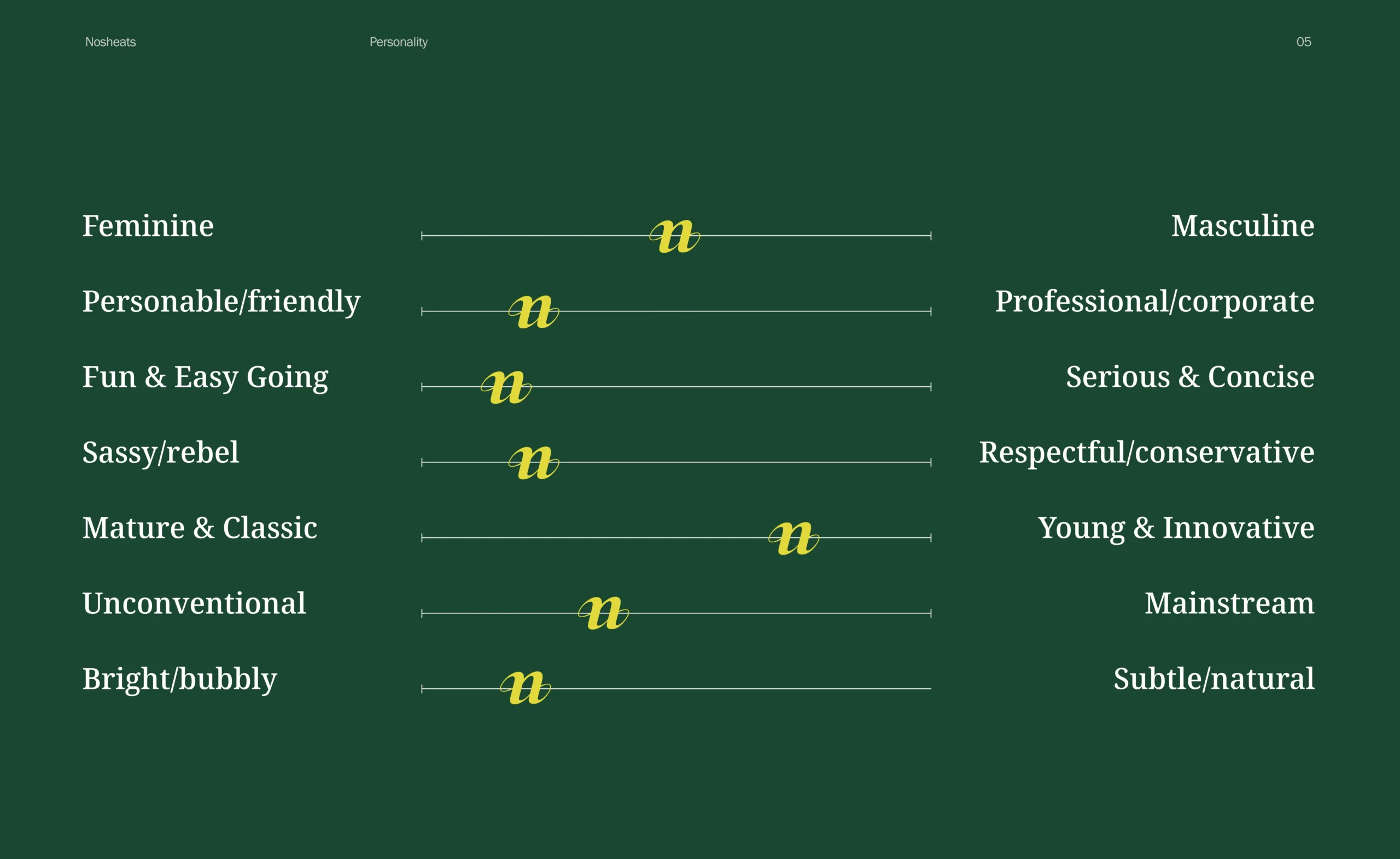
The brand had to communicate better ingredients and mindful snacking without sounding clinical, restrictive, or like another diet-food company.
A new food brand needs to work across products, social media, digital icons, retail environments, campaigns, and future extensions – not only on one pack.
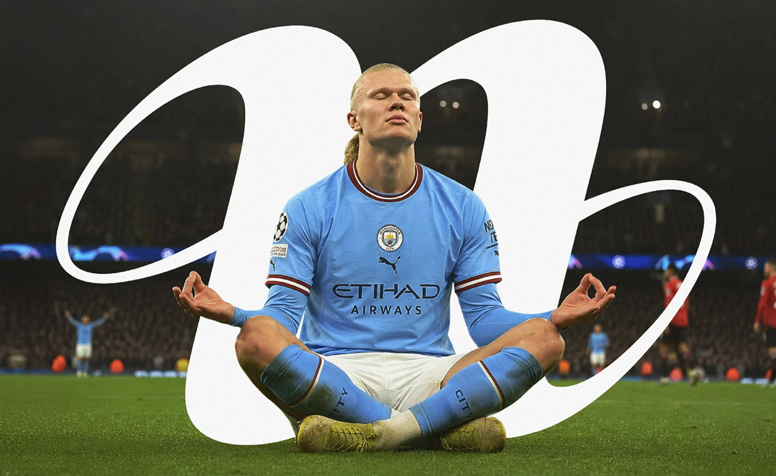
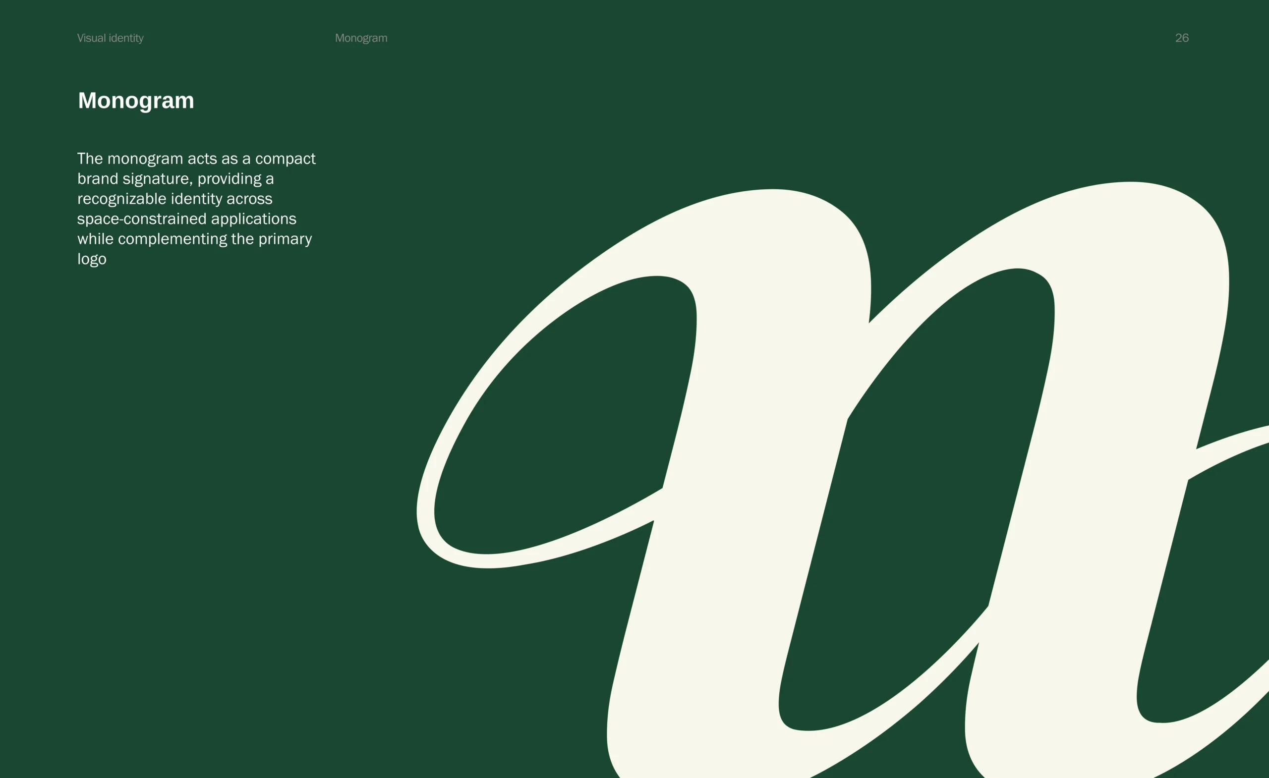
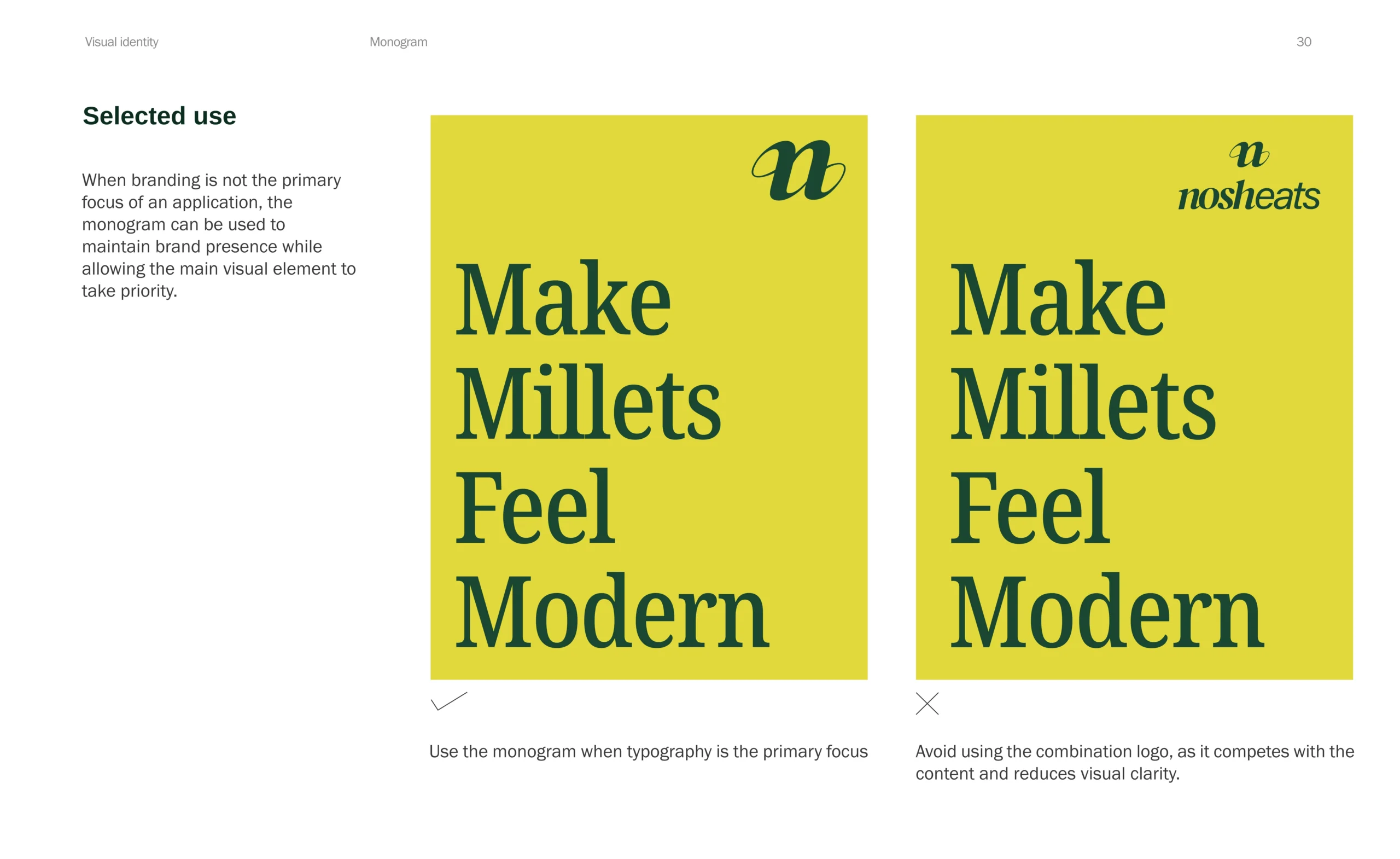
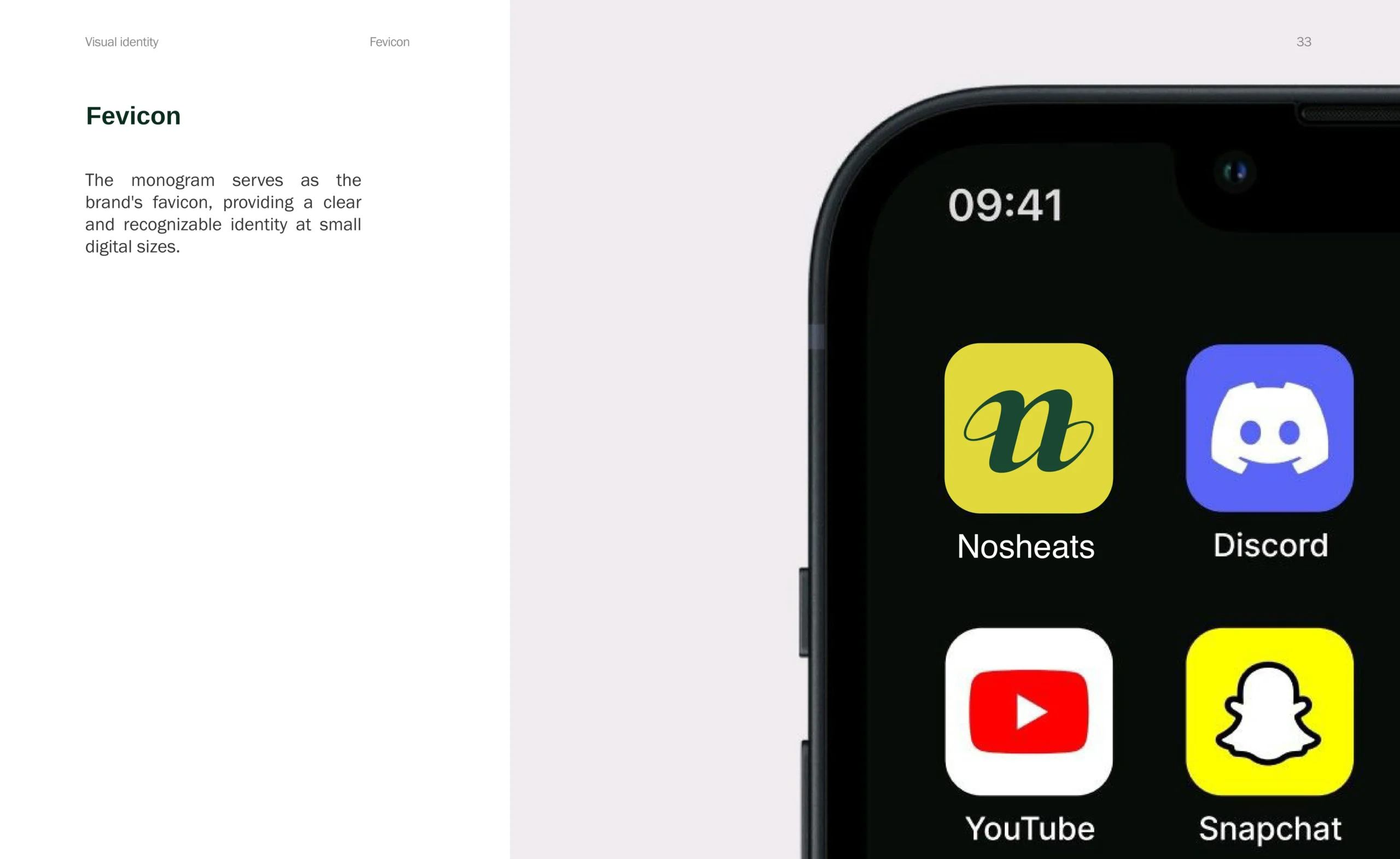
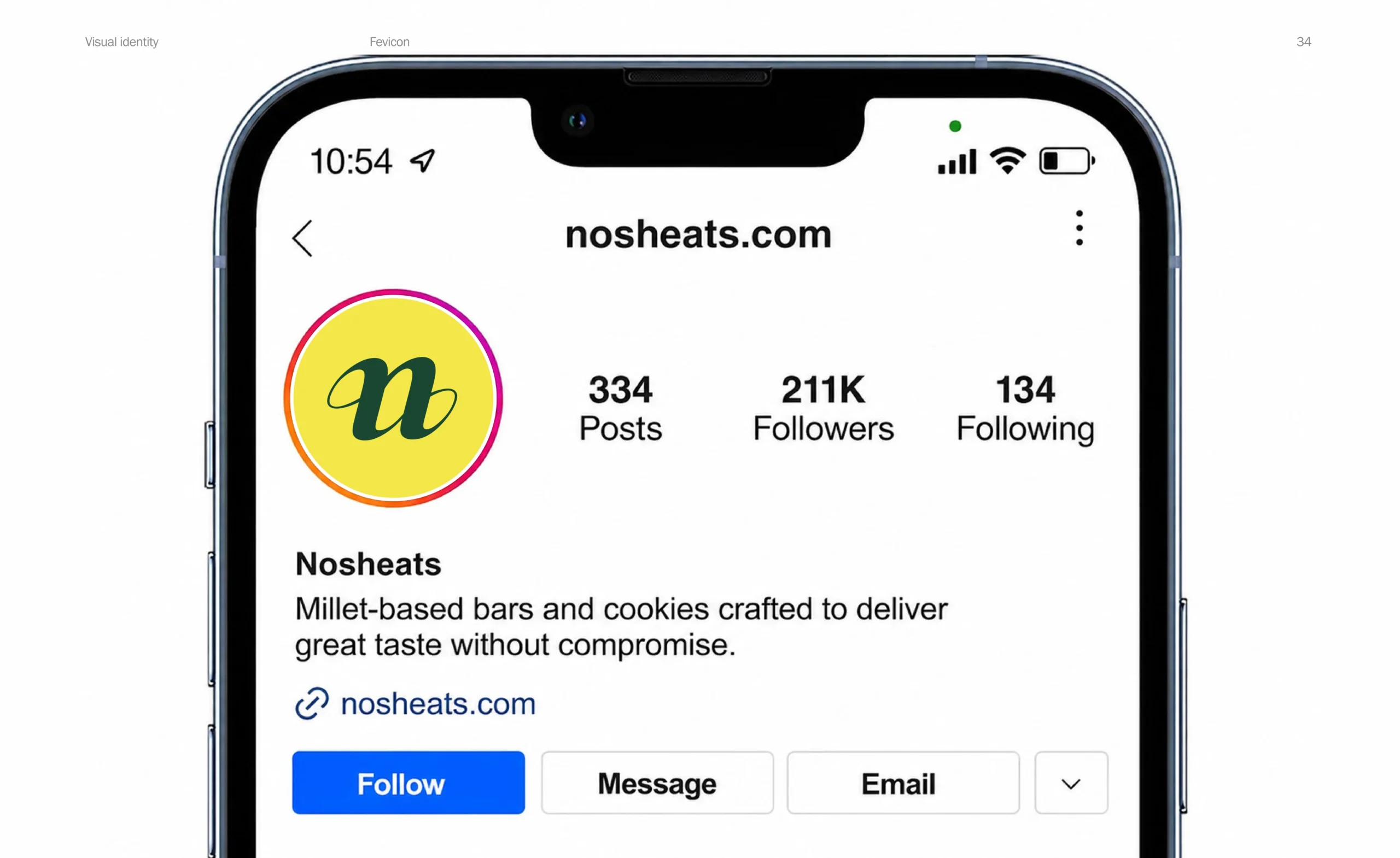
The full wordmark needed clarity, while smaller applications required an equally recognizable symbol that would not lose the brand’s personality.

Strategy
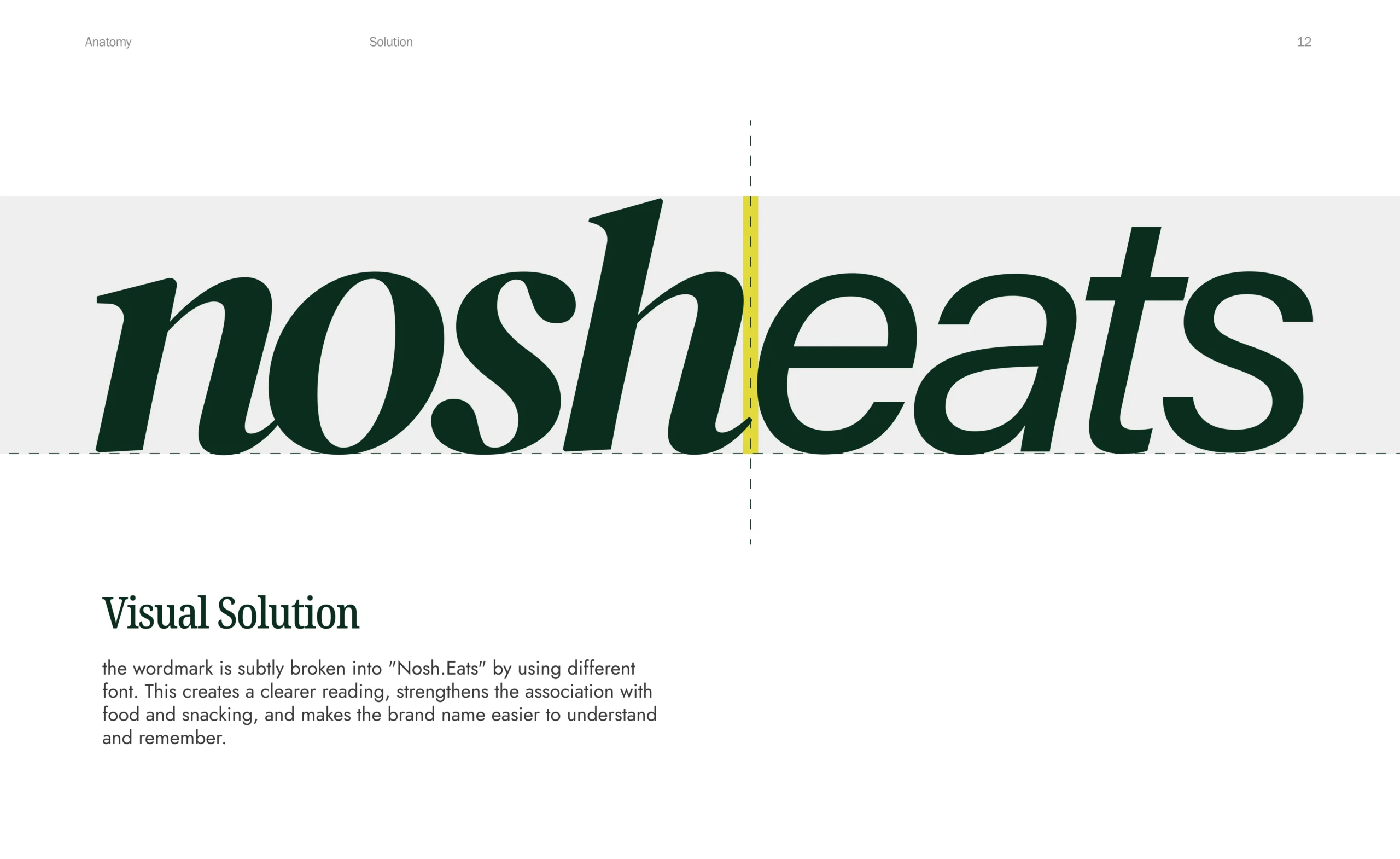
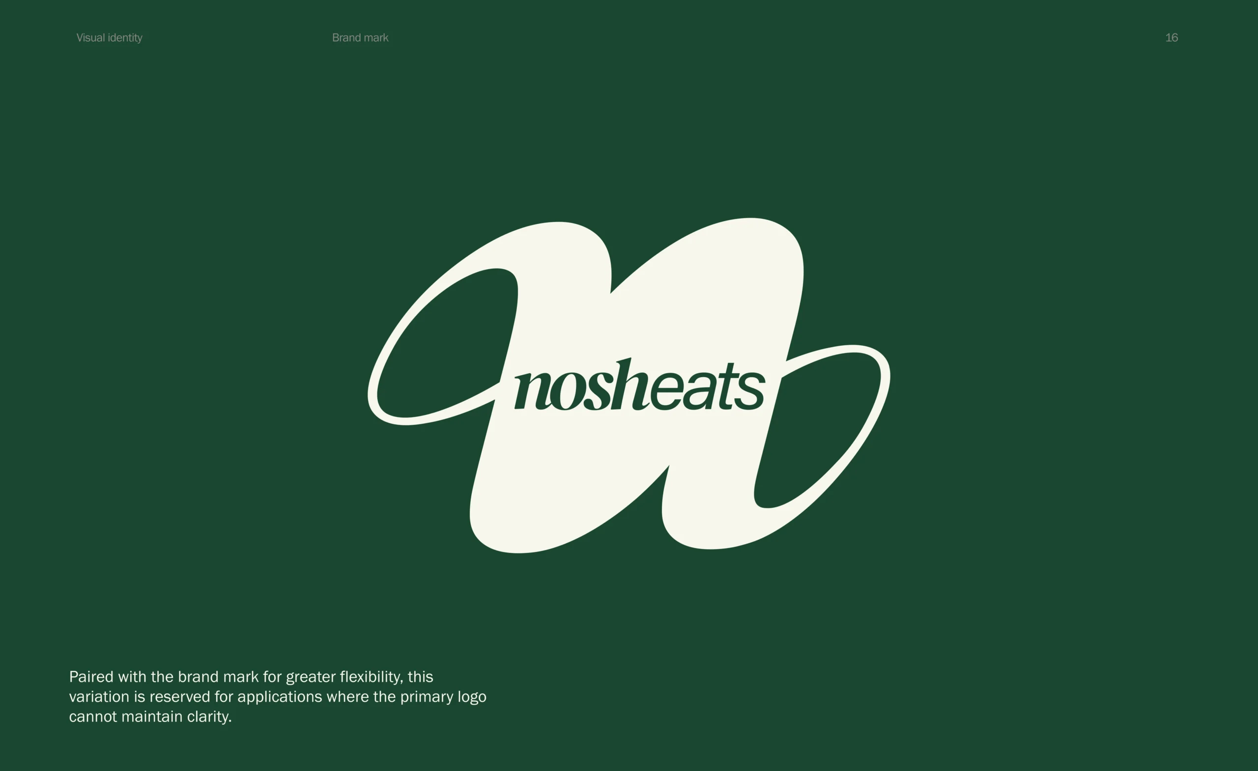
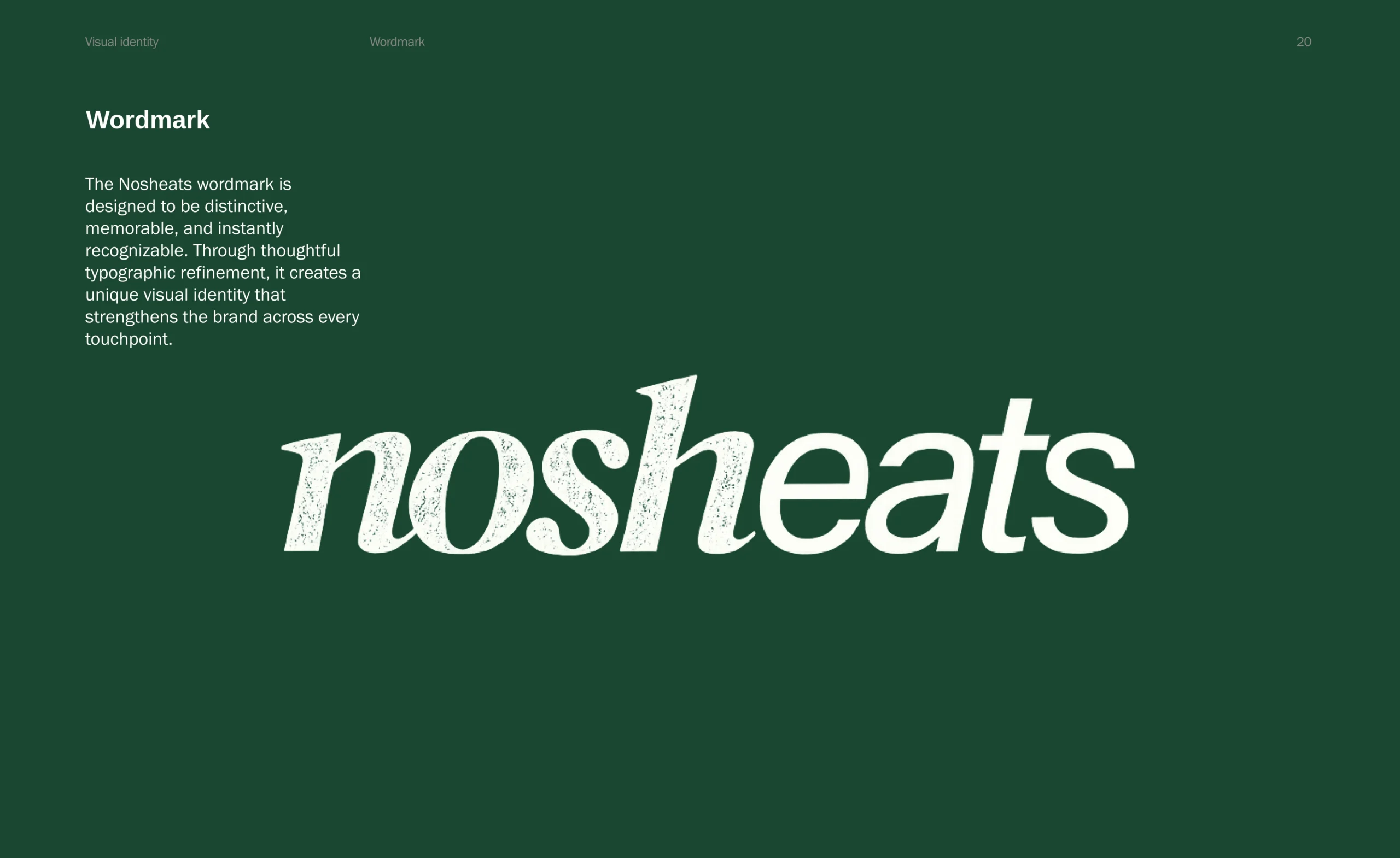
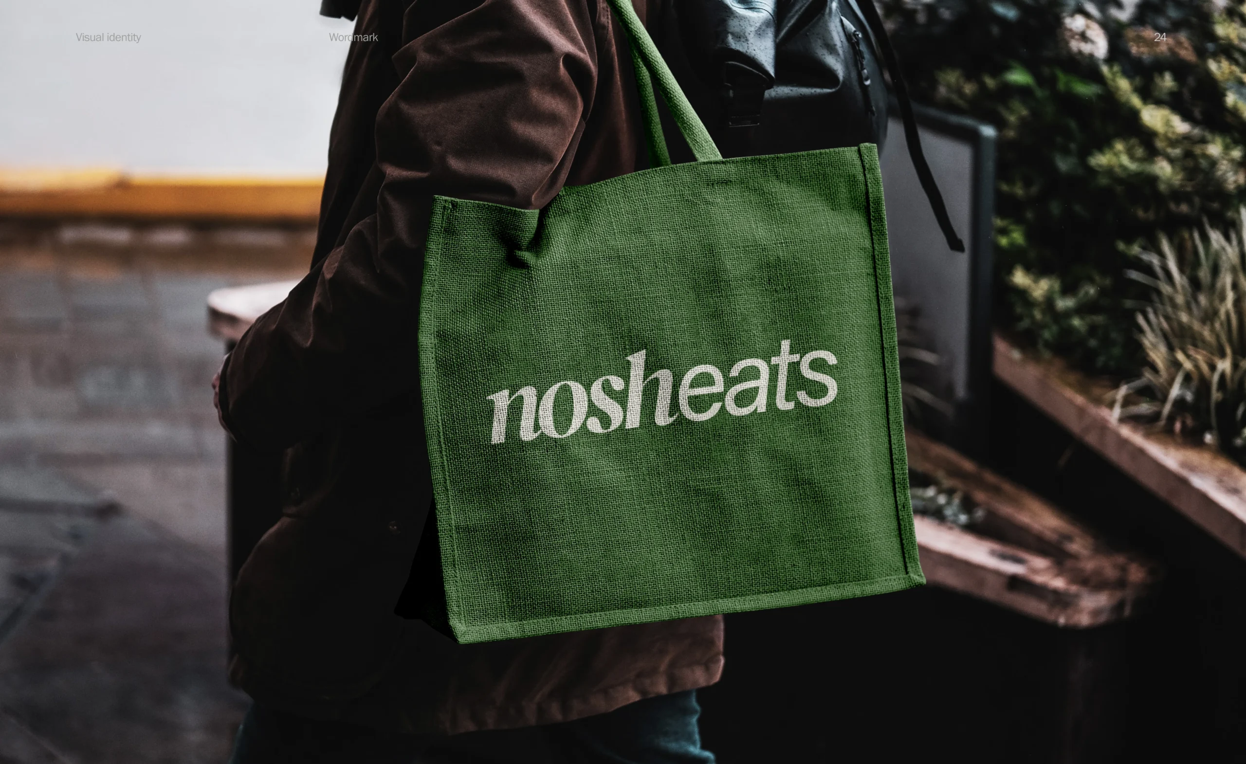
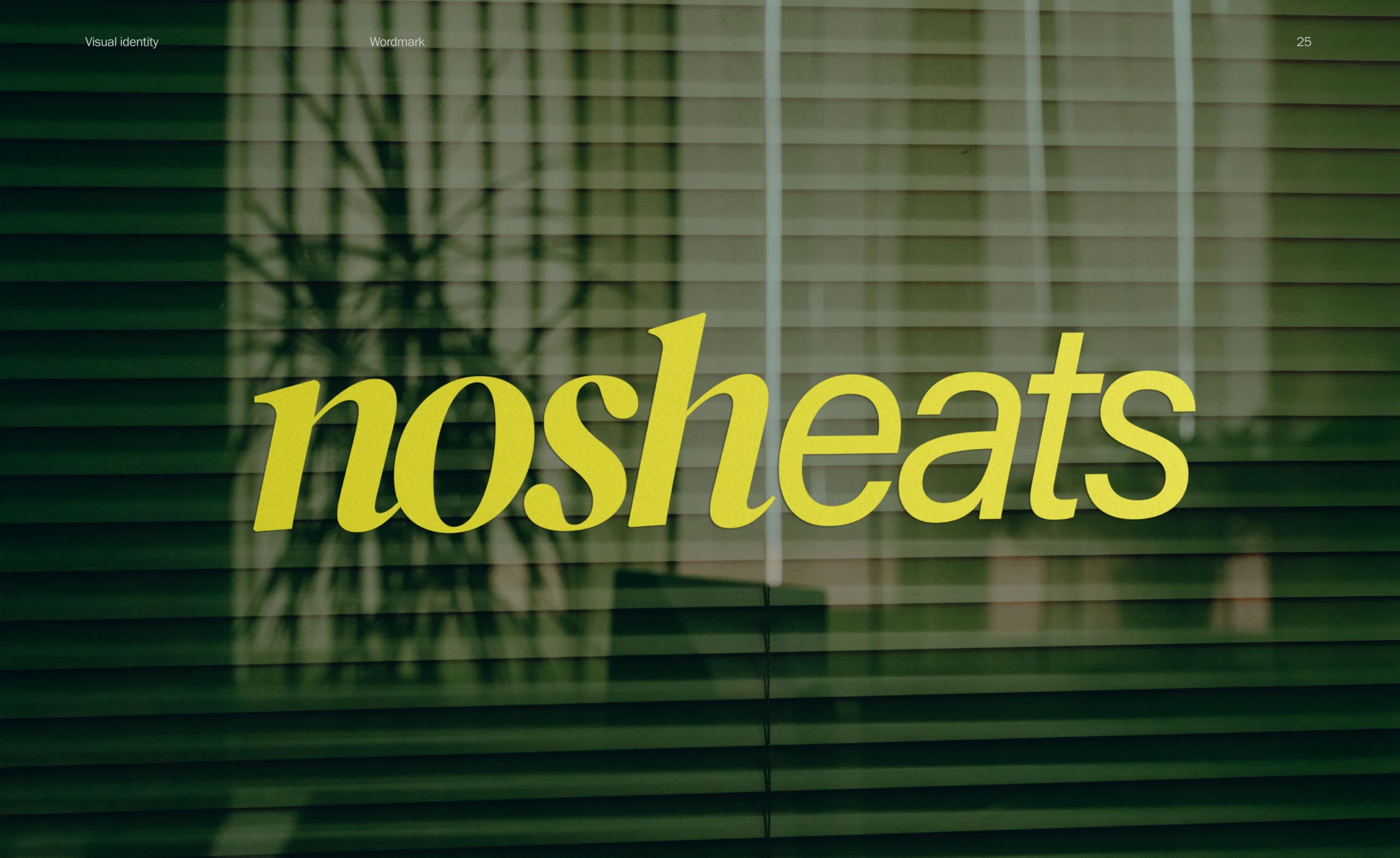
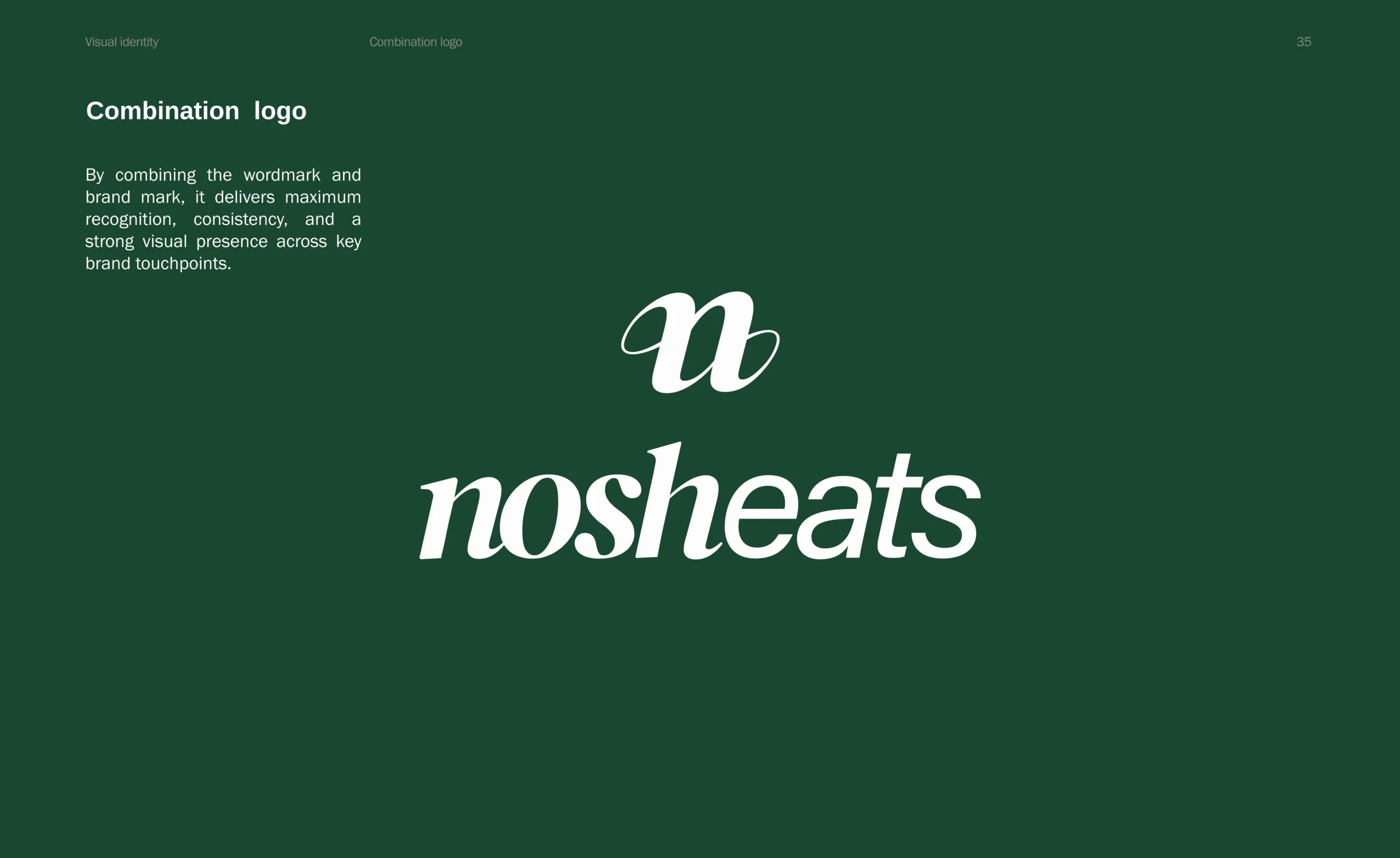
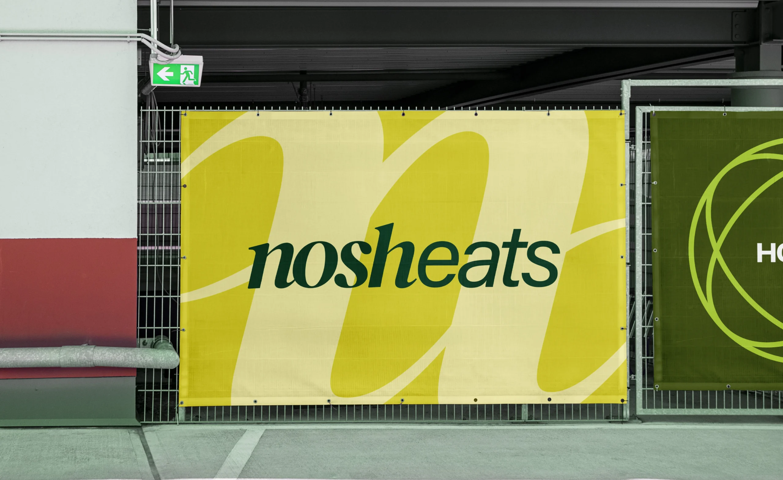
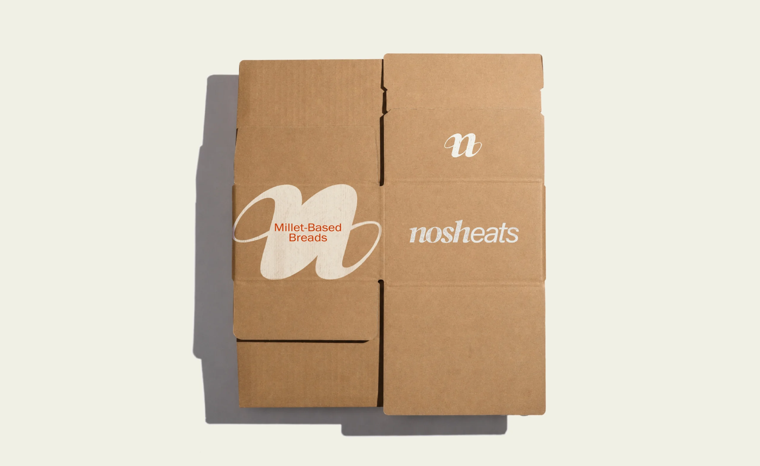
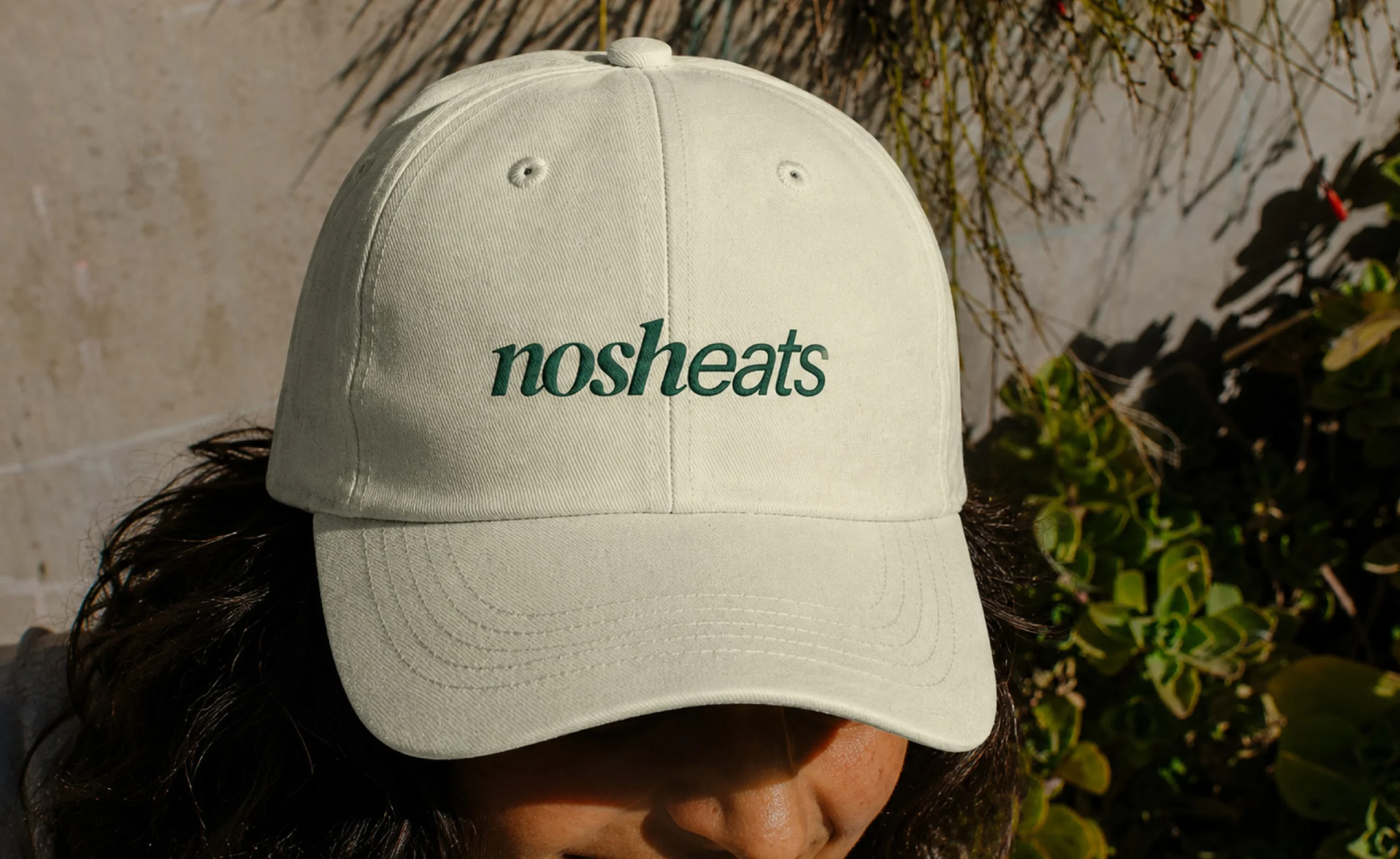
We reshaped the wordmark to separate Nosh and Eats, making the name clearer, memorable, and easier to pronounce.
Identity
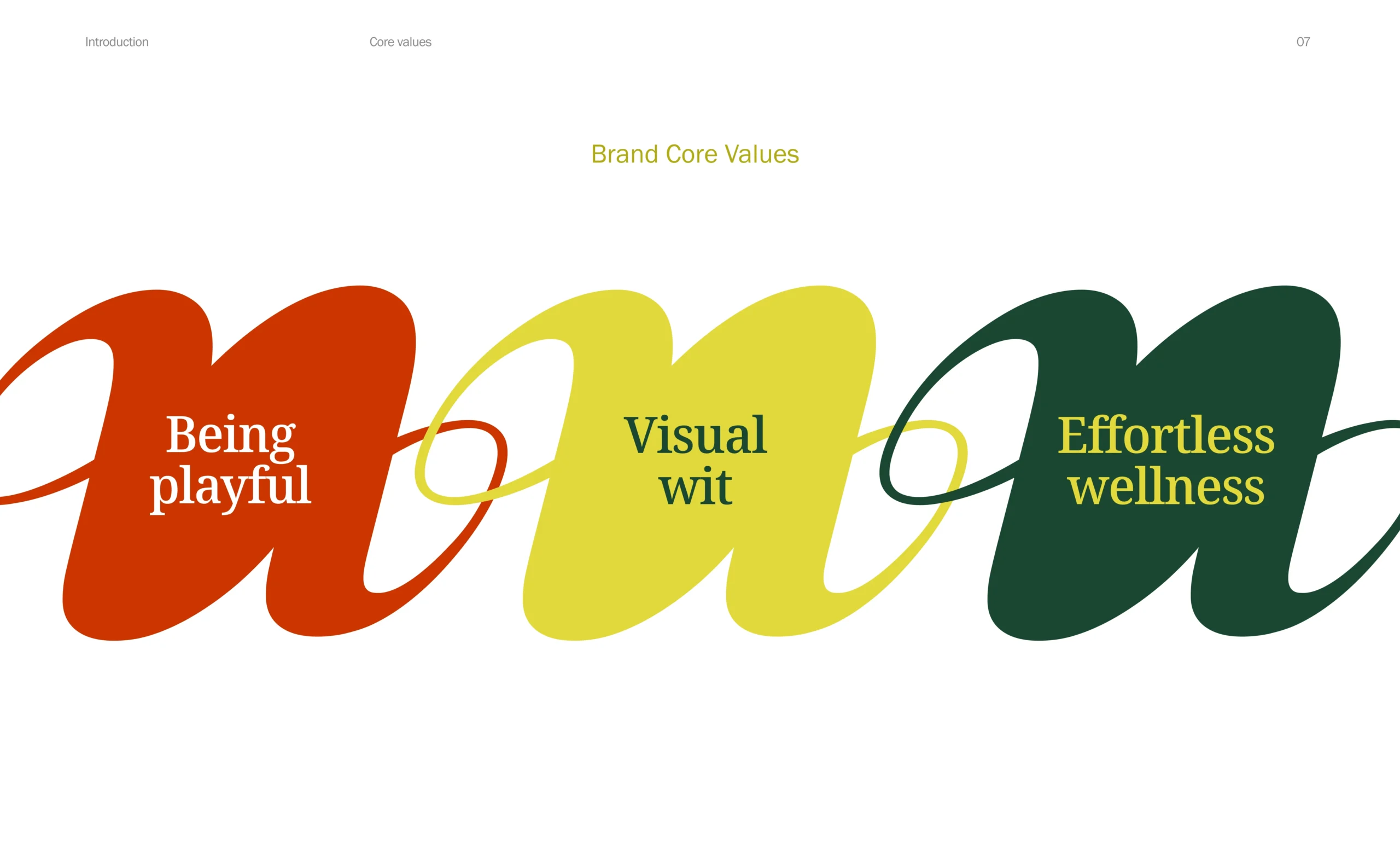
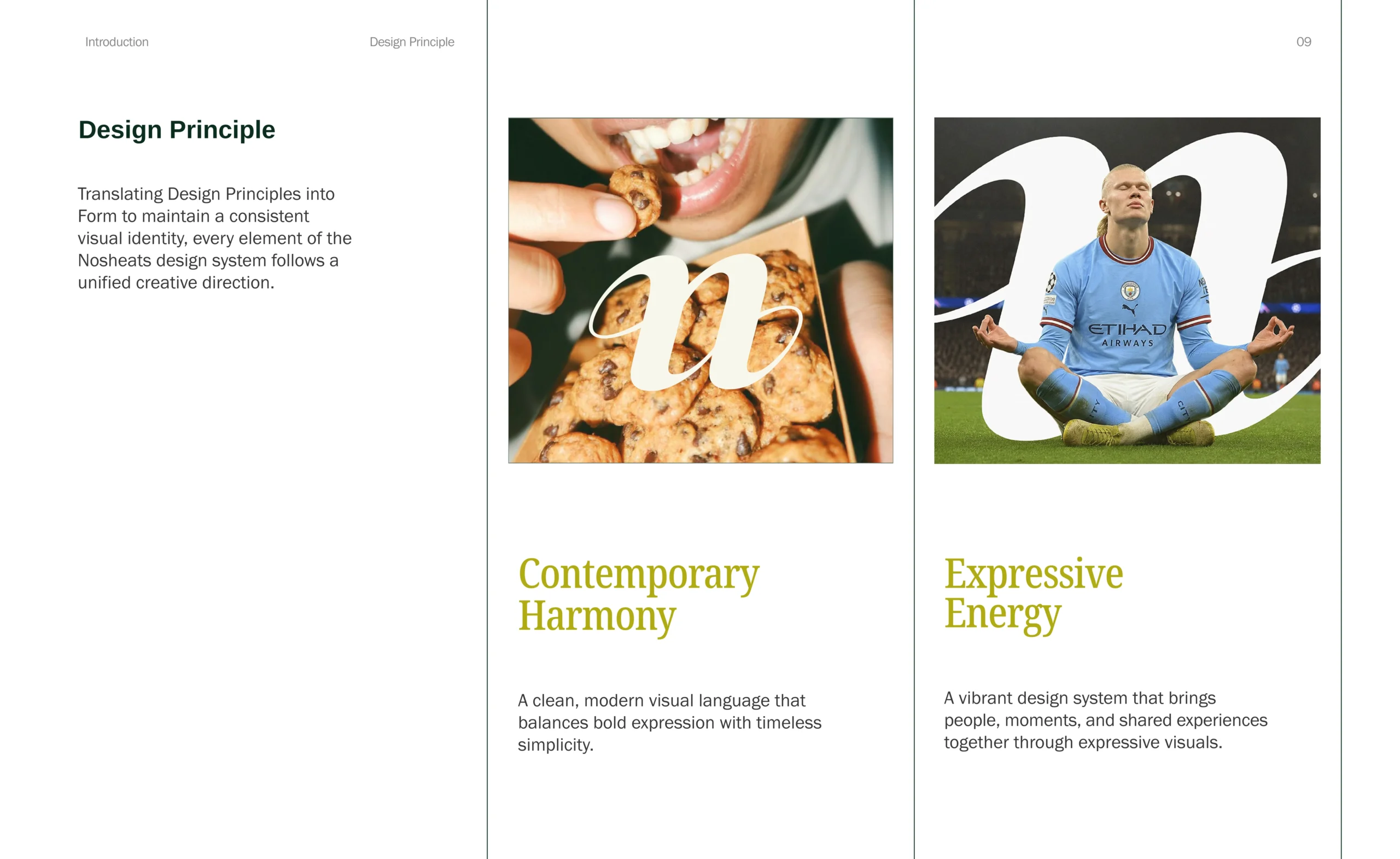
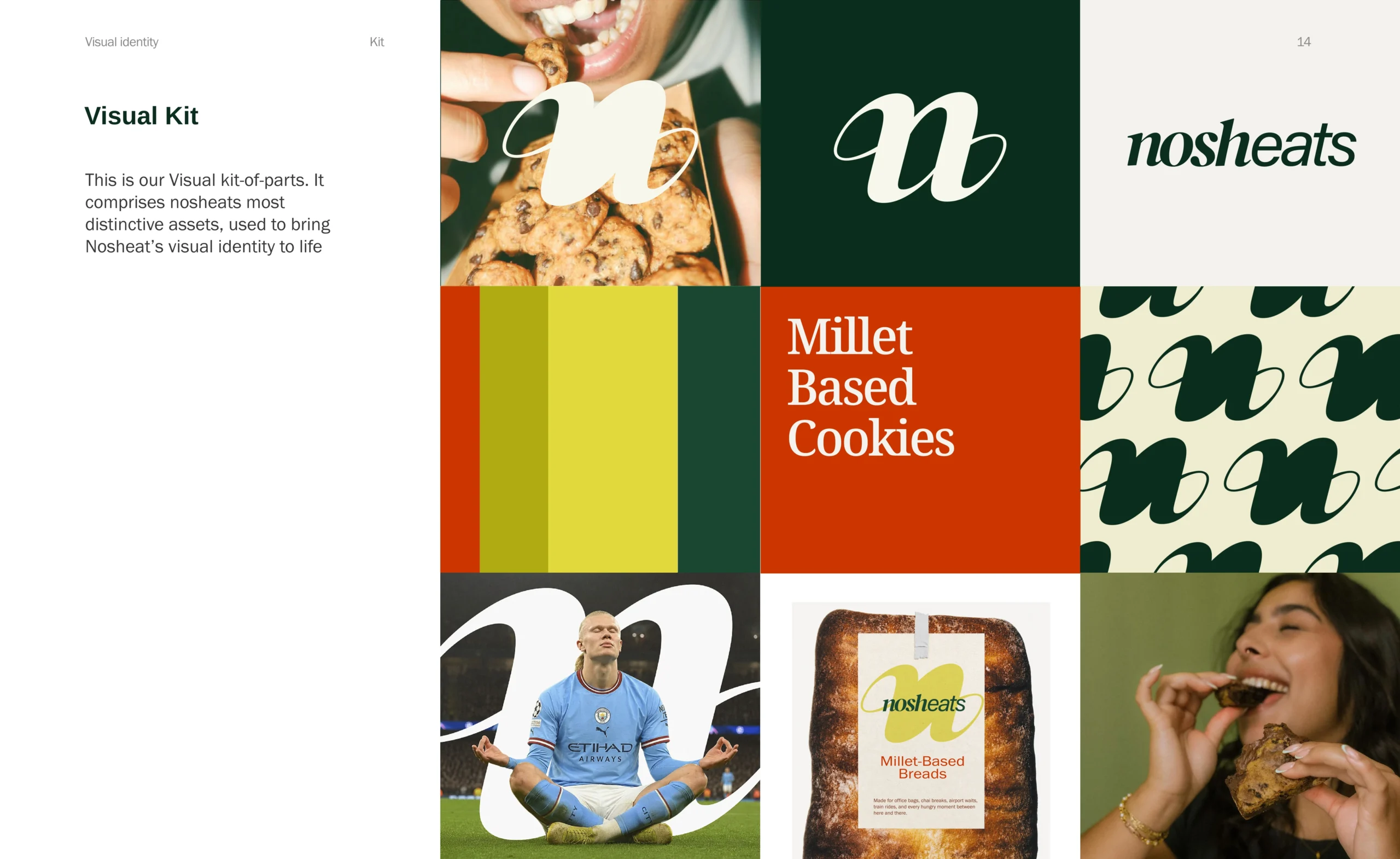
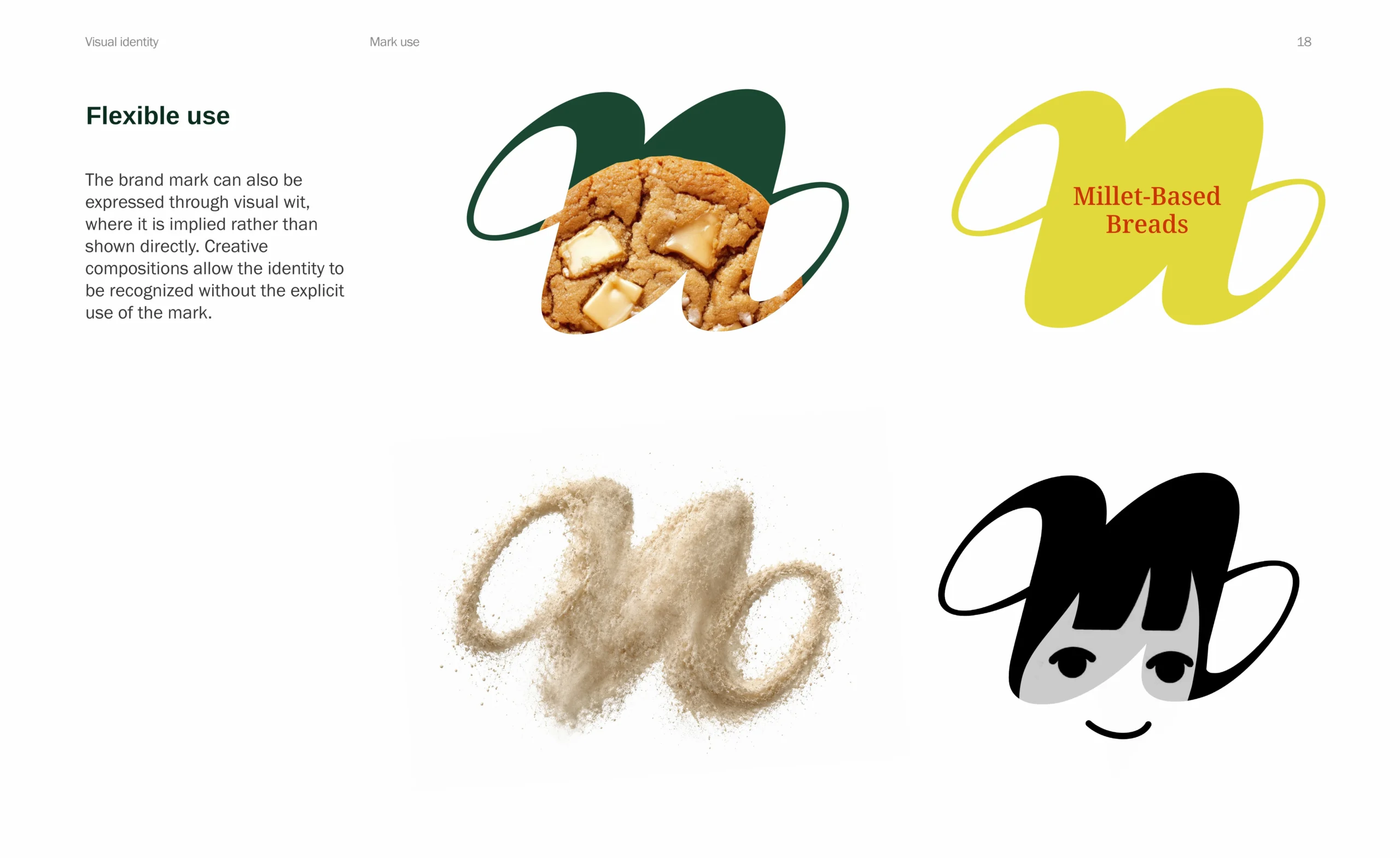
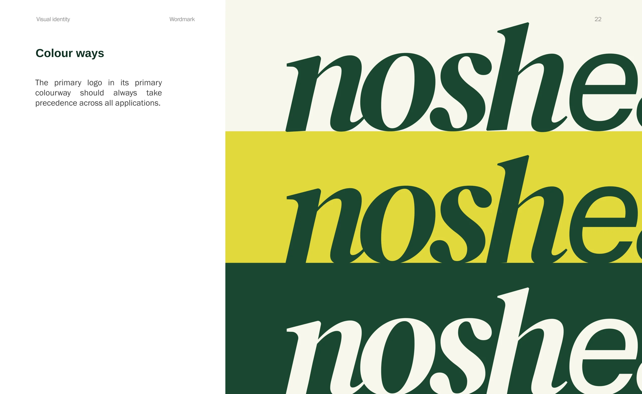
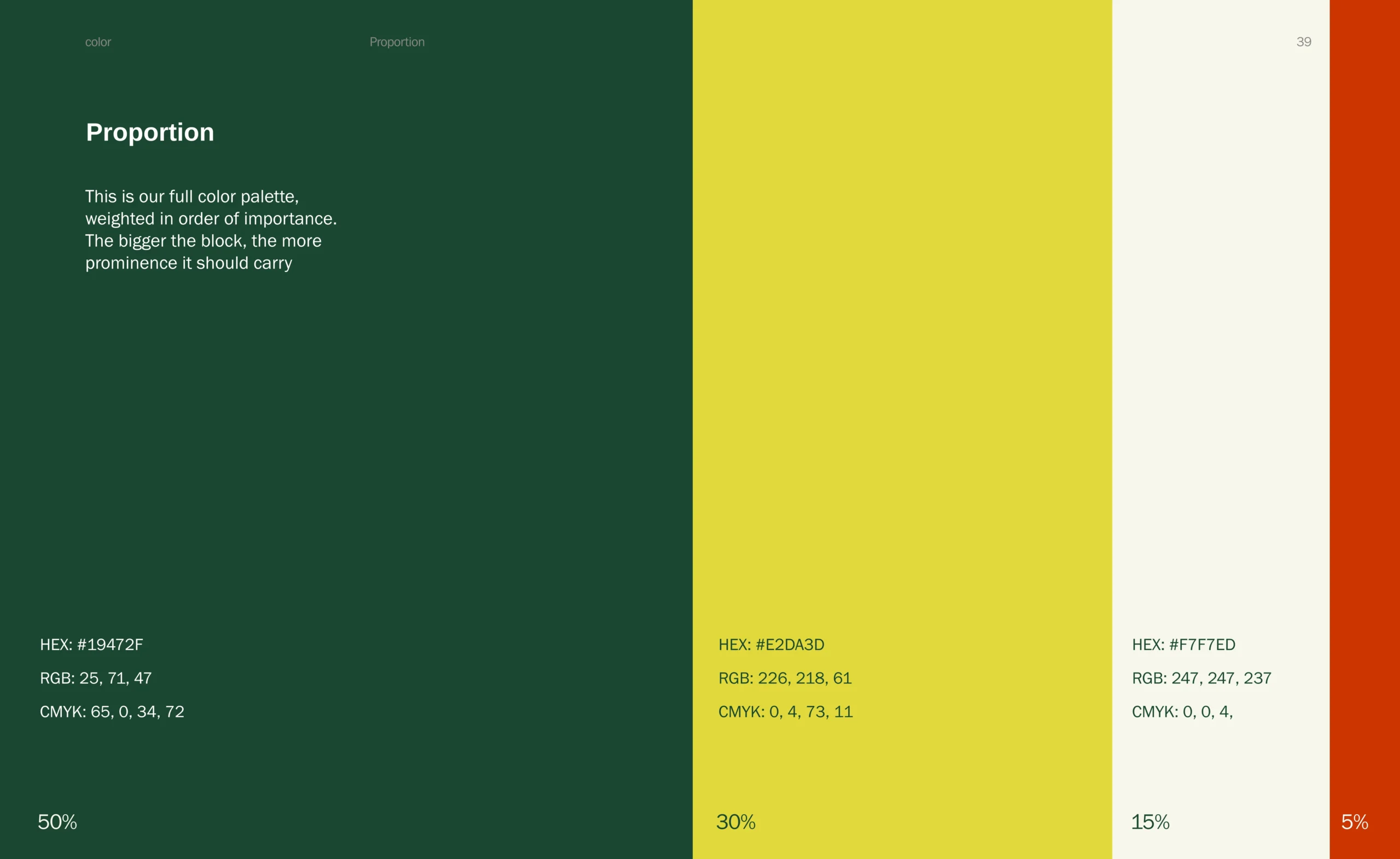
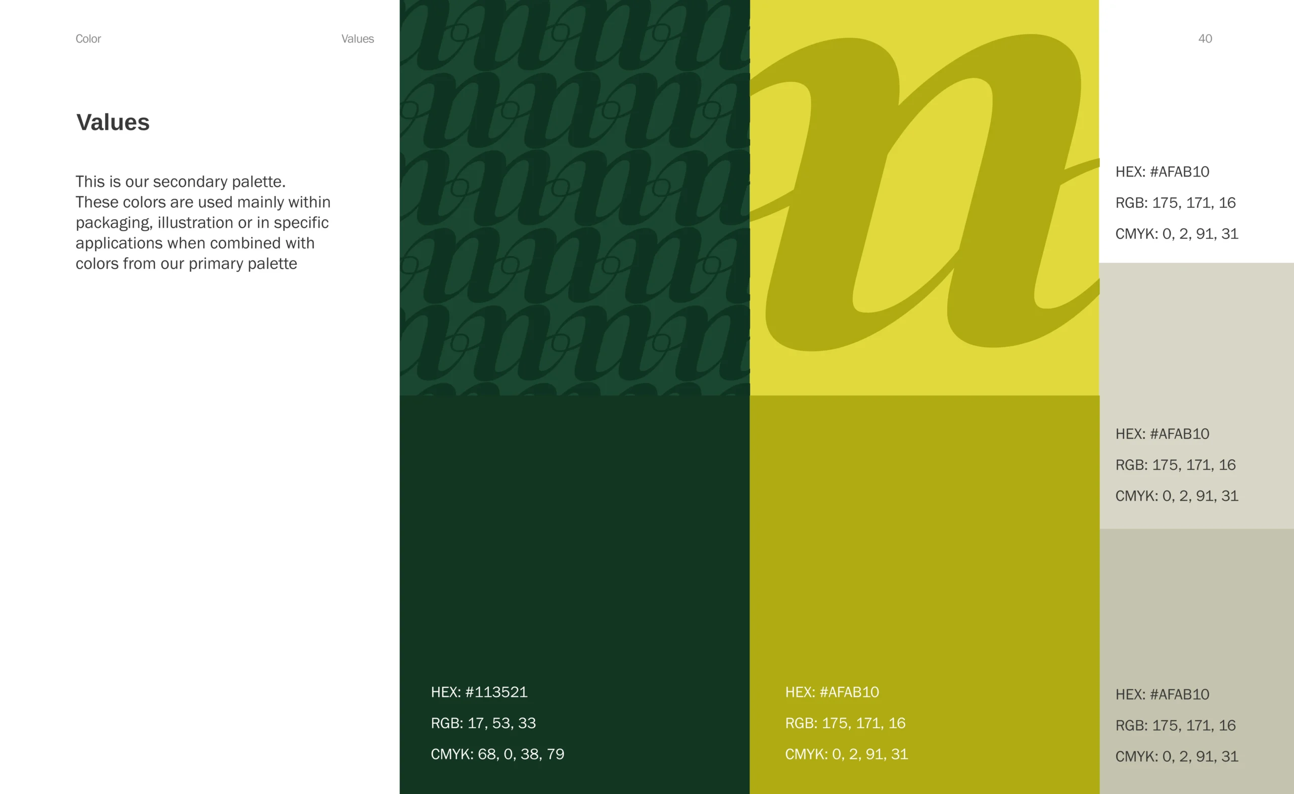
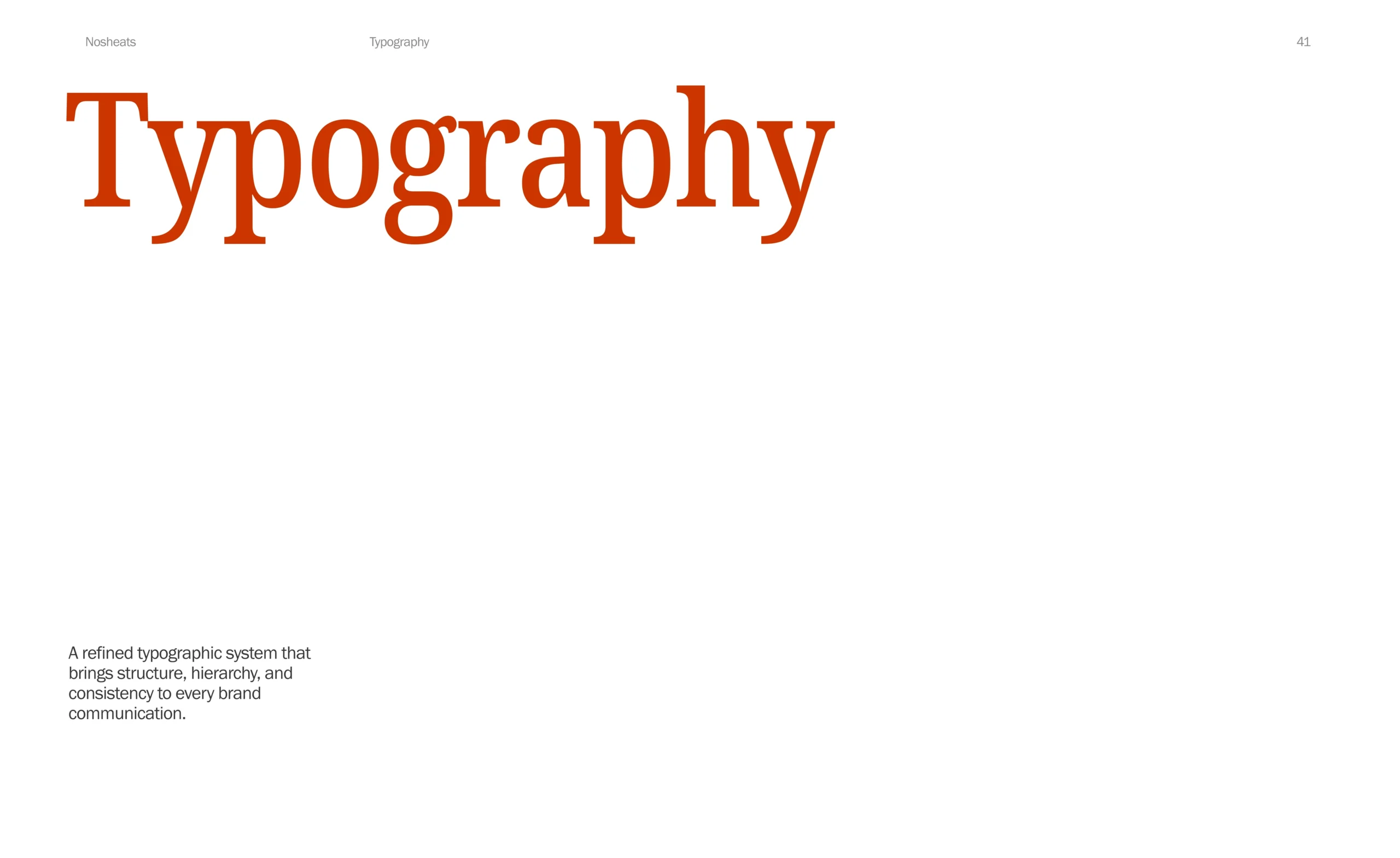
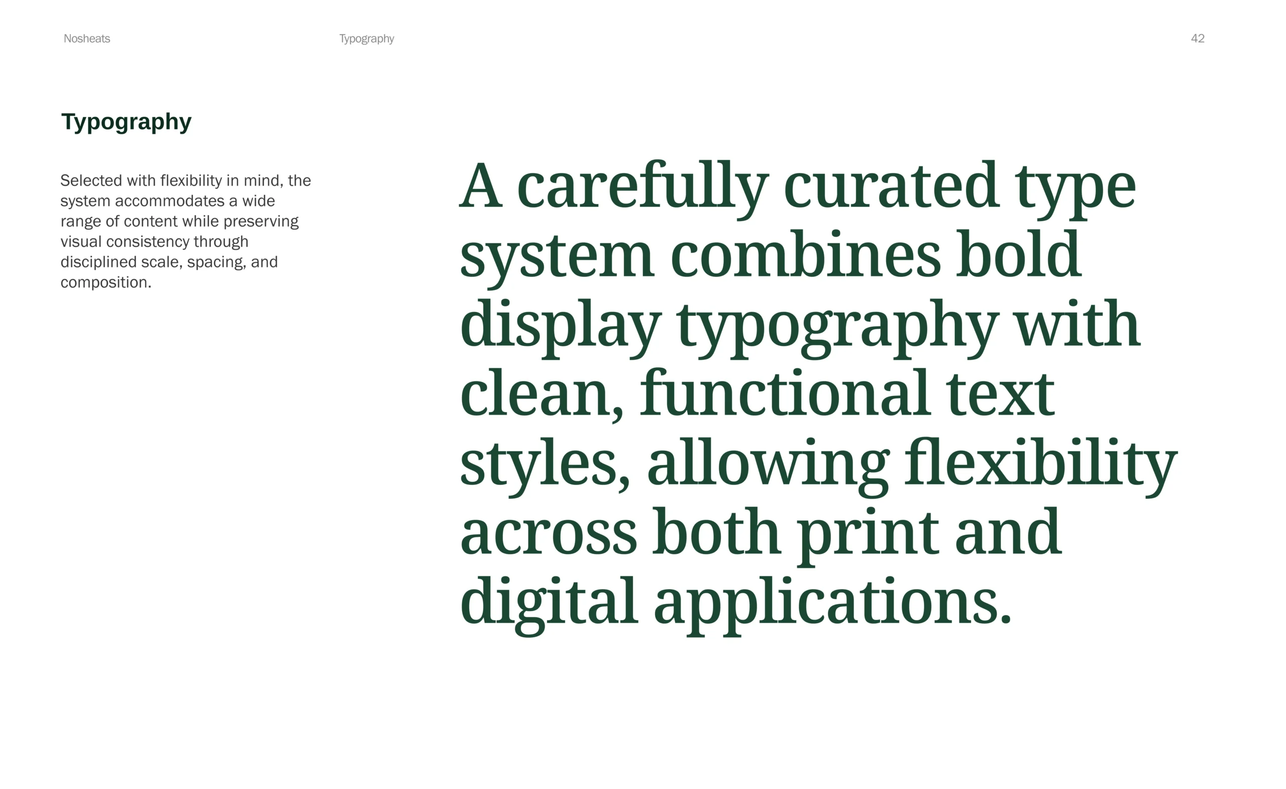
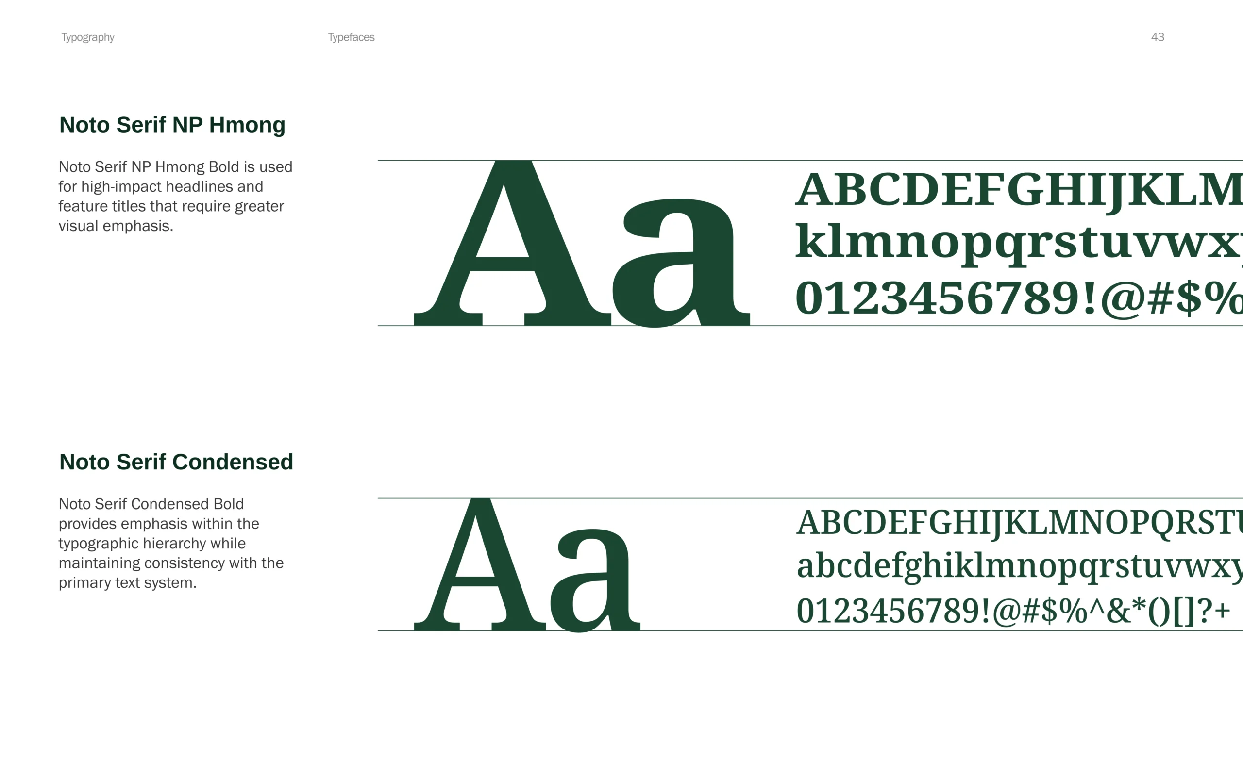
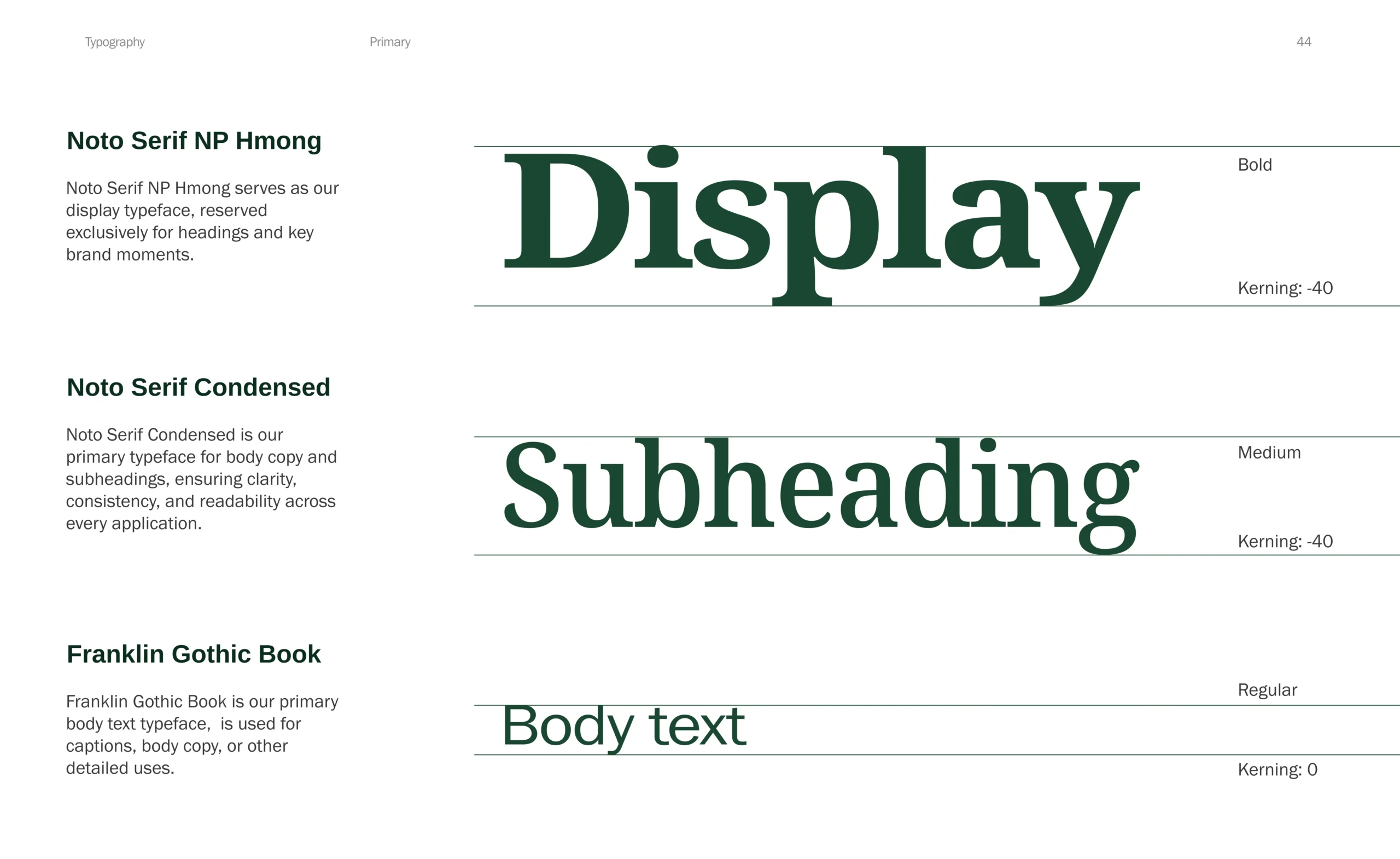
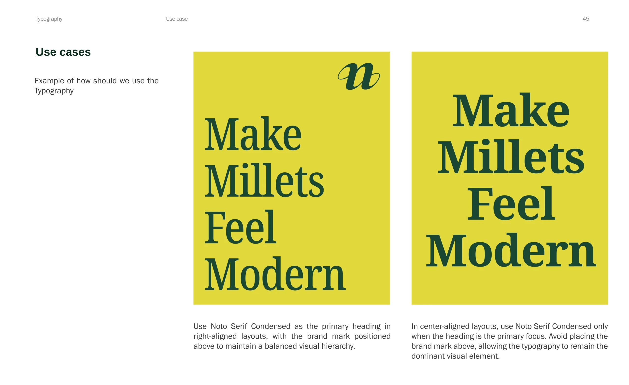
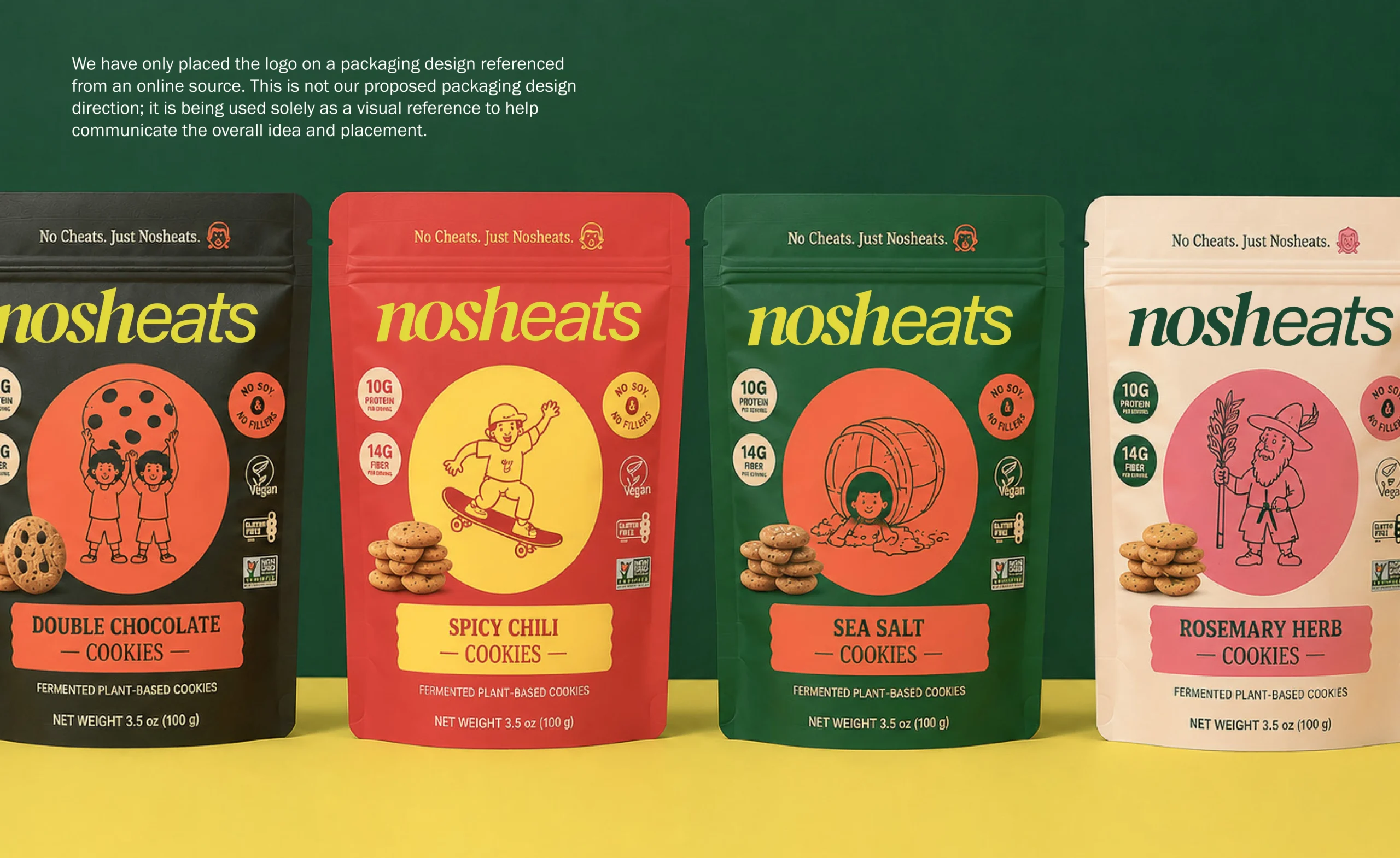
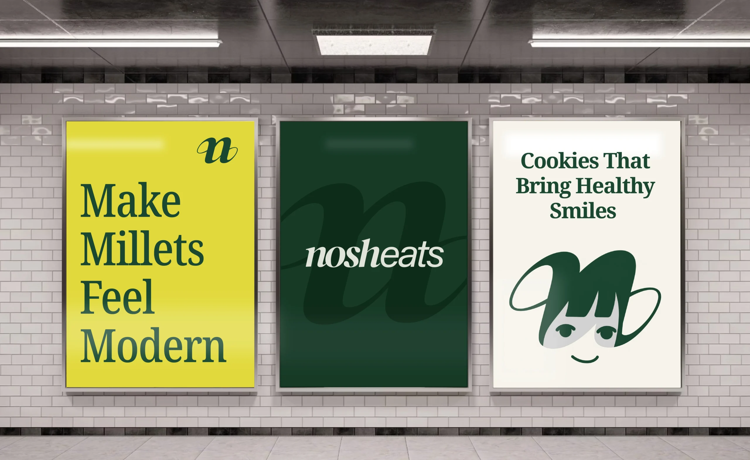
Bold typography, visual wit, and expressive colors moved millet snacks beyond earthy clichés into a contemporary everyday lifestyle.
System
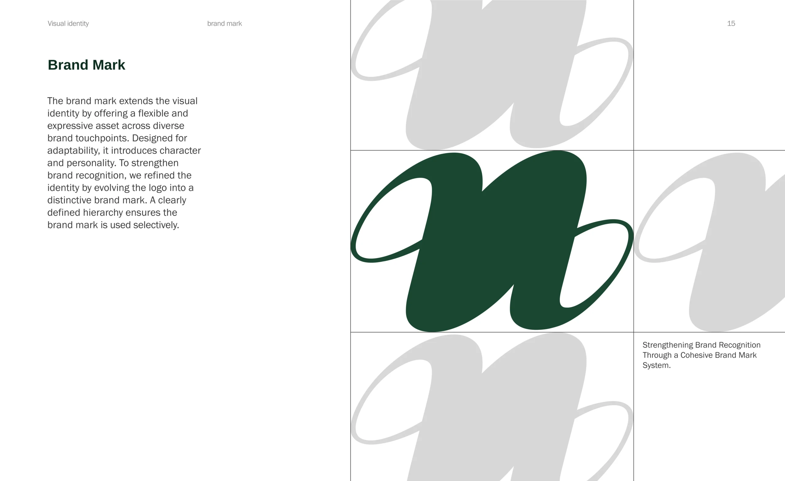
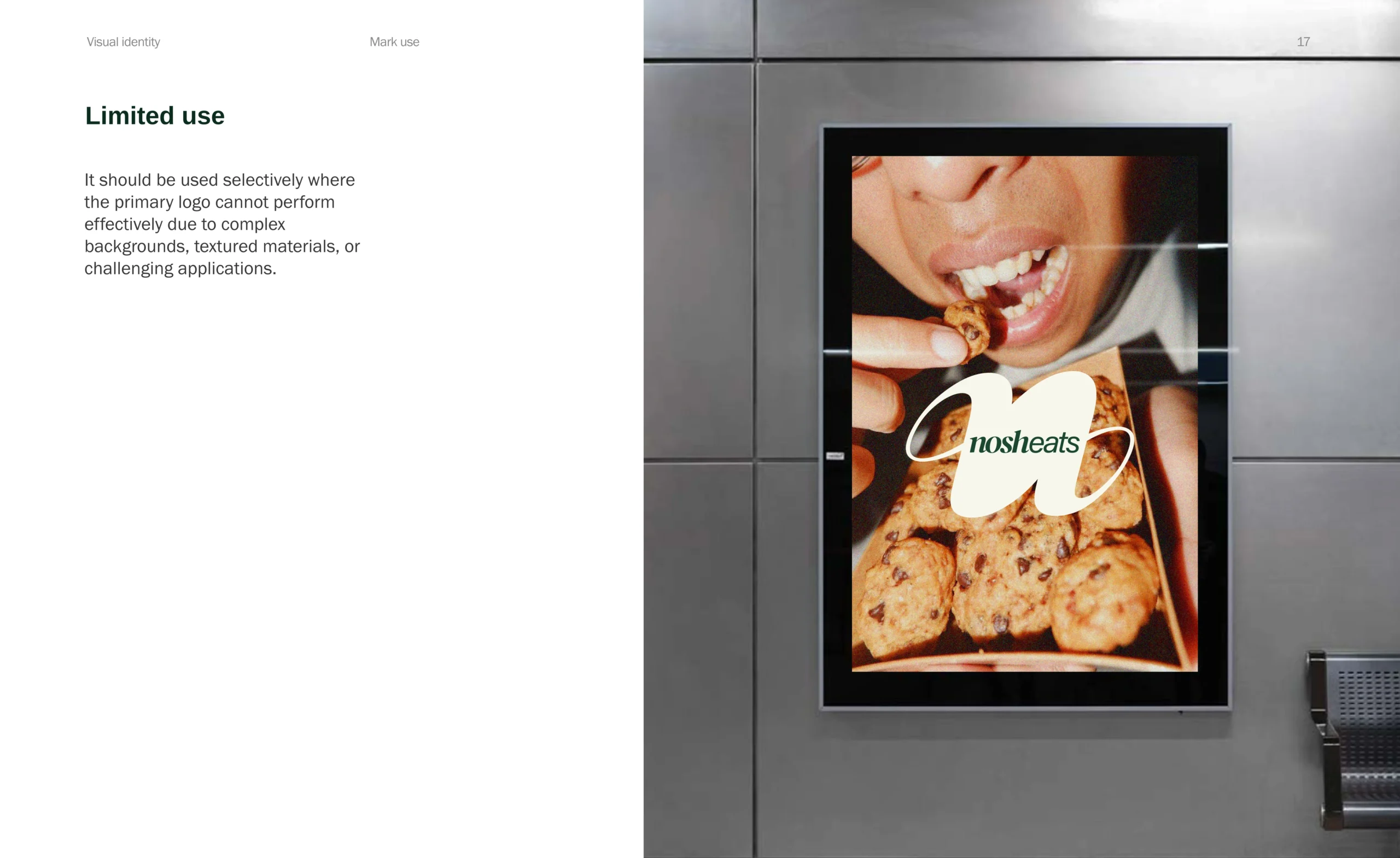
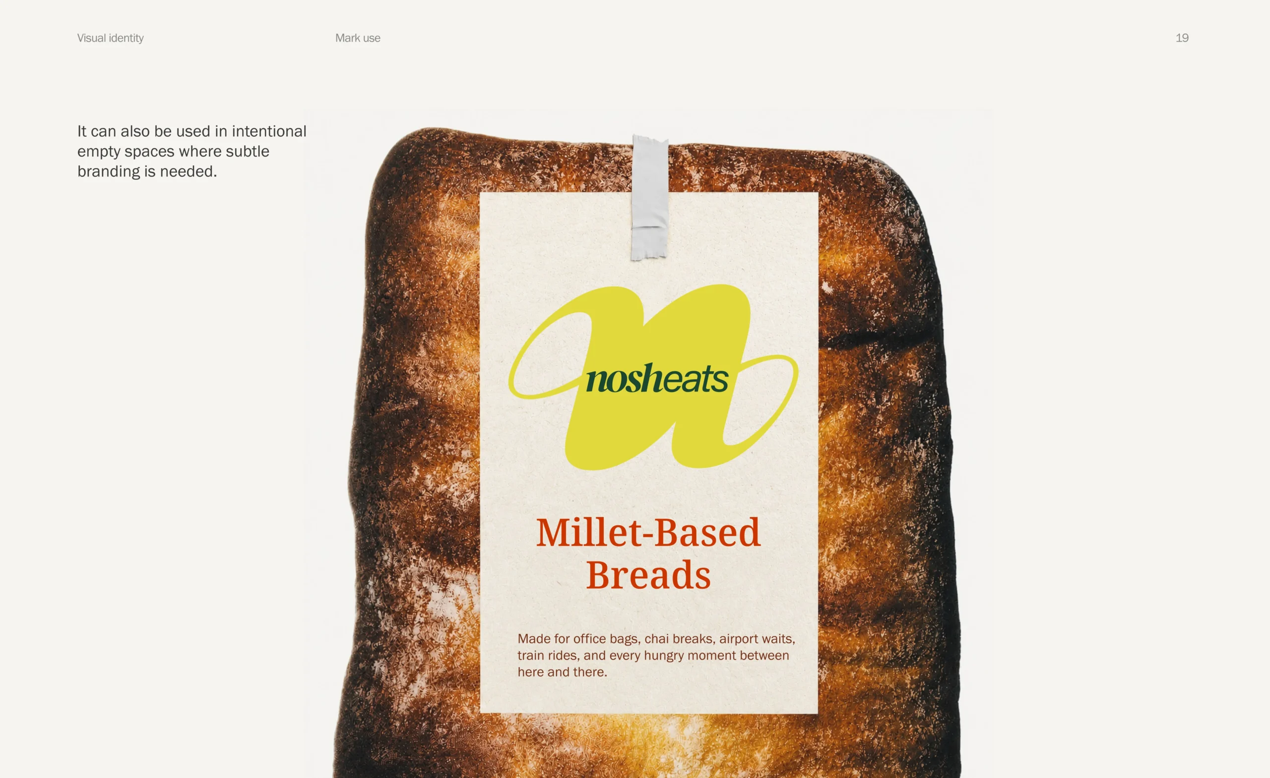
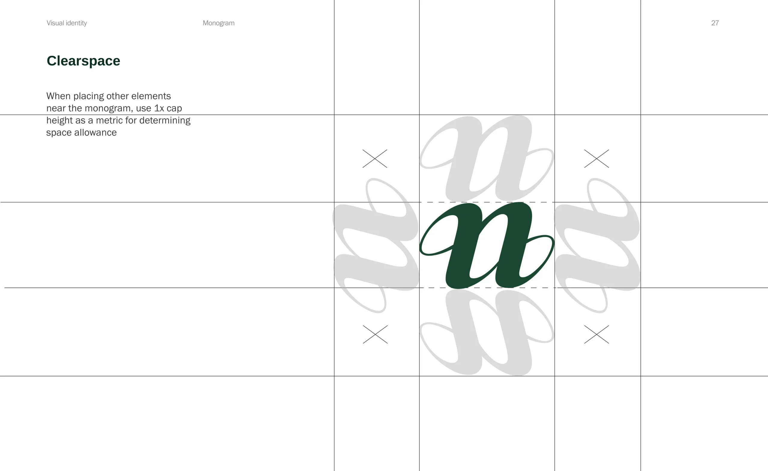
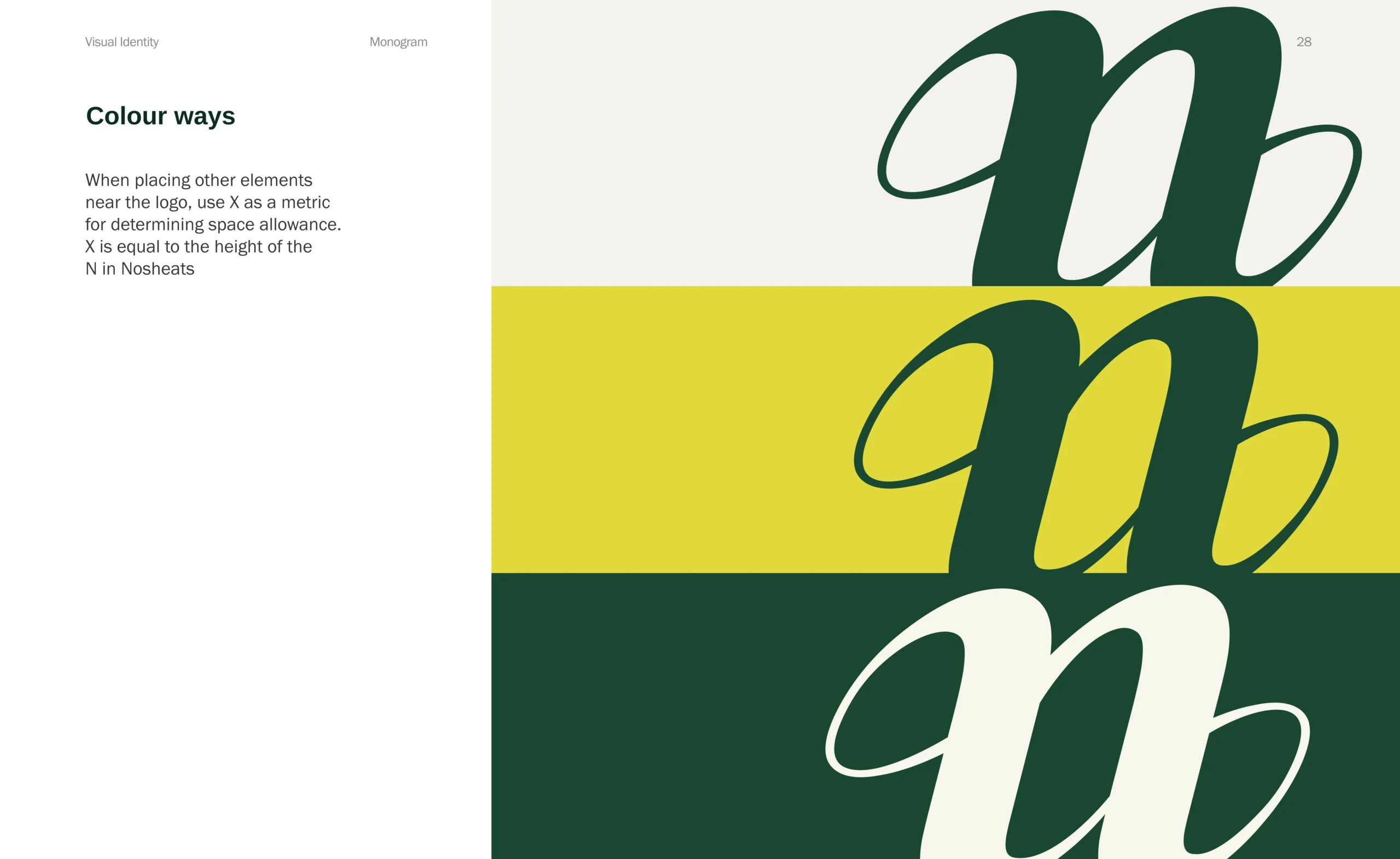
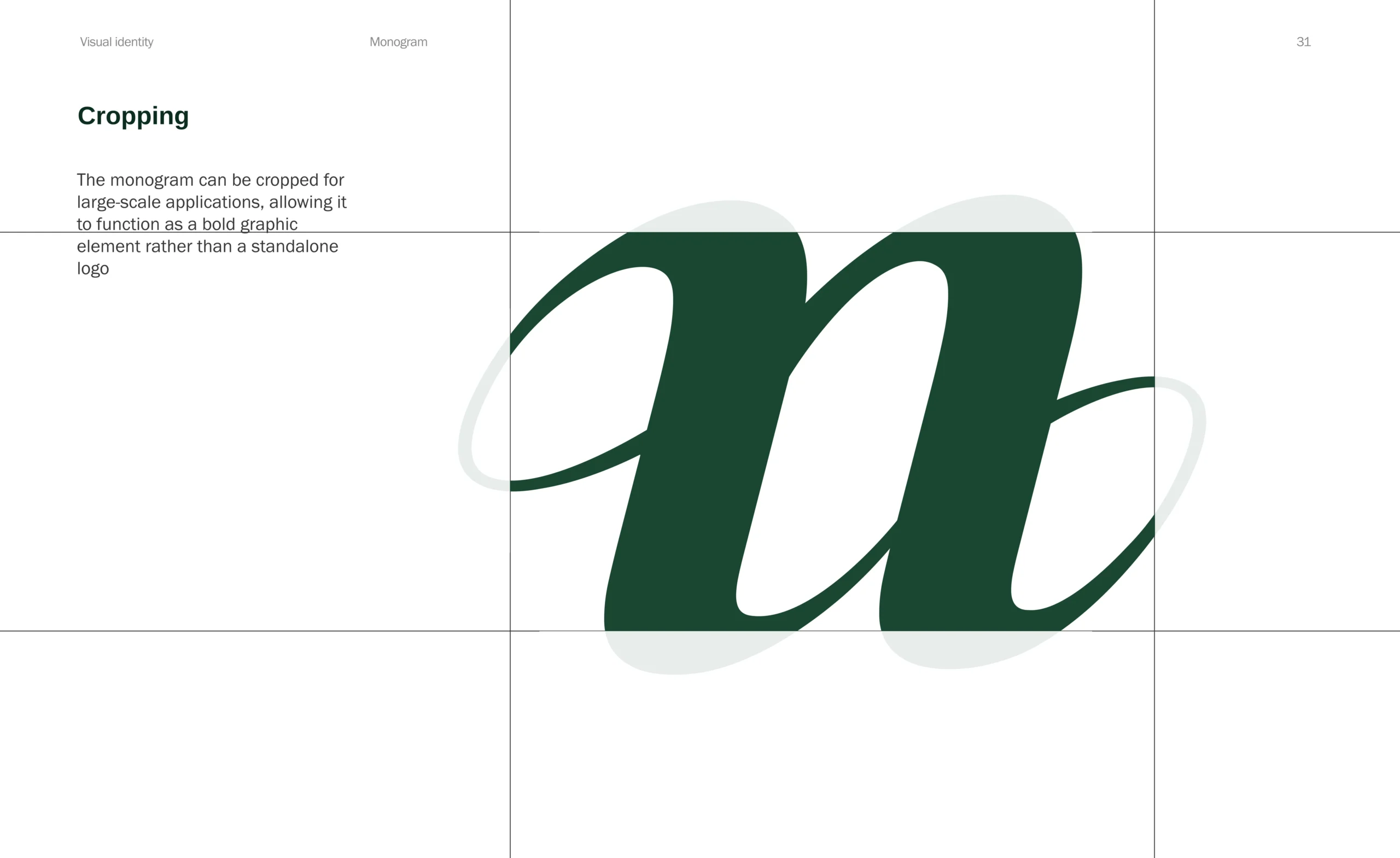
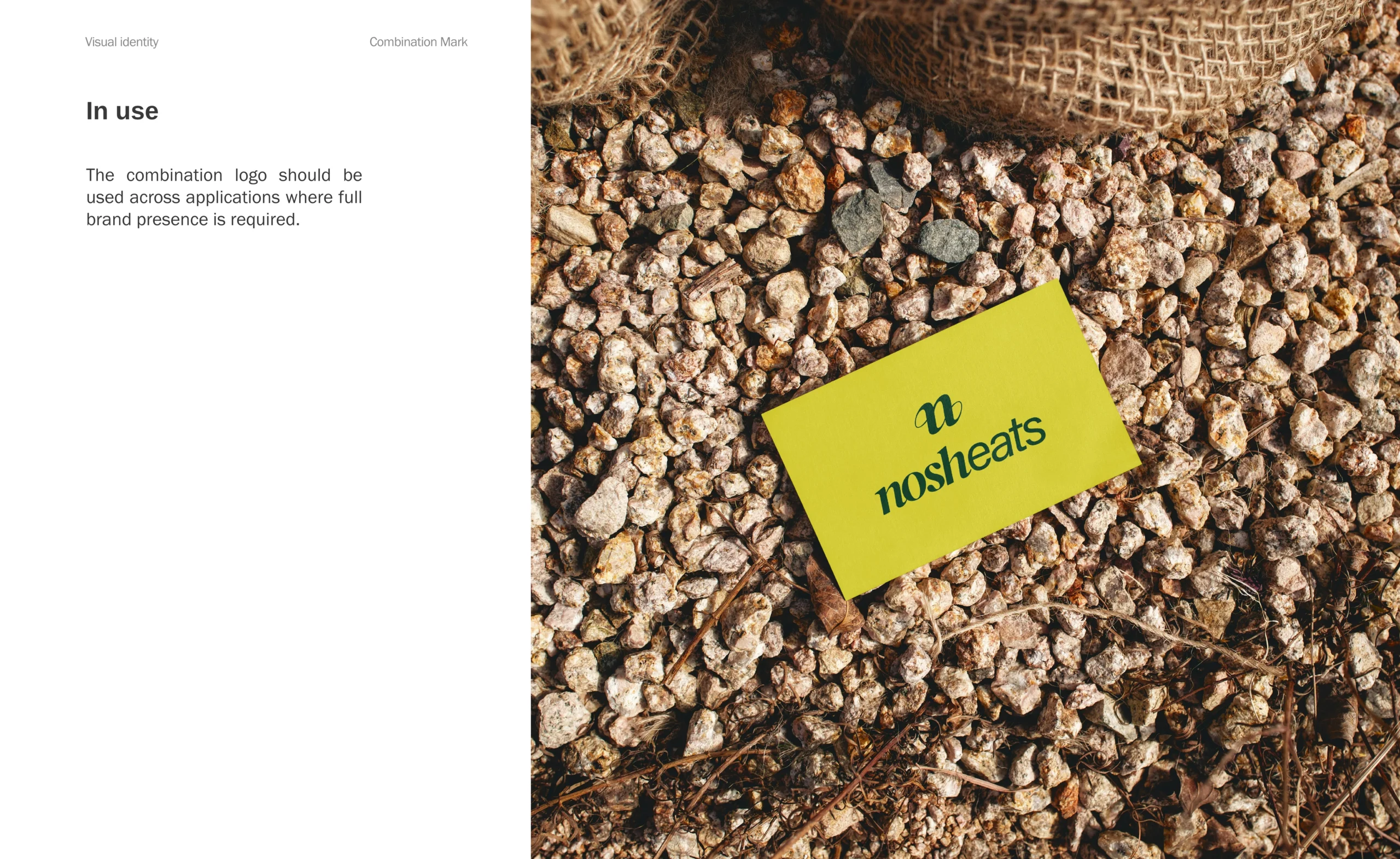
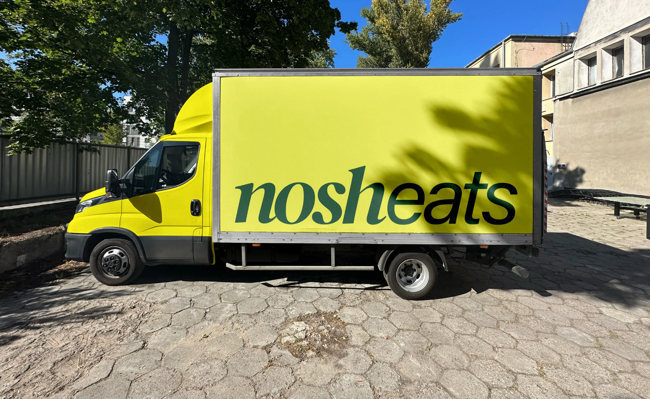
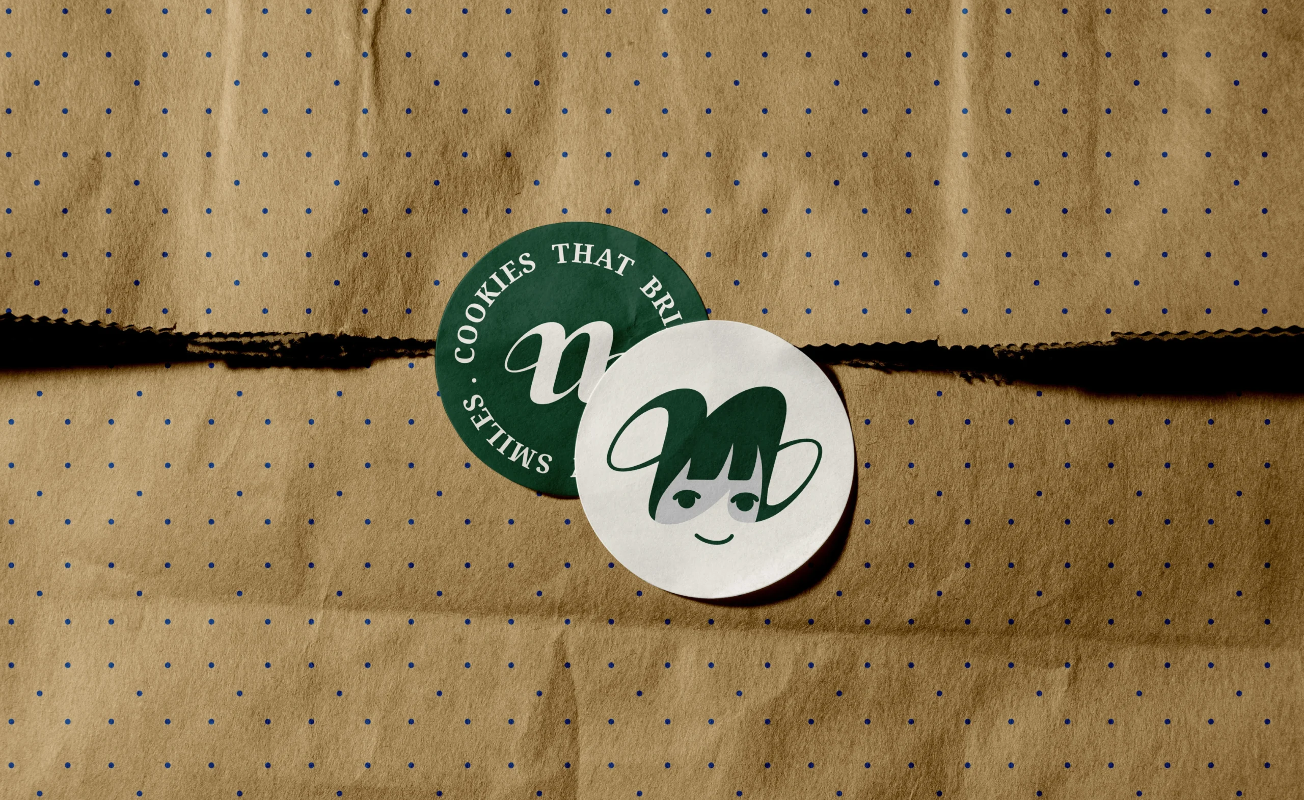
A flexible mark system keeps Nosheats recognizable across digital, retail, campaigns, merchandise, and future product extensions with consistency.
 is the art of becoming knowable,
  likable,
  and trustable.