
See What Seconds Demand
Quick Commerce
Packaging Design
We design packaging to be 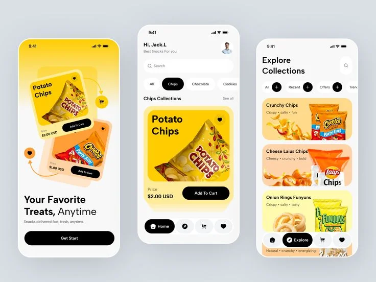 recognised in seconds, even when customers
 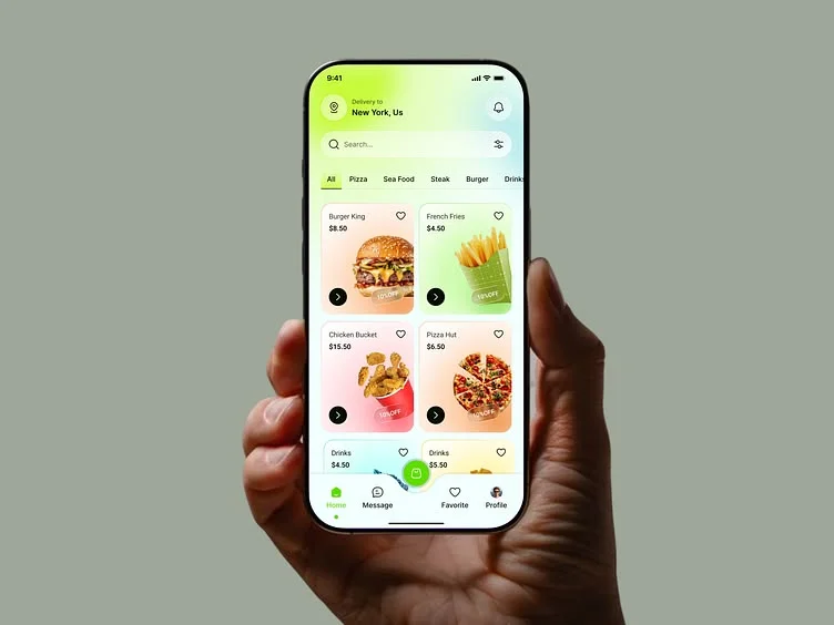 are scrolling fast, comparing quickly, and seeing
  your product as a tiny thumbnail.
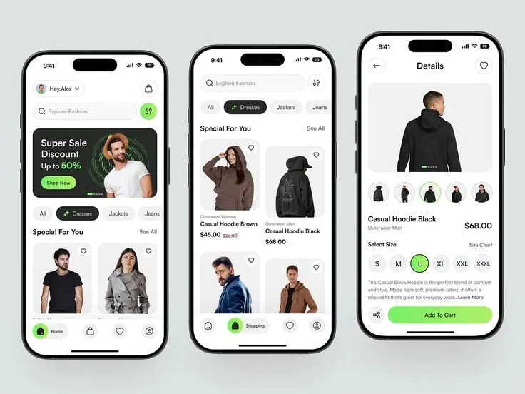
01. Can the Product Be Recognised in One Glance?
Quick-commerce shoppers scroll fast. If the brand, product type, or strongest visual cue takes too long to register, the pack can disappear inside the grid.
We simplify what needs to work first so the product is recognisable even at a very small size.
TFX Strategy in Action
For Burp, strong colour and simple visual cues help the pack stay recognisable without depending on lots of copy.
02. Is It Obvious What the Product Actually Is?
A visually interesting pack is not enough if the customer cannot immediately tell whether they are looking at a soda, snack, supplement, or something else.
We make category and product communication clear enough to survive tiny app thumbnails.
03. Which One Message Deserves the First Second?
A pack may have five benefits, three claims, and several product details.
Quick commerce does not give all of them equal attention.
We identify the one or two messages that matter most at first glance and reduce competition between everything else.
TFX Strategy in Action
For LitePlus, hydration and performance needed to come through faster than a long list of functional information.
04. Can Each Variant Be Identified Without Reading Everything?
On apps like Blinkit, Zepto, or Instamart, multiple flavours or variants can appear beside each other as very small cards.
If the difference relies only on tiny text, customers have to work harder than they should.
We use stronger visual cues so variants can be separated quickly.
TFX Strategy in Action
For Yova, different products need enough visual distinction to be identified quickly while still looking like one connected brand family.
05. Does the Pack Have Enough Contrast to Survive the Grid?
Quick-commerce interfaces already contain prices, discounts, ratings, buttons, badges, and competing product photography.
The packaging needs enough visual strength to remain noticeable without becoming loud for the sake of it.
We evaluate colour contrast, typography, visual density, and dominant brand cues at actual thumbnail scale.
06. Does the Entire Range Become Easier to Shop?
Good quick-commerce packaging is not only about making one pack visible.
When the range grows, customers should be able to scan several products, recognise the brand, understand the differences, and choose the right SKU with less effort.
TFX Strategy in Action
For Bioticle, multiple formats and benefits needed a system that made individual products easier to identify while keeping the overall range connected.
Inside a TFX Quick Commerce Packaging Design
Instant Recognition
We design the pack so the brand and product are identifiable within seconds, even at tiny thumbnail size inside a crowded app grid.
What We Focus On:
- Brand visibility
- Product recognition
- Thumbnail clarity
- Strong visual cues
Decision Hierarchy
Core
We reduce unnecessary competition on the pack and prioritise the information customers need to understand first.
What We Build:
- Product type
- Hero benefit
- Claims priority
- Variant clarity
Fast SKU Navigation
We create a system that helps customers distinguish flavours, formats, and variants quickly while keeping the whole range unmistakably connected.
What We Shape:
- SKU architecture
- Colour differentiation
- Variant cues
- Range consistency
Questions Founders Usually Ask
What makes packaging work well on quick-commerce apps?
Quick-commerce packaging needs to communicate faster than traditional ecommerce packaging.
The product is usually seen at a very small size while customers are scrolling through many similar options. Strong brand recognition, obvious product type, clear variant cues, and one dominant message become especially important.
If customers need to zoom in or study the pack to understand it, the design is already asking too much from them.
How is quick-commerce packaging different from ecommerce packaging?
Both are digital environments, but the buying behaviour is different.
On ecommerce platforms, customers often spend more time comparing products, opening listings, reading reviews, and looking through supporting images.
On quick-commerce platforms, decisions can happen much faster.
That means we place even more emphasis on instant recognition, category clarity, strong contrast, and easy SKU identification.
Should we remove information from the pack for quick commerce?
Not necessarily.
The goal is not to remove important information. It is to create a stronger hierarchy.
The pack may still need benefits, claims, ingredients, certifications, and other product information, but everything should not compete for attention at the same time.
We decide what needs to work at first glance and what can remain secondary.
How do you make multiple flavours or variants easier to identify?
We create stronger visual differences between SKUs using elements such as colour, naming, ingredient cues, typography, icons, or product imagery.
The important part is making those differences visible even when the packs appear as very small thumbnails.
At the same time, the overall system needs to remain consistent enough that customers immediately recognise the complete range as one brand.
Featured Projects
Transformations Exposed
Brand Building Services Only
Not a 360° agency. A focused studio for serious brand foundations.
01
02
03
Packaging Design
Packaging designed to sell on shelves, ecommerce, and quick commerce.
04
Luxury Packaging Design
Premium packaging for brands where perception, detail, and unboxing matter.