Logo
Design
We turn brand strategy into 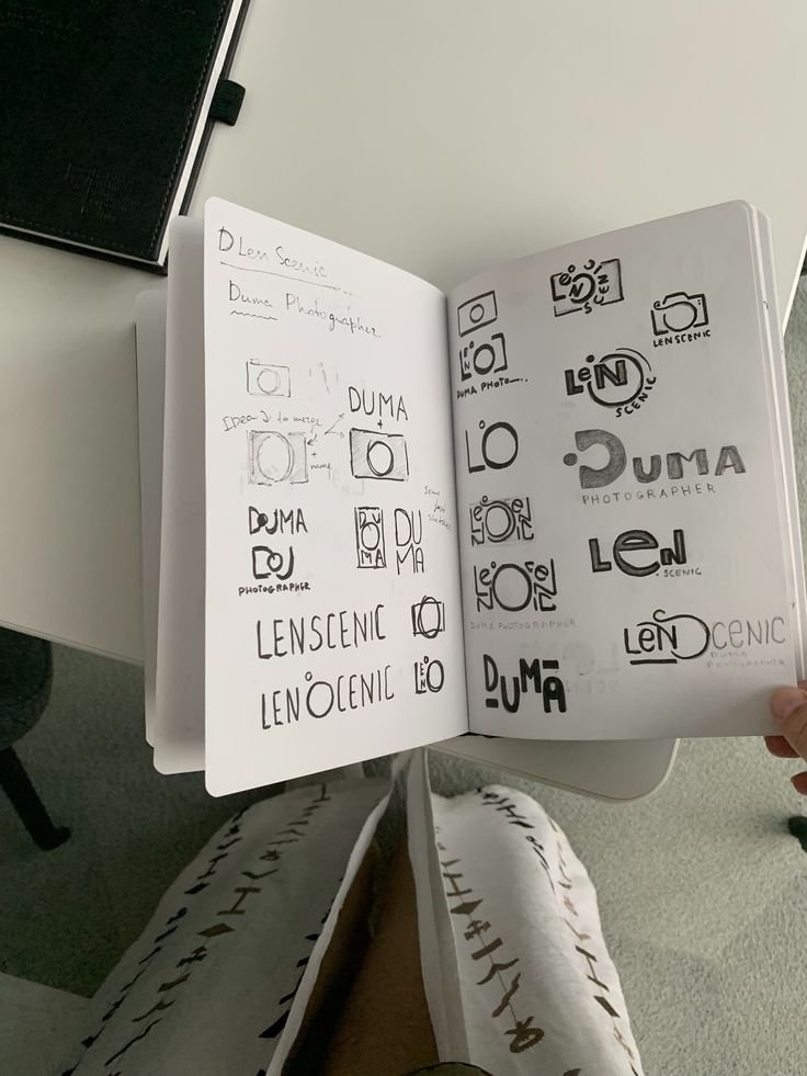 a distinct visual mark that people can
  recognise, remember, and use consistently
  wherever the brand shows up.
01. What Should the Brand Name Make People Feel or Understand?
A logo creates an impression before the customer reads the website, packaging, or brand story.
We first understand the positioning, audience, personality, category, and desired perception so the logo design communicates the right kind of brand from the beginning.
TFX Strategy in Action
For Uveraa, the identity needed to feel intelligent and science-led without becoming cold or overly clinical. The logo direction had to support that balance.
02. Does the Brand Need a Wordmark, Symbol, or Both?
Not every brand needs an icon.
Some names become more powerful through a distinctive wordmark. Others benefit from a symbol that can work independently across packaging, apps, social media, or physical touchpoints.
We choose the logo structure based on how the brand will actually be used, not because one format looks more impressive in a presentation.
03. How Do We Make the Logo Distinct Without Making It Strange?
Different does not automatically mean memorable.
A logo still needs to feel relevant to the category and believable for the brand. We look for a visual idea that creates recognition without relying on unnecessary complexity or short-lived design trends.
TFX Strategy in Action
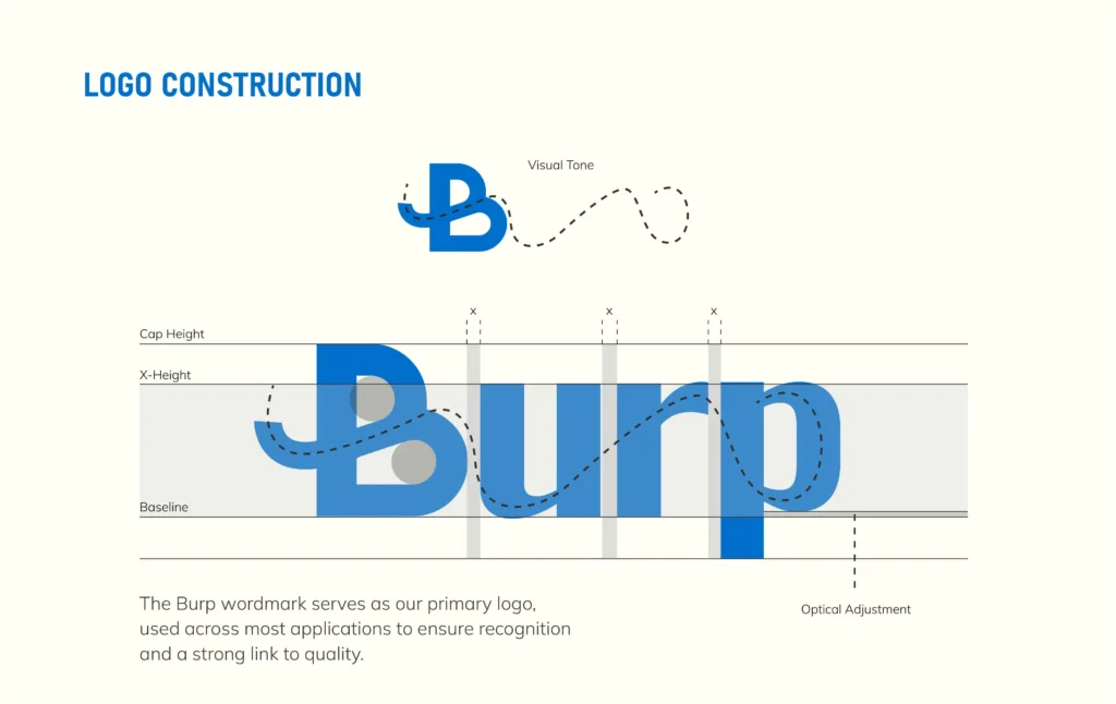
For Burp, the visual identity needed enough personality to stand apart from serious wellness brands without losing the simplicity required for a consumer beverage.
04. Will the Logo Work Everywhere the Brand Needs It?
A logo might look impressive on a large presentation screen and fail completely on a bottle cap, mobile screen, social profile, or small packaging panel.
We test the mark across different sizes, backgrounds, formats, and applications before considering the logo system complete.
What we test:
- Small-scale readability
- Light and dark backgrounds
- Horizontal and vertical spaces
- Print and digital use
- Packaging applications
05. How Does One Logo Become a Flexible System?
A brand should not depend on one locked logo arrangement.
Depending on the identity, we may develop primary and secondary lockups, symbols, responsive versions, monochrome applications, clear-space rules, and usage guidance.
This gives the brand consistency without forcing the exact same logo treatment everywhere.
TFX Strategy in Action
For Rinele, a premium identity needed to remain refined across different jewellery, communication, and brand applications rather than working only as one standalone mark.
06. How Does Brand Strategy Shape the Final Logo?
We do not begin by asking what logo style the founder likes.
The strategy gives us the criteria to judge whether a direction is right. Positioning influences perception, audience affects relevance, archetype shapes personality, and the category tells us what the brand needs to challenge or retain.
TFX Strategy in Action
For Proquity, the identity needed to communicate trust and seriousness while still feeling relevant to a modern platform connecting founders, investors, and bankers.
Inside a TFX Logo Design
Logo Direction
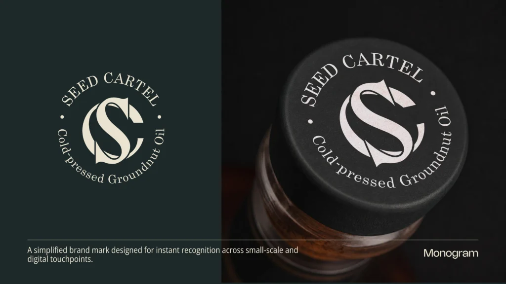
We translate the brand strategy into a clear visual direction before exploring forms, symbols, or wordmarks.
What We Define:
- Visual territory
- Logo structure
- Style direction
- Distinctive cues
Logo System
Core
We build the logo to work beyond one presentation, across different sizes, formats, backgrounds, and brand applications.
What We Build:
- Primary logo
- Secondary lockup
- Symbol or mark
- Responsive versions
Usage Rules
We define how the logo should be used so the identity stays consistent wherever the brand appears.
What We Set:
- Clear space
- Minimum size
- Colour usage
- Incorrect usage
Questions Founders Usually Ask
What makes a good logo design?
A good logo should be distinctive, relevant to the brand, easy to recognise, and flexible enough to work across different sizes and applications.
But the logo should not be judged only on whether it looks attractive.
At TFX, we look at the brand strategy, positioning, audience, personality, and category before deciding what kind of visual mark makes sense. The goal is to create a logo that feels right for the brand and can continue working as the business grows.
Do we need a symbol, or is a wordmark enough?
Not every brand needs a separate symbol.
Some brands are better served by a strong wordmark, especially when the name itself has enough personality and recognition potential. Other brands benefit from a symbol that can work independently on packaging, social media, apps, merchandise, or smaller touchpoints.
We decide the logo structure based on how the identity will actually be used, not because every brand needs an icon.
How many logo concepts do you create?
We prefer focused exploration over presenting a large number of random options.
The early design process may include multiple directions, sketches, and visual territories, but the concepts presented to the client are narrowed down based on the strategy and creative direction.
The goal is not to give the founder twenty logos to choose from. It is to develop a smaller number of directions that already have a clear reason behind them.
How do you make sure the logo works in the real world?
We test the logo across the situations where the brand will actually appear.
That can include:
- Packaging
- Websites
- Social profiles
- Business cards
- Small print applications
- Light and dark backgrounds
- Horizontal and vertical spaces
For a brand like Rinele, the logo needs to remain refined at both premium brand applications and much smaller jewellery-related touchpoints. Testing these situations early prevents the identity from working only inside a presentation.
Featured Projects
Transformations Exposed
Brand Building Services Only
Not a 360° agency. A focused studio for serious brand foundations.
01
Brand Strategy
Pretty design cannot save a confused brand.
02
Brand Identity Design
A clear visual system built for trust and consistency.
03
Packaging Design
Packaging designed to sell on shelves, screens, and stores.