
Color &
Typography System
We build a colour and typography 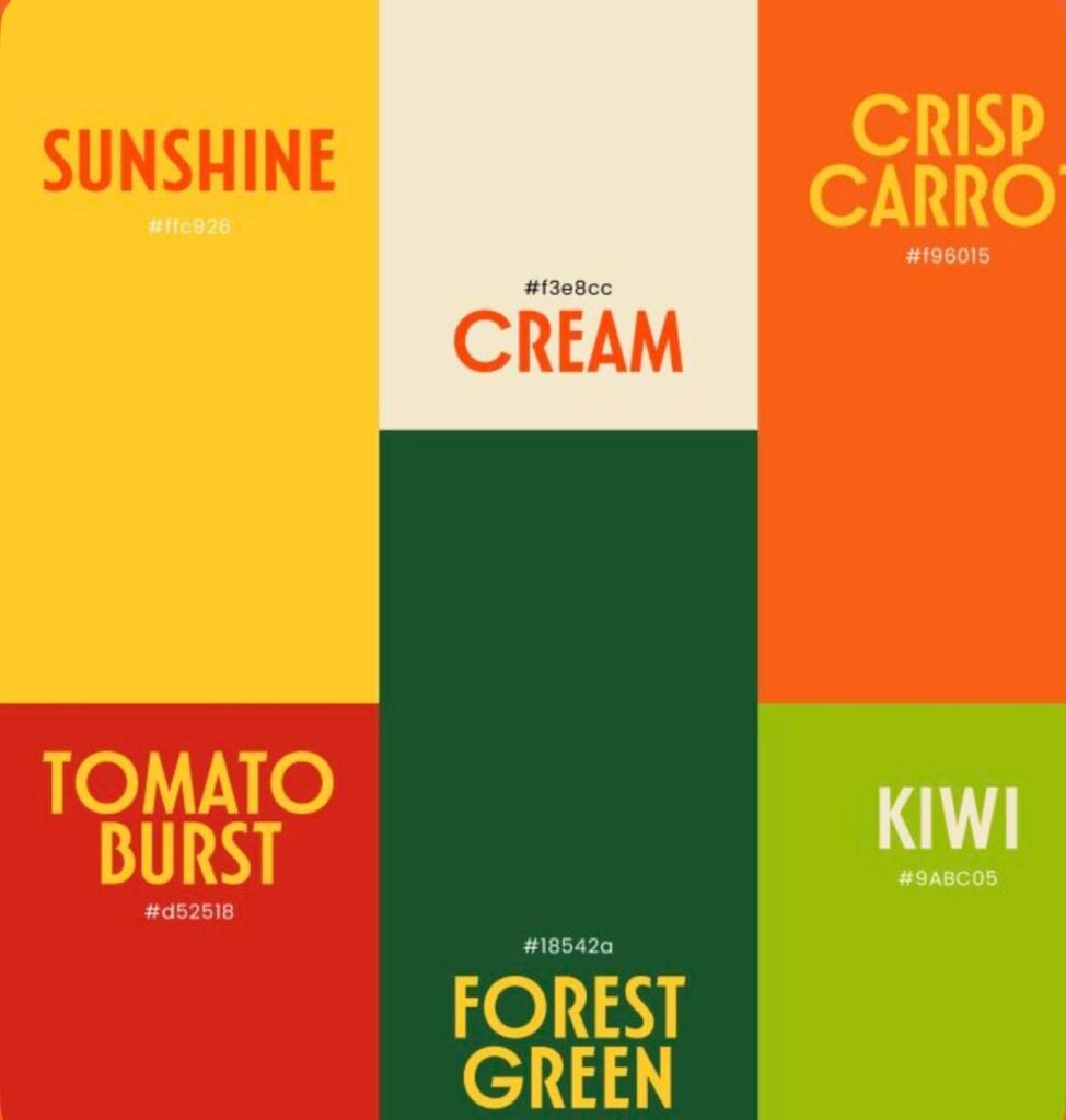 system that gives your brand recognition,
 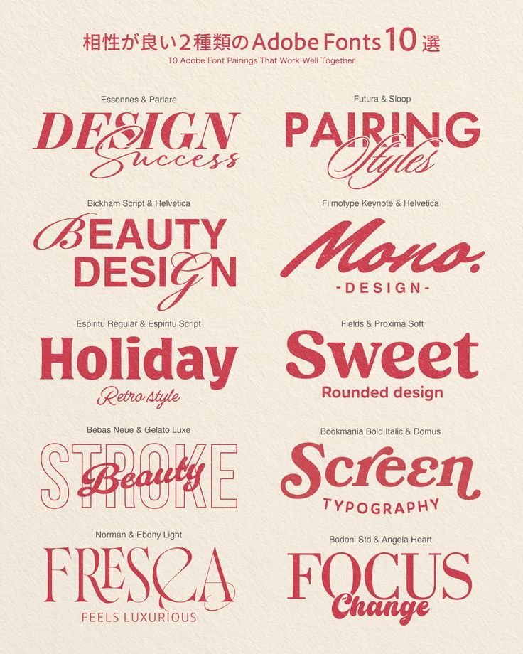 hierarchy, personality, and consistency
  across every touchpoint.
01. What Should the Brand Look Like Before Anyone Reads a Word?
Colour often creates recognition before the customer processes the logo, headline, or product name.
We define the emotional and strategic role of colour based on positioning, audience, category, personality, and desired perception so the palette feels intentional, not decorative.
TFX Strategy in Action
For Uveraa, the visual system needed to feel intelligent and science-led without becoming cold. The colour direction had to balance clarity, trust, and everyday warmth.
02. Which Colours Should the Brand Actually Own?
Choosing brand colours is not about finding a palette that simply looks good together.
We look at category patterns, competitor usage, contrast, recognition, accessibility, and future applications to build a colour system the brand can use consistently across identity, packaging, and digital.
03. What Should the Typography Make the Brand Feel Like?
Typography carries personality even before the words are understood.
A typeface can make the brand feel refined, expressive, technical, playful, authoritative, or approachable. We choose typography that supports the positioning and works naturally with the wider visual identity.
TFX Strategy in Action
For Rinele, typography needed to support a more refined and globally relevant premium expression without falling into overly ornamental jewellery conventions.
04. How Should Headlines, Body Copy, and Packaging Work Together?
A typography system needs hierarchy, not just two selected fonts.
We define how display type, headings, body copy, product information, captions, numbers, and packaging details should work together so information remains clear and recognisable across different formats.
05. Will the System Still Work Across Every Touchpoint?
A colour palette or typeface can look strong in a brand deck and fail in real use.
We test the system across packaging, websites, social media, presentations, print, small-format applications, and different backgrounds to make sure the identity remains usable as the brand grows.
TFX Strategy in Action
For Burp, the system needed enough energy for a playful consumer brand while remaining clear across packaging, flavour variants, and communication.
06. How Do Colour and Typography Become One Recognisable System?
Colour and typography should not behave as separate design decisions.
The palette creates recognition and emotional tone. Typography creates voice, hierarchy, and rhythm. Together, they help every brand touchpoint feel connected even when the layout or content changes.
TFX Strategy in Action
For Proquity, the identity needed to balance trust and professionalism with a contemporary feel. Colour and typography had to support the same perception instead of pulling the brand in different directions.
Inside a TFX Color & Typography System
Color System
We build a structured palette that supports recognition, contrast, hierarchy, and consistent use across different brand applications.
What We Define:
- Primary colors
- Secondary colors
- Accent colors
- Functional colors
Typography System
Core
We define typefaces and hierarchy so the brand has a consistent visual voice across headlines, body copy, packaging, and digital communication.
What We Build:
- Primary typeface
- Secondary typeface
- Type hierarchy
- Usage rules
System Application
We show how color and typography should work together across real touchpoints so the identity remains clear and consistent.
What It Guides:
- Packaging
- Digital
- Brand communication
Questions Founders Usually Ask
How do you choose the right brand colors?
We do not choose colors only because they look good together.
The color system should support the brand positioning, personality, audience, category, and the perception we want to create. We also study competitor palettes so the brand does not unintentionally disappear into familiar category patterns.
For Uveraa, the system needed to communicate science and trust without becoming overly clinical. That meant finding a balance between clarity, intelligence, and warmth rather than simply choosing typical healthcare colors.
How many colors should a brand have?
There is no fixed number.
Most brands need more than one primary color, but adding too many without clear roles creates inconsistency.
A structured brand color palette may include:
- Primary colors
- Secondary colors
- Accent colors
- Functional colors
- Background or neutral colors
The important part is defining when and why each color should be used, so every designer is not creating a different version of the palette.
How do you choose typography for a brand?
Typography is selected based on both personality and usability.
We look at how a typeface feels, how readable it is, what languages and characters it supports, how many weights are available, how it behaves at different sizes, and whether it works across packaging, websites, presentations, and print.
For Rinele, typography needed to feel refined and premium while remaining contemporary and practical enough to work across real brand applications.
A beautiful font that cannot function consistently is not a useful brand typeface.
Does a brand really need a typography system?
Yes, especially once more people begin creating communication for the brand.
Choosing one or two fonts is only the beginning. A typography system defines how headlines, subheadings, body copy, numbers, captions, product information, and other content should behave.
Without hierarchy, every designer decides sizes, weights, spacing, and styles differently.
The system makes communication easier to read and helps the brand remain recognisable even when the logo is not immediately visible.
Featured Projects
Transformations Exposed
Brand Building Services Only
Not a 360° agency. A focused studio for serious brand foundations.
01
Brand Strategy
Pretty design cannot save a confused brand.
02
Brand Identity Design
A clear visual system built for trust and consistency.
03
Packaging Design
Packaging designed to sell on shelves, screens, and stores.