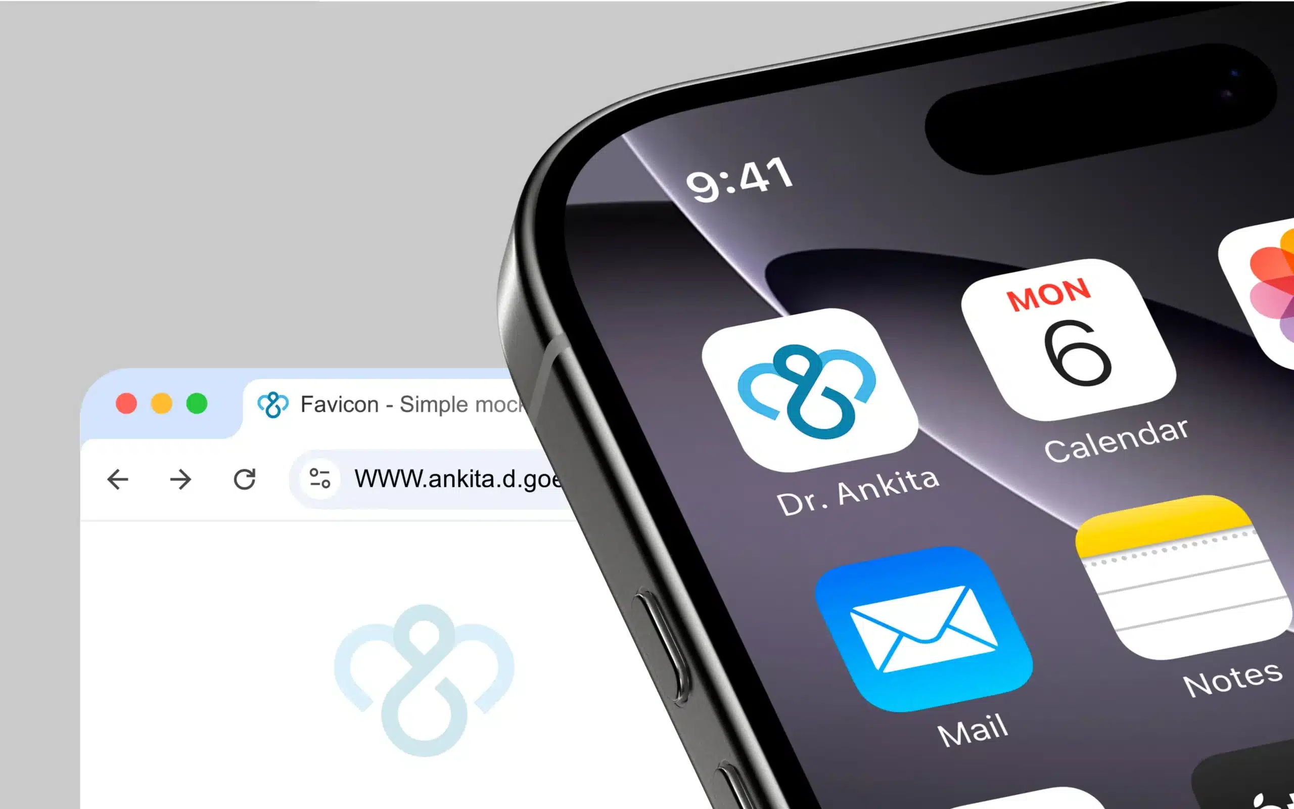
Patients need clarity and calm. Staff need assets that just work. We turned Dr. Ankita D Goel’s practice into a clear, scalable logo system—built for tiny favicons and big clinic signage, without the daily design friction.
A heart-loop monogram on a geometric grid, calming clinical blues, and high-legibility type – so every touchpoint signals trust, hygiene, and care.
Scope
- Logo Design (Primary mark, monogram, wordmark, lockups, favicon exports)
Industry
- Healthcare
- Medical Practice
- Personal Brand

Challenges
Warmth + Clinical Trust
Balancing empathy with a professional, evidence-led image.
01
Micro to Macro Usability
Logo must read from prescription headers to outdoor signage.
02
Daily Ops Ready
File-light assets so small teams can deploy fast with zero guesswork.
03
Personal Brand, Not Hospital
Distinct identity for a gynaecologist & laparoscopic surgeon—credible, modern, human.
04
Solutions: The Factor X Way
A System, Not a Single Mark:
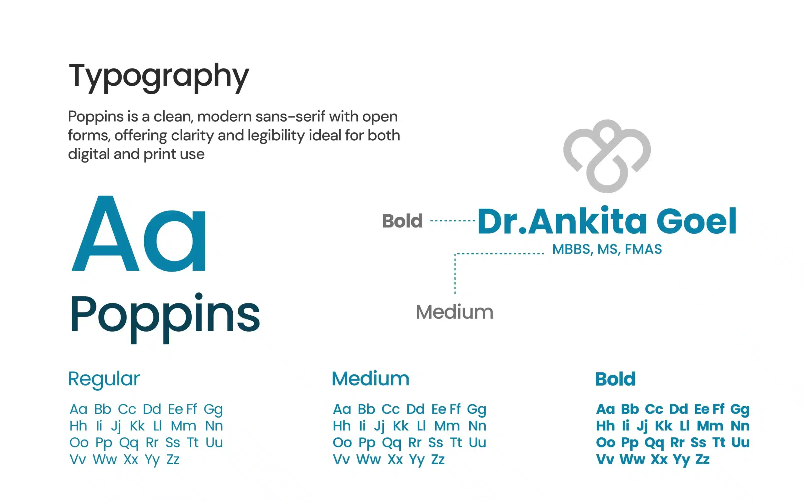
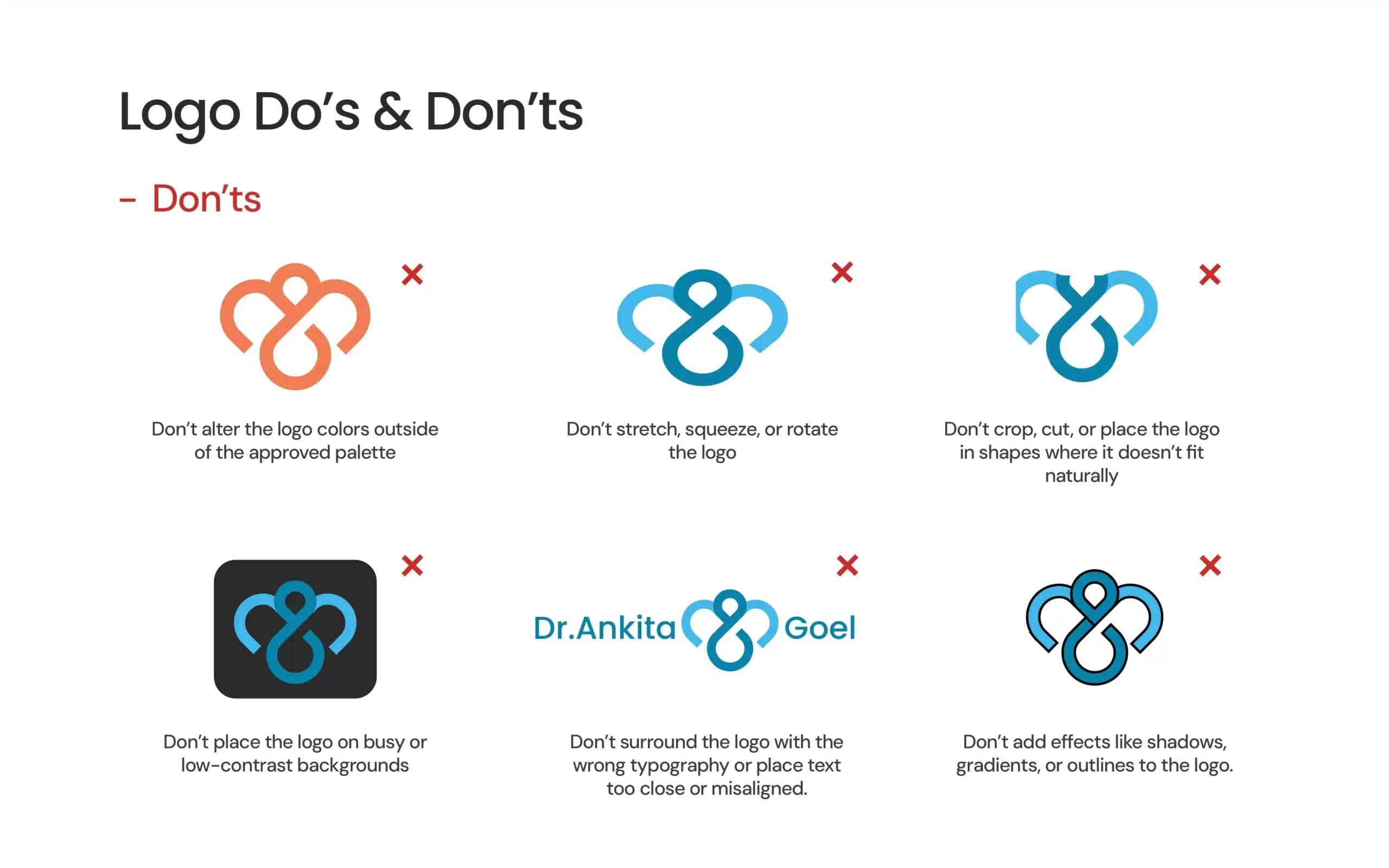
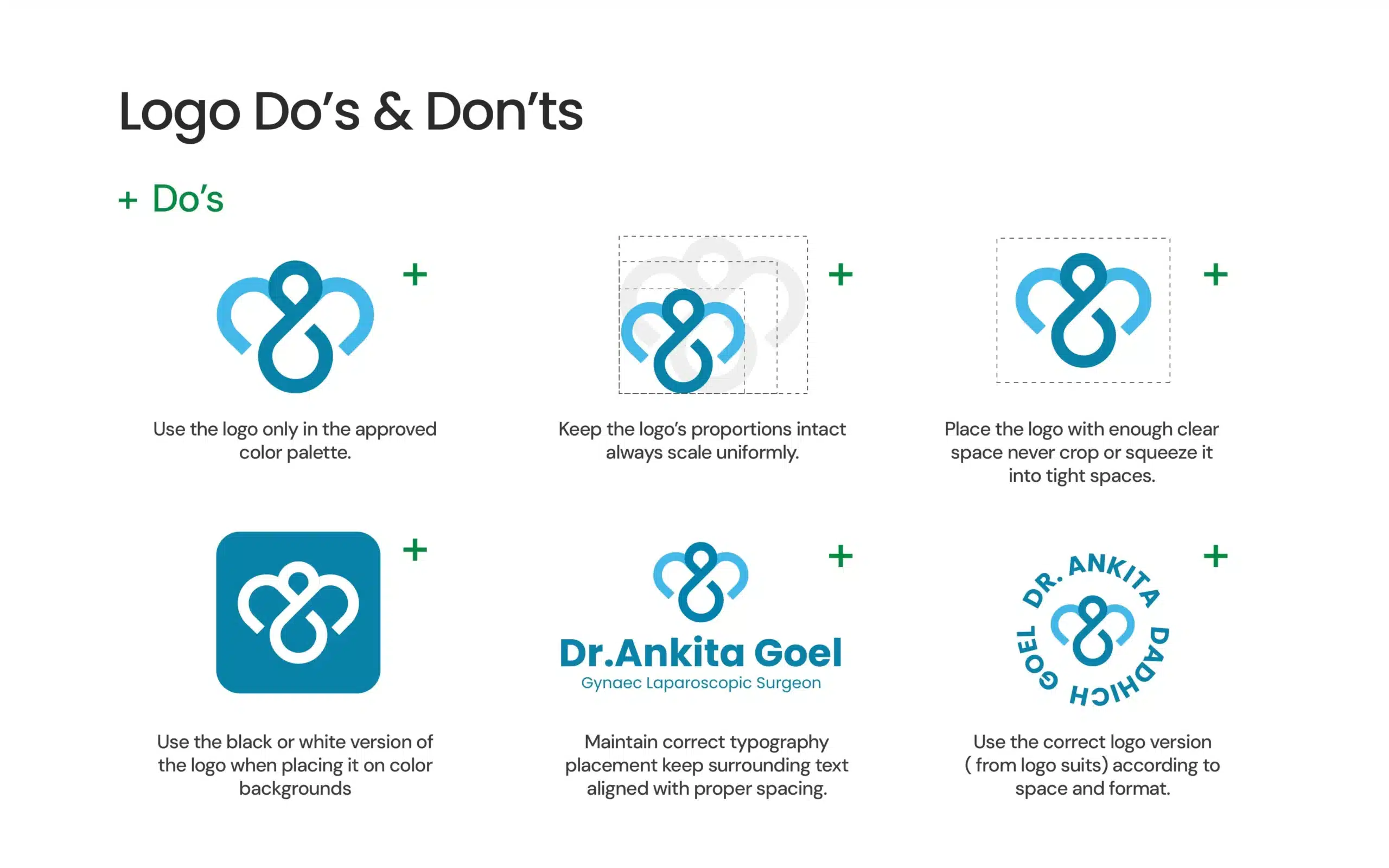
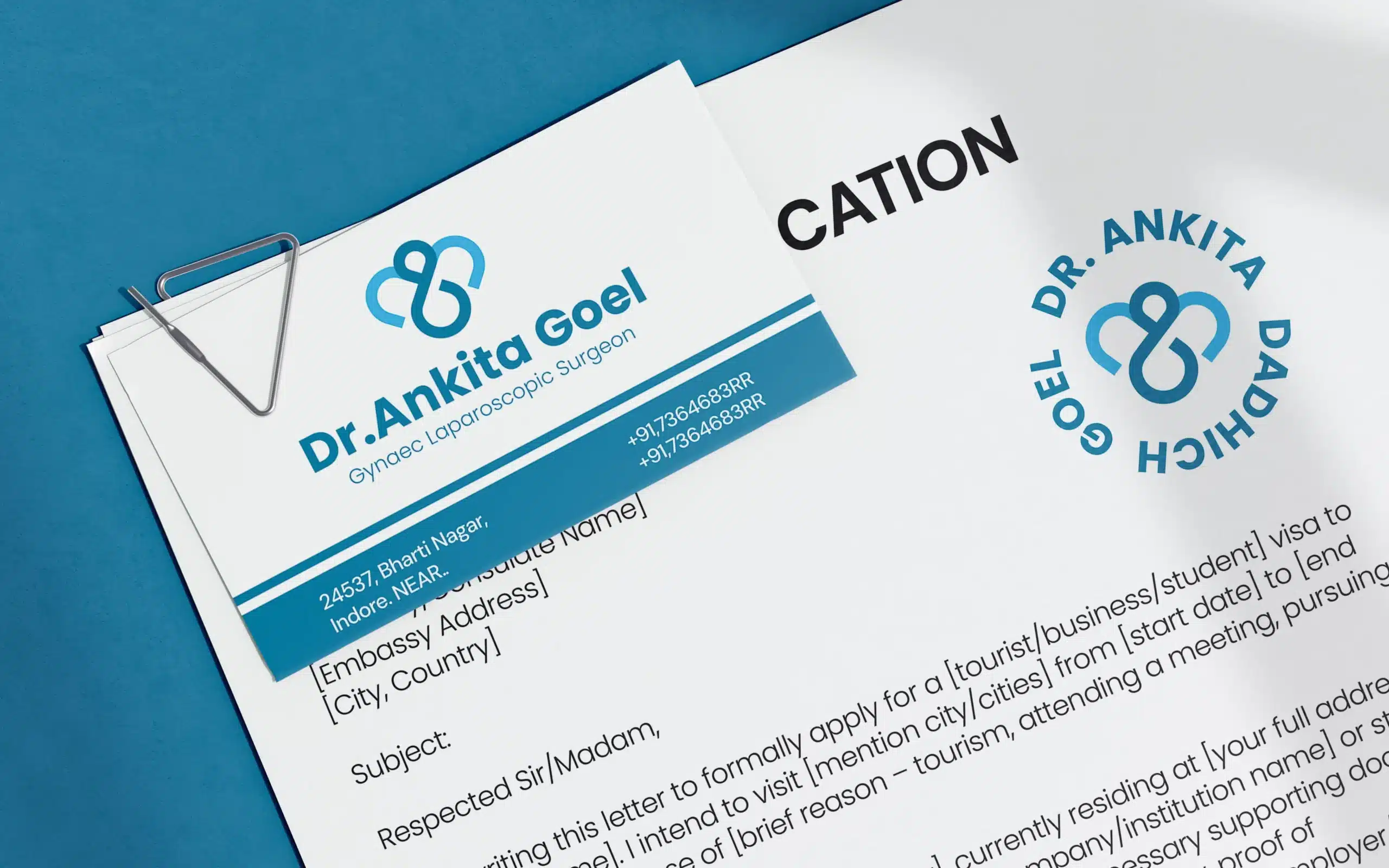
We designed a heart-loop monogram (built on grid) that pairs with a clean wordmark for different contexts – favicon, badge, coat embroidery, door plates, digital screens. Clinical blues and neutrals carry the hygiene cue; accessible typography keeps forms, prescriptions, and reports legible. Final delivery included ready-to-use lockups and export presets so the team can move fast without calling a designer.

Xceptional Branding, Crafted to Perfection


